
Simplify Your Life &
Align with Your True North
Choose Your Path
-

Simplify
-

Introspect
-

Quotes
-

Inner-Voice
-

One-Person Business
-

Financial Freedom

043: Don't create a website that is stunning. Create a website that converts.
See the four steps of the marketing process and assess which step you need to optimize on your website.
Don't create a website that is stunning. Create a website that converts.
Yes, this is coming from someone who loves building beautiful websites for her clients. But it also comes from someone who has built a website that actually serves as a business asset that is the main source of revenue for her. So consider this advice very closely, my friend - build a website that converts not just a website that is stunning.
Watch the Video:
I Love Stunning Websites. I Love High-Converting Websites More!
Don't get me wrong. I am all for a beautiful, stunning website.
You can spend the big bucks on designing a site that is awe-inspiring, with the coolest effects, high-quality photos and customized code but if it doesn’t connect with your potential customer, then it will just be that - a beautiful site. It will fail in working for you.
That's why I'd rather go for a website that gives me value than a website that sits there looking pretty.
Your business depends on your website to help grow your business regardless of what kind of a business you are running. If you are a brick and mortar business with most of your clients coming in through the door, a web presence is so critical. Your customers will most like seek you out online before deciding to drive down, park somewhere expensive and then walk in all kinds of weather to get to your store.
And if you are a solopreneur or an online business owner who wants to sell a product (physical or digital like an e-course) or a service, then a website that converts is essentially bread and butter for your business. It determines whether you will be able to pay your business costs as well as feed and house you and your family.
So you can see it is so critical to implement strategies that will make your website worth the time and money you put into it. You need a website that converts.
A Stunning Website ≠ A High Converting Site
Unfortunately, I see too many websites that are heavy on design but light on content. And unless, your content is design - say you are graphic designer or visual artist, then my friend, I am sorry to say, your pretty website is really not working for you. If you want your website to actually build your credibility, win you clients and sell your products (digital and physical) then you've got to make some changes. (I do have a word for the visual artist a little ways down this article. So if you are a visual artist, do consider those thoughts).
I myself have fallen for the trap of the pretty website. I cannot even recount how many hours I have spend on changing my the template on my website and going through countless number of images in order to choose the right photo for the right mood. Or spending hours on Canva or some design tool creating the perfect Pinterest thumbnail. If had spent even half of that time on creating content, creating blogs and videos that solve people's real problems, then I would be in a completely different place in my business today - without a doubt.
A stunning website is not equal to a high converting site.
And that is what I am now focussing on in my business and I want you to do so as well: Transform your website into a value-giving, content rich home for solving people's real problems. As you begin doing this, you will be well on your way to transforming it into a real business asset - one that produces revenue for your business.
I know there are many SEO guru's who will advise on creating SEO rich landing pages. Sure you can do that. But don't squint your efforts in creating real helpful content for your specific audience.
Content is the name of the game today.
But you are asking why is it so important to create content. You've got your portfolio that speaks for itself. You've got your courses that stand for itself. You've got your bio, that explains it all. Then why do I need more content?
Content really is the name of the game today.
People are going to the web more so for solving problems than ever before. With more and more people around the world getting access to the internet, more of them will come knocking at your door to find solutions to their real problems. And if you can solve them, you will not only make a difference but stand out as someone who adds value. People care about people who add value to them.
And it is with value-giving content that you can truly stand out. People today watch your videos, read blogs, listen to your podcasts and say, "I like this woman and what she has to offer." I wonder if she will be available for doing this project for me.
It is content that converts not a glitzy glam website. If you want to sell a product or a service as a solopreneur or a small business, you've got to have a value-rich website.
Here's #realtalk for the artists who want a portfolio-website: I must say that even if you are an artist whether a visual or performing artist and your work is more design and visuals than words, you will find that creating content around your creative process will bring you much further in your career than just displaying your awesome creations in a bad-ass portfolio. A hand-lettering artist, for example, who walks people through her process of her craft, will establish herself as an expert in her topic faster than you can say "what?".
So this post is for entrepreneurs in two different stages. One: Brand new. You’ve decided to go get a website and you want to make sure it’s done right from the start. Two: Experienced online entrepreneur or business owner frustrated with her results. You’ve had your site for a while, say a year or two, and are not seeing the kind of results you had hoped for.
What’s common in both these situations is that you want your website to work for you. You realize that creating a stunning, beautiful website is only part of the game plan. Squarespace makes it easy to build such an eye-catching site. But what you are becoming even more aware of is the importance of strategies that will actually influence your revenue. You want to build a high-converting website that converts.
What do I mean by a website that converts in the first place?
Now, I want to be clear in the use of terminology and want to make sure I express what I mean when I say, “a website that converts”. A website that converts is essentially a website that successfully convinces a reader to start their relationship with you.
It is a fact that 97% of new visitors of your site will not make a purchase. They view your site and then fizzle away into the vast deep space of the internet.
"As Chet Holmes points out in The Ultimate Sales Machine, only 3% of people are ready to buy right now. You want to keep in contact with the 97% who are in the “not quite yet” stage".1
What you want is to have things in place on each page of your site that will help them say, “Yes, I like this. I want to see what they have here for me”. "And oh, wait, I want to give her my email address, so that I don’s miss out on all the goodness she has to offer".
You want them to want to sign up to whatever free content you have on offer and give you their email address.
Notice that I said, "give you their email address". I didn’t say, “buy your product or services”. Of course, there are occasions when you get a purchase right away from someone who just landed on your site, depending on what type of industry you are in and what type of product or service you are selling. But even for those types of sales to happen, your website has to check off some key boxes, so that a brand new person visiting your website today can have the confidence in what you offer and say, “Hey, I like what you have on offer. Take my money.”
So, my definition of a website that converts is: a website that convinces people that you are a reliable, trustworthy source of valuable information and makes it super easy for visitors to become your subscribers. You can measure this by what percent of your site visitors are turning into subscribers of your email list. You can see this by how many people join your list.
4 Step Marketing Process in Online Business
A natural process of marketing for online business looks like this:
Step 1 -> Step 2 -> Step 3 -> Step 4 = Sales$$
Step 1 Land on your website->
Step 2 Convert those visitors into subscribers ->
Step 3 Nurture them with value-giving content ->
Step 4 Invite them to new products and services
= Generate revenue & sales
Step 1: First, people have to know about your website. To have that happen, there are tons of things you can do which has to do with content marketing, seo, social media marketing, networking with influencers, guest blogging, interviewing, etc. This falls under creating traffic to your website.
Step 2: Second, when all those efforts (from step 1) have been successful and people finally land on your website, that’s when your site has to already be in gear, ready and waiting to welcome them. Just like the sales person inside a tea shop is ready with everything - all items are on display, the pricing is clear, and she is present as well so that she can answer any questions you may have. This falls under what I call, "making your site conversion ready".
Step 3: Third, is when they are on your email list and over time, you build a like, trust and know factor by sending them consistent, high-value content. This is the nurturing and trust-building phase.
Step 4: Fourth, once the relationship is nice and strong. Then, you can then invite the people on your list to a new product, service or a program or an event.
=
All of these steps combined lead to revenue and sales.
It seems to me that there’s a lot of focus on step one. A lot of folks are focussing on social media, Facebook Ads, Google Adwords, etc. All of this is important and certainly has its place. It is important to do all those things to get people onto your website.
But it’s even more important to do steps 2 and 3. Because no matter how successful step one efforts are, they all fall flat if step 2 is not done well. Step 2 is where the reader actually sticks around a bit after landing on your site and then finds things that they want to opt-into and instantly get access to. This is so so key.
Remember Step 2 is all about having a conversion ready website. And Step 3 is about nurturing those folks who are on your email list.
How do you fair on step 2, in creating a conversion-friendly website?
Step 2 calls for putting into place a strategy, a plan of action for what your site is going to do to inspire people to subscribe to your list. But not in a sneaky, manipulative way. Instead, it’s got to do it in a way that the visitor says to herself, “wow, i really need this. ooh, I need to opt-in for this, and this and this. There’s so much here, I will bookmark this page. I will come back in my lunch break. I need to binge watch and binge read…" You get the point. It has to be in the most generous way. You’ve got to make the person feel that there’s a ton of content, useful content here that they absolutely need to get their hands on. They may even ask themselves, how come they haven’t heard about this page and start thanking their stars that they have finally found you.
This I find key because of all the effort you are putting into guest blogging or into social media and driving all that traffic to your website, you’ve got to have it ready for them. So that they will stop, spend some time there and give you their email. Instead of simply bouncing off to the next thing on their to-do list.
Only when Step 2 is done, will step 3 and 4 even come into play. You see what I mean. How can you nurture a list when people are not opting in. How can you launch a product and service when you don’t have a list of people who like trust and know you? I hope you are beginning to see why Step 2 is über-essential.
So the moral of the story is put efforts in making your Website Conversion ready.
How to make your website conversion ready?
Now, there are plenty of ways to make your Squarespace site do really well in Step 2. There are three key things you need to do in order to make your website conversion-friendly.
1. Clarity of purpose
2. Value-rich Content
3. Effective Calls to Action (CTAs)
1. Clarity: Present yourself clearly
You’ve got to be very clear on what you do and how you do it. Big big clarity.
So for example, don’t just state that you are web designer. State that you build websites on Squarespace with a 2- week process of completion.
This has to emerge very clearly in the way you present your business. It can refer to a main result, a core service or to specific tools, strategy or the approach you use that makes you stand out. Key would be to also add who you do this for. Don’t be afraid of getting really niche and getting really narrow.
I once saw a presentation of blogger who runs a million dollar business selling all things around succulents! Not plants but a very focused type of plant: succulents. And then she said that she would make more money if she addressed the needs of a yet narrow group within that succulent category. Wow! Succulent is already narrow and she said going even narrower would be her ticket to greater success. This is key. And don’t worry about have it all right from the start. Begin somewhere and refine as you go. Some other ways to present yourself clearly would be to use videos and photos while make it all personable and showing your process.
2. Content: Value-rich content that solves problems
Next, you’ve got to have tons of content on your site. Experiment with different types of content. You will begin to feel what your strength is. And then eventually you can focus on that one thing that is at the crux of your skill and what works.
For example, Amy Porterfield, a very successful marketer, does only audio podcasts. Just that one thing. She makes high-quality value rich content in the form of audio podcasts. She also has PDF checklists and summaries that people can download connected to that episode. Plus she has free PDFs on her home page that people can download for free. This is a great way to give out content. Another example is Melyssa Griffin. She has an immense resource library where you can get a whole portfolio of PDF resources. I think she does this really well.
But you may find that you love to create blog articles or video tutorials.
May you are a photographer or a visual artist of some kind, an actor or a performer. May be you make things by hand. Then articles that showcase your work, your process, in text and photos would be a huge way to build content.
I personally have found live workshops a great way to teach content. I do intense, info filled paid trainings like this one and then shorter, more focused live trainings for free as well. I am also building my youtube channel full of video tutorials. For me, blogs, live workshops, youtube videos are the three types of media I use that provide content. Then I support all of those by offering a variety of PDFs for people and I have a few in queue for publishing in the coming months.
3. Call to Actions: Every page must have a CTA
And finally, CTA. Now this is kind of interlocked and overlaps with the above point but it also has a unique feature that earns it its own section. So what is a CTA? It essentially is a Call to Action that basically invites your visitor to take one small action to move the relationship forward. Think of the example of two people going on a date. A girl and a guy go out for drinks. Then the next day, the girl takes the next step and calls the boy and says, ”hey do you want to go for a movie” and then the next day the boy invites her to go for dinner. At each step, there’s the next step. So the girl and the guy are not going for drinks, dinner and a movie all in the same moment. Which may happen down the road but it begins in small tiny steps.
CTA’s are very useful for moving the visitor from a content consumer to the next state where they are actually becoming a friend and more interested in your business and your offerings. They are taking the next step. Now, what’s important to note is that at any time they can take the relationship from visitor to consumer to customer. That option must be available for them. When you are at an advance stage where you have a nice size list that is active and engaged, then you can do launches of signature products and so on. But at the beginning stage, you’ve got to have things available at each stage of the customer journey. Meaning you've got to have clarity, value-rich content, and calls to action to take the next step.
So that's it, my friend. I hope you will review your website in light of the ideas I've presented here. The key message here is to encourage you to move way from obsessing about the design and style elements of your website and begin obsessing over creating useful content and products and services that solve people's problems. In the end, that will solve your problems as well because your website will begin generating revenue for you.
~ Peace,
Sophia

Related Videos:


042: These 6 tweaks I made to my Squarespace website helped conversions
See the 6 tweaks that helped me make my website conversion-friendly. Watch the video for case studies and examples to help you get ideas and inspirations.
These 6 tweaks I made to my Squarespace website helped conversions
Over the last few years, I've studied and collected tons of information on how to make a website conversion-friendly. In other words, conversion-friendly is all about preparing your website so that visitors turn into subscribers.
It's not just about putting up a lead-magnet or sign up to my newsletter form, which of course are important. But you need to pave the way with these other strategies so the reader will want to subscribe.
Now, knowing all the info is one thing. But implementing is another. So today, I want to share with you the 6 changes I actually implemented on my Squarespace Website that helped me to improve my website conversions.
I invite you to assess your own site and see if you need to make any of these changes to your site to improve your website conversions.
Watch the video to see examples and
case studies from other sites for all 6 tweaks
So here are those six tweaks I made on my website:
1. I changed all my links to be of the same color:
This is something I learnt a couple years ago from Derek Halpern of Social Triggers. It made sense to me. When we have different link colors, the experience for the reader is discord and disharmony. Our eyes are trained to see patterns.
So bank on that behavioral fact and make all your links to have the same color. This unified look will give cohesion and clarity to your site and trains the eye to easily know what is "clickable".
Pro-tip: Choose a color for your links that stands out from the rest of the font colors on your site.
Pro-tip: Apply this rule to all buttons and anything clickable.
Pro-tip: Carry over this rule into your emails where buttons and links are of the same color as those on your site for links.
These are examples from my blog as of June 14th, 2018:


Here you see an excerpt of my blog summary on my home page. I've got the clickable headline in mango-yellow. And the Read More link is also in mango-yellow.
Here you see my Blog sidebar. Notice that all the category links are in a unified color.
Also my invite to my weekly newsletter is wrapped in a mango-yellow circle.
Here is a screenshot of my Live Workshops page. Notice the button is in mango-yellow.
On my work with page, I have yet another button. You can see that "Start this package" button is in a button that has a mango-yellow border.
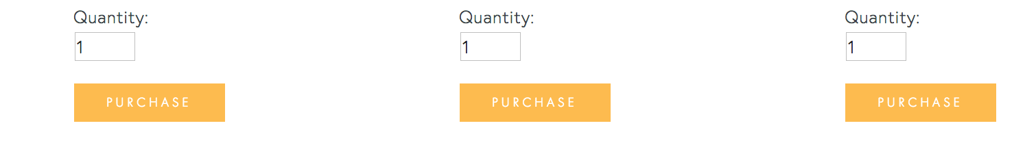
Same thing I repeated with the purchase buttons on my "Create a Website that Converts" Live Workshop page. You see the repetitive mango-yellow and they are all clickable.

Here's a screenshot of my top navigation. You can see that upon hovering over each option, the link color turns mango-yellow. And of course, the text logo on the upper-left and the button on the upper-right are both clickable and have mango-yellow to create a harmonious user-experience.
2. I reduced my top navigation to four tabs
I streamlined my top navigation with only four page choices: Portfolio, Blog, Work With Me and Live Workshops. All of them have interlaced purposes. I want my Portfolio to show that I can build Squarespace Websites so that folks will want to Work with Me. My Blog also helps to build credibility and demonstrate my expertise which leads folks to either work with me or join my Live Workshops. I am working on integrating my Portfolio within my Work with Me page so it will go down to three and make room for a value-giving lead magnet instead.
Below you can see my top navigation has only four options:

Right now, my footer navigation is a bit overcrowded. But I am on my way to fixing it and want to streamline it as well.
You will also see that there are no drop-downs. I find them a bit cumbersome and sometimes even counter-productive when they end up overlapping on top of other menu items.
Having fewer options to click makes it easier to for the viewer to make choices and move forward with interacting with your site. You can always put more details nested within the umbrella pages.
If you do need to have very distinct pages all at once in a at - glance view, have them in the footer in a neat and logical list. I encourage you to find more cleaner and streamlined ways to organize your pages. In the video I show some good example of orderly footers. I am taking my own advice and working on streamlining my footer navigation is on my task list!
3. I have a logical CTA on each page (as much as possible)
I made an effort to have calls to action (CTA) embedded on each page as much as possible. Each page of your site needs to graciously move the conversation forward. For example, once people have read your About page, what should they do next? After they have read your blog article, what's the next step. Ask this question when crafting each page of your site and you will create a natural flow to keep your visitor moving forward. Call-to-actions can be anything that makes the person click and helps them move forward in exploring your content and connecting with you. Some examples of CTA: Read more, Hire me, Check out the blog, Sign up to the newsletter.
My next goal is to bring a CTA above the fold. Above the fold essentially means, to the top part of your page on the screen, before you need to scroll down. I still have this to do on most of my pages. It is a work in progress - the work is always getting more and more refined over time!
4. I have a blog that is filled with useful content
This is really key to making your website conversion-friendly. Why? Because a blog helps you stand out, shows that you can help people solve a particular problem and builds trust. Whether its written content, audio podcast, video tutorial or a combination of it all, a blog is one of the most important things on your website. It makes people come back to your site repeatedly.
Your blog content sets you apart as an expert, an authority, as someone who knows what they are talking about. It is your digital content that serves as the window to your business. Create content. Create consistent content. That's key. Sean McCabe at the 2017 Craft and Commerce Conference said that as soon as we started writing daily, the income in his business sky rocketed. Take a look at this photo below of one of his slides where he points out how his revenue increased when he began writing daily. Here are some meaningful things I learnt from Sean McCabe in my blog post No. 025.

Consistent can mean different things to different people. Pick a frequency and keep at it. Weekly, twice a month or monthly - whatever it is Pick it and stick to it.
For over a year, I blogged weekly but burnt out and had a gap for a while. This didn't help my business.
Now I am back, with a stronger and better approach to creating content and so far I have been doing well with a new weekly publication - every Thursdays!
Want to receive my Thursday emails? You can sign up here.
So, yes, creating content is muy importante. Please consider putting up a blog if you don't have already and start publishing content. It would be a wise move on your part.
5. I personalized my about page:
I still come across sites where I see nothing about the creator or the human behind the website. People buy from people. We like to know who we are dealing with. People are always eager to find out who is this person behind this organization or behind this site. Add an about page.
And then don't be afraid to show your personal side. At least add one photo - and choose a photo that reflects the mood you want to project to your audience.
Ex. I chose a photo of me with a kitty - why? for two reasons. I love cats and that’s a huge part of my life - I have seven cats and my dream is to fund animal shelters in places that don’t have any. And two, my brand is about friendly expertise that I share with the main purpose of helping my readers.
That’s why the mango-yellow is a big part of my site branding. I did not choose a photo of me in a suit sitting behind a desk working on my computer. That’s not the image I want to give.
Also, you’ll see lots of trees and nature and landscape on my site - that’s part of a very intentional choice. I love nature but do spend 8 to 10 hours behind the screen. And so do my readers and my clients. I want to give them a chance to experience nature at least visually through my site. Nature also represents wisdom and quiet strength. And that is what I want to bring to my clients under all of the tech and the strategy, my goals is that with all that help people will be able to have a peaceful, thriving life where they act from compassion and wisdom. Not very common for a business that is so tech oriented but that’s a big part of me.
6. I added a location
This may not seem important but it is important. Every website should state where it is located. This helps people have an anchor in their minds. I often like to know where my clients are based or where they are if they are traveling.
My mind makes an invisible connection with that place and I know that’s where my client is. Otherwise people are just floating in the vast internet space and that is very unnerving for us earth-bound creatures. Don’t you think so?
Adding a location also adds character and personality to the site. If you are a business based in London or one that's based in Perth or one that is based in the deep forests of the Appalachain Range in North Carolina (that's me), you will each have a different vibe. It's important to bring that flavor.
I choose to not have cityscapes and gorgeous street art graffiti in my photo choices on my site because I live inside a national forest. I have wall-to-wall green, lush trees to look at - so I feel my site should emanate that vibe.
There you go. Now it's your turn!
These are just a few of the tweaks that I made on my website that has made it more conversion-friendly. My clients have found me because of the blogs that I have written and videos on YouTube that helped them solve a problem. And people are registering for my workshops. This is evidence to me that things are on the right track.
If you've got all these tweaks down and your site is working well for you, congrats.
But if not, and you want to transform your website into one that converts,
And learn those tips and strategies in an afternoon, then you are invited to my live workshop.
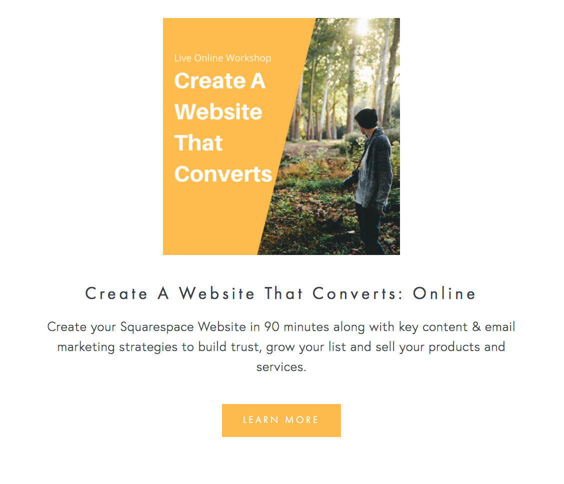
I'm hosting a live workshop, "Create a Website that Converts".
Get all the dates, details and registration info here.
Thanks for being here,
Sophia

