
Simplify Your Life &
Align with Your True North
Choose Your Path
-

Simplify
-

Introspect
-

Quotes
-

Inner-Voice
-

One-Person Business
-

Financial Freedom

060: Why is the Cart Icon Not Showing up in My Top Navigation?
After I design a website, my clients can still work with me by hiring me on an hourly basis. This blog+video is a direct result of a request my client had after I completed her site. I had created an e-commerce site for her that had a shop with multiple products. My client wanted to have the cart icon show up for her. But she found that to be not a simple click and activate situation. There was one more step to take care of.
If you are using any of the Brine Family of templates and have a product page but your cart icon is not showing up in Design and then Site Styles, then follow the simple step in this video to resolve it.
Why is the Cart Icon Not Showing up in My Top Navigation?
After I design a website, my clients can still work with me by hiring me on an hourly basis. This blog+video is a direct result of a request my client had after I completed her site. I had created an e-commerce site for her that had a shop with multiple products. My client wanted to have the cart icon show up for her. But she found that to be not a simple click and activate situation. There was one more step to take care of.
If you are using any of the Brine Family of templates and have a product page but your cart icon is not showing up in Design and then Site Styles, then follow the simple step in this video to resolve it.
1| Go to Commerce > Checkout
Uncheck “Express Checkout”.
2| Refresh page
You should now see the cart icon show up a) either in the navigation bar or b) as an option under Design> Site Styles> Header: Layout
3| Customize the icon or text
Change the color, size or type of icon as you like.

1| Go to your panel Commerce > Express Checkout. Then uncheck this option.
2| b) Click the drop down arrow and change from “Hide” to a position, for example “Top Right”.
Show us what you’ve created!
Again an easy 1-2-3 video. Let me know if you have other questions about this tutorial and I’d be happy to help!
Your Brand New Website!
Are you getting excited to get your own website? I love designing websites for fabulous people like yourself, so take action to get your website design process started —> Start the Conversation by sharing some ideas about your site with me and get a free 15 minute video consultation to discuss your website dreams.
Questions about this blog post? You can drop them in the comments below!
~Peace,
Sophia

059: How to Activate Cart Icon in Your Top Navigation in Squarespace
One of the benefits of a Squarespace site is the ease of the shop functionality. You can have your digital or physical products on sale or you can sell your 1 to 1 services, online workshops (like I do) or coaching sessions.
Now if you want to have a cart icon enabled in your navigation, this blog + video is for you. In this example, I am working with the Rally template but it applies to any template within Brine.
How to Activate Cart Icon in Your Top Navigation in Squarespace
One of the benefits of a Squarespace site is the ease of the shop functionality. You can have your digital or physical products on sale or you can sell your 1 to 1 services, courses (like I do) or coaching sessions.
Now if you want to have a cart icon enabled in your navigation, this blog + video is for you. In this example, I am working with the Rally template but it applies to any template within Brine.
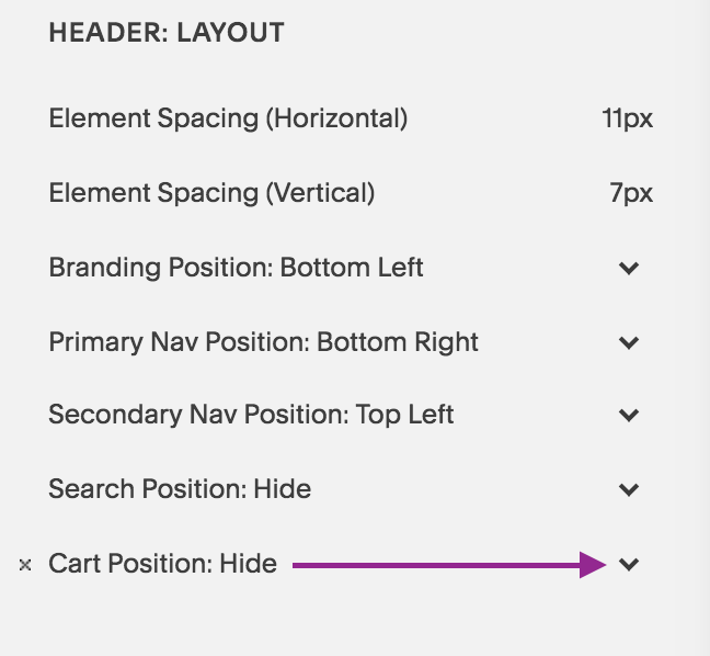
1| Go to Design > Site Styles
Hover over the top navigation and see if the Cart option shows up in the sidebar setting options. You will see under Header: Layout, Cart Position: Hide. Click on the drop down arrow and select the position you want it to show up. In my case, I chose Top Right.
If this option doesn’t show up, that means you need to create a product page with either digital, physical or services items.
Note: If you have a product page but still don’t see the cart option, then you need to disable “Express Checkout” in your Commerce> Check Out options. See how to do this in an upcoming video.

2| Go to Header: Cart
Under Header: Cart, you will see the options for customization show up. Choose from Text, Cart, Cart (alternative), Bag (alternative).
3| Choose Colors & Font to match your design

When you select “Cart”, you can customize these items: font size and style, color of the quantity and color of the quantity text.
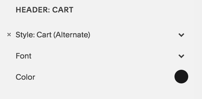
When you select “Cart Alternate”, you can customize these items: color of the cart icon, and the font size + type of the quantity text.

When you select “Bag”, you can change the color of the bag, and the font size + type of the quantity text.

When you select “Bag alternate”, you can change the color of the bag, and the font size + type of the quantity text.

When you select “Text”, you can change the font size and type and the color of font as well.
Show us what you’ve created!
That’s it, my dear friend! It really is as easy as 1-2-3! I love seeing what you create so hop on down to the comments and show me what you’ve created!
Your Brand New Website!
Are you getting excited to get your own website? I love designing websites for fabulous people like yourself, so take action to get your website design process started —> Start the Conversation by sharing some ideas about your site with me and get a free 15 minute video consultation to discuss your website dreams.
Questions about this blog post? You can drop them in the comments below!
~Peace,
Sophia

058: How to Create Double Top Navigation Layout in Squarespace
A double top navigation layout is a great way to separate out your links on the top of your site. This way you can create a visual distinction among your links and space out the links reducing navigation clutter. Watch the video below or follow the steps in the blog to create that look for your site on Squarespace.
How to Create Double Top Navigation Layout in Squarespace
Some links in your top navigation are important but you may not want them to take prime real estate. You may want them to take a secondary position but still stay easily found by your visitors.
How to create such a layout? Enter: the navigation bar above the top navigation.
A double top navigation layout is a great way to separate out your links on the top of your site. This way you can create a visual distinction among your links and space out the links reducing navigation clutter. Watch the video below or follow the steps in the blog to create that look for your site on Squarespace.
1| Go to Design > Site Styles
Hover over the Secondary Navigation to pull up relevant settings. Under Header: Layout, look for “Secondary Nav Position”. Click to choose “Top Left”. This will create its own bar on the top.
2| Primary Nav Position: Bottom Right
Also under Header: Layout, look for “Primary Nav Position”. Select “Bottom Right”.
3| Reduce Padding
Under Header Bottom: reduce the padding to get the right spacing between the new top bar and the Site Title
4| Change color of the White Bar
Click on the white bar. The settings for Header:Top will now show up on in the sidebar panel. Under Background, select the color you want the bar to have.
5| Hit Save 6| Refresh the Page & you are done!

Show us what you’ve created!
That’s it, my dear friends! I hope you will try this layout effect for your site. If you do, I’d love to see it. Drop a link to your page in the comments and share what you’ve created!
Your Brand New Website!
Are you getting excited to get your own website? I love designing websites for fabulous people like yourself, so take action to get your website design process started —> Start the Conversation by sharing some ideas about your site with me and get a free 15 minute video consultation to discuss your website dreams.
Questions about this blog post? You can drop them in the comments below!
~Peace,
Sophia

057: How to Change the Background Color of an Index Section
Are you ready for a little CSS fun? There’s a lot you can do with Squarespace websites and one of them is tweaking the design to create your own customized look - a look away from the templates that Squarespace offers. Today, I am showing you how you can change up the background color of a page or section in your Index collection of pages.
Are you ready for a little CSS fun? There’s a lot you can do with Squarespace websites and one of them is tweaking the design to create your own customized look - a look away from the templates that Squarespace offers. Today, I am showing you how you can change up the background color of a page or section in your Index collection of pages.
Have a look at this super quick video (less than 5 minutes) to see how it is done.
1| Identify the URL Slug of the section
As you will see in the video, the Navigation Title and the URL Slug of your page/section may not be the same. So you first need to collect the URL slug of the page you are targeting.
Notice that I will use the word “page” and “section” interchangeable as both apply in this situation. An Index is a collection of pages. Each page is called a section.
To find the URL slug, click on the wheel icon that is next to the Page you are targeting. Then look for the URL Slug and either copy it or memorize it.
Try and memorize it to train your memory skills - well that’s what I tell myself at least. You can always go back and check if you missed something and you will know that latest when the CSS code doesn’t apply to your section. That’s because the Code never lies! Okay, I am in a funny mood as I prepare this blog (I hope you don’t mind).

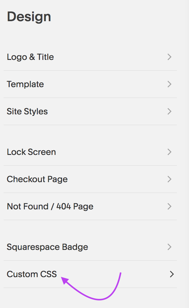
2| Go over to Design Panel
Armed with your URL slug, you will jump into your Design Panel. Instead of heading to Site Styles, go all the way to the bottom and click on Custom CSS. That’s where the magic instructions will be placed!
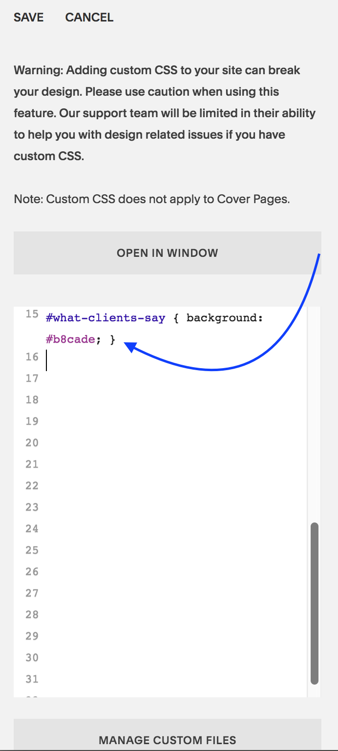
3| Enter the CSS code
Now you are ready to enter the CSS code which should look like this:
#what-clients-say { background: #b8cade;}
Here’s a quick breakdown. Everything after the colon ”:” is what you will be doing. I keep mixing colons : and semi colons ; as you will see in the video. I certainly hope my 8th grade English Teacher doesn’t find out! Hihi!
Enter: #
Next write the URL Slug: what-clients-say
Then open bracket: {
Then write: background
Add a colo: :
Write the hexcode of the color: #b8cade
Add in semi colon: ;
Close bracket: }
Click: Save
Refresh page to see the magic happen!
That’s it, my dear friends! I hope this quick fix pikes your interest in Custom CSS as it really is so so cool!
Squarespace always alerts its users that using Custom CSS code could “break” their website. That’s to be on the safe side. So, I too, am alerting you: Using Custom CSS can break your website. Use it only if you know how to employ the code correctly.
Al’right, that’s enough for disclaimers and such.
Show us what you’ve created!
Changed the background of a section of your Index? I want to see! I want to see! Drop a link to your page in the comments and share what you’ve created!
Your Brand New Website!
Are you getting excited to get your own website? I love designing websites for fabulous people like yourself, so take action to get your website design process started —> Start the Conversation by sharing some ideas about your site with me and get a free 15 minute video consultation to discuss your website dreams.
Questions about this blog post? You can drop them in the comments below!
~Peace,
Sophia

056: Squarespace Pricing Comparison: Which plan is right for your business?
Hopefully, you are convinced that Squarespace is the right platform for you and now you want to figure out which plan is right for you. Or may be you are still undecided and understanding the Squarespace pricing plans is the last bit you need to make an informed decision. In either case, this blog article is exactly what you need as I walk you through the different plans and show you how they differ from each other so you can make your decision quickly and easily.
Hopefully, you are convinced that Squarespace is the right platform for you and now you want to figure out which plan is right for you. Or may be you are still undecided and understanding the Squarespace pricing plans is the last bit you need to make an informed decision. In either case, this blog article is exactly what you need as I walk you through the different plans and show you how they differ from each other.
Note: This info is subject to change - so get the latest info on Squarespace pricing from their website.
Squarespace Pricing Plans
Here’s a run down of the 4 pricing plans and tips on how to decide if it’s right for you.
1| 4 Pricing Tiers
As of Feb 6th, 2018, Squarespace has 4 pricing tiers ordered within two categories: Websites and Online Stores.
Under Websites, there are two tiers:
Personal
Business
Under Online Stores, there are two tiers:
Basic
Advanced
It can be confusing how these 4 tiers are classified. So read the points carefully below and you will be able to choose the right one for your business in no time.
2| Each plan builds upon the former.
As you go up in the pricing tier, you get all the features that a lower priced tier includes. It is not always this logical in all business offers where sometimes a higher tier may omit something from a lower one and have something of greater value instead. That’s why it’s worth a mention here.
There’s a pricing hierarchy and so a plan always includes everything from the plan right below it. Personal plan is the lowest priced tier and it goes up all the way to Advanced. This visual makes it easy to see that:

3| Here’s what’s included in each plan
On the Squarespace Pricing page, you will see these 4 plans laid out in detail. I’ve made an at-a-glance visual that shows you all the features
For a larger view of this graphic, click on the image to see the details better.
4| Which plan to choose?
As you go about choosing your plan, the decision on which of the two categories to choose will depend on whether you plan to sell (receive money) on your site. If so, how much do you expect to sell in the first stages of your business. This will directly influence the category and the tier you choose.
Tier 1: Personal Plan (Website)
This is ideal for a solopreneur, artist or a small business or essentially anyone who wants to build a smaller site. This one is also good for those who simply want a online business card, meaning the most important info about their business is presented online without much changing content (although you can make updates anytime). It limits contributor access to 2 people only. (Contributors are anyone who would be accessing the back end of your site).
You can display a photo gallery, set up a blog page and have as many as 1000 pages that are mobile optimized. So for most use cases of a small business, this plan works well. But as soon as you want to sell an item (physical or digital), grow your portfolio of things to sell or collect payment for services rendered, you will need to move up to the next level.
Note: Some bloggers still have posts that say you can sell products on the Personal plan. This is now only possible on what is called a Legacy Personal Plan - the plan you had before Squarespace updated its pricing offers. What you see in this post is up-to-date info as of Feb 6th, 2019 but keep in mind this info can change as Squarespace may change their pricing at anytime. Whenever I make updates on the pricing, I will make a note using an *asterisk.
Pros of the Personal Plan
+ unlimited pages (1000 max)
+ free custom domain 1st year w/annual purchase
+ SSL Security
+ website analytics
+ 2 contributors
+ mobile optimized website
Cons of the Personal Plan:
- cannot sell products/services
- cannot add more than 2 admin contributors
- limited website analytics
Personal Plan Price:
If you purchase it month to month: $16/month
If you purchase an annual plan: $12/month
Total Annual cost: $144 to $192 per year
*Squarespace Authorized Trainers can pass on a 20% discount code to their clients. (I am one of them and my clients and workshop participants benefit from that discount). Plus, remember that you get a free custom domain for the 1st year when you purchase the annual plan - saving you around $20.
Tip: The Personal Website plan of Squarespace is great for small businesses, artists, individuals who want an online presence to showcase their skills, portfolio, writings and service descriptions. Those who want to receive payment for the goods and services online will need to skip this tier and look at the remaining three tiers.

Tier 2: Business Plan (Website)
The Business plan has a bit more of the bells and whistles that will take your business website a long way. You get everything in the Personal Plan and can start selling products, have an integrated business email (GSuite $50/yr), have an announcement bar on top of your site to draw attention to new happenings on your site, and can do third party integrations.
However, you do have a 3% transaction fee for each product/service sold. This is fine if you are only selling a few products a month. But as soon as you are selling boatloads, you will need to consider the next two tiers (e-commerce tiers of Basic and Advanced). On the Basic and Advanced, you will pay a higher monthly amount but will skip the per product transaction fees which is great.
Pros of the Business Plan
+ unlimited pages (1000 max)
+ free custom domain 1st year
+ SSL Security
+ advanced website analytics
+ unlimited contributors
+ mobile optimized website
+ professional email from Google
+ $100 Google Ads Credit
+ promotional pop-ups
+ fully integrated pop-ups
+ unlimited products & accept donations
+ mobile information bar
+ announcement bar
+ premium blocks and integrations
+ CSS and Javascript customization
Cons of the Business Plan
- 3% transaction fee per sale (Not really a ‘con” because this allows you to pay a lower monthly plan fee. Makes sense if the sales start off slow in the first few months. You can upgrade to the next tier anytime).
- doesn’t have the pros of the Basic and Advanced Plans (see below)
Business Plan Price:
If you purchase it month to month: $26/month
If you purchase an annual plan: $18/month
Total Annual cost: $216 to $312 per year*
*Squarespace Authorized Trainers can pass on a 20% discount code to their clients. (I am one of them and my clients benefit from that discount). Plus, remember that you get a free custom domain for the 1st year when you purchase the annual plan - saving you around $20.
3| Tier 3: Basic (Online Store)
This is the tier where no transaction fees comes in. For a few more bucks per month than the Business plan, the Basic plan lets you sell unlimited products/services without a transaction fees added on top of the fees from the payment processor such as Stripe or Paypal. You also get powerful commerce metrics to track your sales and inventory. And other e-commerce related features such as label printing, track inventory, add tax and coupons and sell products on Instagram.
This is a good online store tier for the perfect Goldilocks situation. Not as small as the Business Plan and not as big as the Advanced Plan. Just right! ;)
Pros of the Basic Plan
+ everything from the Business Plan
+ no transaction fees
+ unlimited products
+ mobile optimized website and checkout
+ powerful commerce metrics
+ inventory, orders, tax, coupons
+ label printing via ShipStation
+ integrated accounting via Xero
+ Checkout on your domain
+ customer accounts
+ products on Instagram
Cons of the Basic Plan
- doesn’t have the pros of the Advanced Plan (therefore it is a bit lower in the price).
Basic Plan Price:
If you purchase it month to month: $30/month
If you purchase an annual plan: $26/month
Total Annual cost: $312 to $360 per year*
*Squarespace Authorized Trainers can pass on a 20% discount code to their clients. (I am one of them and my clients benefit from that discount). Plus, remember that you get a free custom domain for the 1st year when you purchase the annual plan - saving you around $20.
4| Tier 4: Advanced (Online Store)
This is a full-fledged online store feature all the bells and whistles that Squarespace has to offer. You have more backend commerce features that make sense when you have a large shop selling a lot of items. You can also add gift cards and offer flexible discounts. And of course, no transaction fees - this really adds up with a large ecommerce shop.
Pros of the Advanced Plan
+ everything from the Basic plan
+ no transaction fees (like in the Basic plan)
+ abandoned cart auto-recovery
+ advanced shipping
+ flexible discounts
+ gift cards
+ orders API
Cons of the Advanced Plan
- a higher pricing tier than Basic (but no transaction fees and more advanced ecommerce management backend.
Advanced Plan Price:
If you purchase it month to month: $46/month
If you purchase an annual plan: $40/month
Total Annual cost: $480 to $552 per year*
*Squarespace Authorized Trainers can pass on a 20% discount code to their clients. (I am one of them and my clients benefit from that discount). Plus, remember that you get a free custom domain for the 1st year when you purchase the annual plan - saving you around $20.
5| Is hosting extra or included?
Website hosting is included with all Squarespace plans. This is great because you save time. You don’t have to shop around for the best hosting offers. And you don’t have to invest time in setting that aspect of your site nor will you have to invest money in a website designer to get that taken care for you.
This saves you anywhere between $5 to $30 or more per month depending on the needs of your business, the bandwith used and offers from the hosting companies. That’s between $60-$360 you save by going with Squarespace because they include hosting in their pricing already. Plus, no extra technical set up is needed.
6| Is a domain name included or extra?
I am super excited about the fact that you can purchase a domain name (your website url eg: sophiaojha.com) directly from inside the Squarespace dashboard. No more domain registration, IP address or nameserver updating! It really is just one click.
That will cost $20 per year for the domain and you can set it on auto-renew that way no need to worry about your domain name expiring and someone grabbing it. (This actually happened to a business owner friend of mine and so this is a real problem. He forgot to renew his domain name by just a day and already someone had purchased it and wanted to sell it back to him for a hefty amount).
+ Plus, you save around $20 for your domain in the first year because when you purchase an annual plan. So your domain name for the first year is free!
+ Also, you don’t have to worry about your domain name expiring because you can have Squarespace auto renew your domain each year automatically. You will just need to set the auto-renewal in the backend correctly (it is just a checkbox).
Tip: If you want multiple domains to point to the same site, for example: you want both sophiaojha.com and Highcountrywebsites.com to go to the same website, then you can do that too with great ease. All you have to do is to select which domain will be primary one.
So there you have it - all the details around the pricing plan on Squarespace. Remember you can always switch from one plan to another at anytime. You will find that a plan above Personal is most suitable for a business that sells products or gets paid for their services online. If you want a digital portfolio or an online resume (with no selling involved) and if you will not be collecting any emails, than a Personal Plan will be perfect for you.
Are you getting excited to get your own website? I love designing websites for fabulous people like yourself, so take action to get your website design process started —> Start the Conversation by sharing some ideas about your site with me.
Questions about Squarespace’s Pricing Tiers? You can always jump over to Squarespace and their excellent customer service team to clarify any of your questions. Plus, you can drop them in the comments below!
~Peace,
Sophia
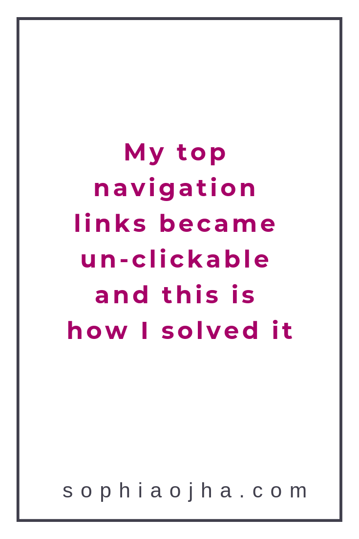
055: My top navigation links became un-clickable and this is how I solved it
I hope that you never run into the problem that recently rendered my top navigation links of my website un-clickable. It was a glitch that completely took me by surprise and even the Squarespace support could not solve it.
But after looking throughly at how I had things set up, I figured it out and fixed it. And today, I want to share it with you. I want to share it with you so that you can learn from this mishap and even if you never experience this particular problem, you will know how to think about solving your website problems on Squarespace.
How to Troubleshoot Glitches on Your Squarespace Website
I hope that you never run into the problem that recently rendered my top navigation links of my website un-clickable. It was a glitch that completely took me by surprise and even the Squarespace support could not solve it.
But after looking throughly at how I had things set up, I figured it out and fixed it. And today, I want to share it with you. I want to share it with you so that you can learn from this mishap and even if you never experience this particular problem, you will know how to think about solving your website problems on Squarespace.
Watch the video below to see the top navigation acting up and how I fixed it.

The Mysterious Problem: Top navigation links were un-clickable

So a couple weeks ago, I was updating my site with a new blog post and realized that the top navigation pages were functioning in a weird manner. When I hovered over each of them (see video as I recorded how it was acting) it was not clickable. I needed to hover slightly above or slightly below the links and then it would work. The interesting thing was that the secondary navigation page (Workshop in yellow button) was working fine.
I won’t go into the whole process of how I figured it out (the process included confusion, frustration, impatience, slight panic and removing every bit of code I had on my site to find out where the glitch was rooted).
But I must give appreciation to one of my Squarespace Authorized Trainer colleagues who pointed out that the secondary navigation was overlapping the primary navigation pages. He suggested some code to fix it, if all else failed.
I didn’t want to have to use code to fix a problem that shouldn’t have been there in the first place. I want to use code in scenarios where I want to create an effect to add to the visual aesthetic of the site or correct how something looks on mobile. However, the top navigation links should work by themselves!!
Well, I noted my colleague’s point carefully and kept his suggestion in mind as a last resort.
What You See Is What You Get?
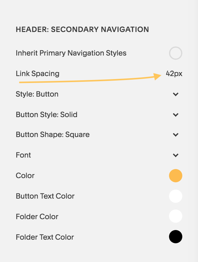
To cut to the chase, I found out that my settings in the Site Style panel were affecting how my navigation links were working. It was the Link Spacing under HEADER: SECONDARY NAVIGATION that was at a crazy high number. As soon as I reduced the number down to 42, everything went back to normal!
So, it turns out that when adjusting the Site Style settings, I had played around with the Link Spacing. But I didn’t see any change visually right away and so I simply moved on. I did that because Squarespace is a WYSIWYG website builder. What this means is: What You See Is What You Get and any changes I make from Site Styles panel is usually visible right away. But for some reason, it was not working like that in this case.
This goes to show that What You See Is NOT ALWAYS What You Get!
The Solution: Looking carefully at Site Styles Panel
Sometimes, glitches like this can happen. And the remedy is to take a deep breath, go back to your settings and see which element is not showing a change and know that sometimes even when you don’t see a change in your Site Content Area while adjusting things in the Site Styles panel, things are actually happening. (Watch the quick video to see all of this demonstrated).
Well, my friends, I hope that you will take this message with you when designing your website on Squarespace. In the rare case you run into an issue like this, look at the Site Styles panel more carefully.
Let me know in the comments your thoughts on this and if you’ve run into an issue that doesn’t make sense. I’d be happy to have a conversation and guide you in the right direction.
Squarespace is a real fun platform to host your site on. And I love designing websites for fabulous people like yourself, so take action to get your website design process started —> Start the Conversation by sharing some ideas about your site with me.
Remember to drop your comments in the comments section below!
~Peace,
Sophia

054: Ten tools (free) for choosing your website color scheme
Did you know that 90% of an assessment for trying out a product is based on color alone? This data is according to Buffer and it’s one more reason why the color palette of your website holds über-importance.
That’s also one of the toughest decisions for me when building a website. Selecting the right combination of colors that will go on a website is essential for attracting the target audience of my client’s business.
The color palette should not only reflect the style, voice and values of my client’s business but it should also have a visual aesthetic that is attractive to the audience that my client wants to serve and speak with.
It’s not easy but I want to help to make this part of the website design process easier for you - with my favorite 10 tools.
Whether you are building your website from scratch or even tweaking it to fit a renewed focus or expansion of your business, these 10 tools will be of help. They have helped me at different stages of my web site design creation process. I’ve bookmarked them and they all open up in a new window when I am ready to work on a new website.
Ten tools (free) I use for creating a color palette
or a mood board for my client’s websites
1| Start with some inspiration
This blog on Canva comes in handy when you are just starting to brainstorm. When my clients send me info about their business and a selection of photographs, I already have made notes on the mood, the voice and the style the website should reflect. This blog gets my creative juices flowing as I am very visual and I find that looking at 50 curated websites based on style (ex. fun and professional or modern and clean or enon tones and sharp contrast), is quite helpful.
Blog: https://www.canva.com/learn/website-color-schemes/

Source: Canva.com
2| Play With the Color Wheel
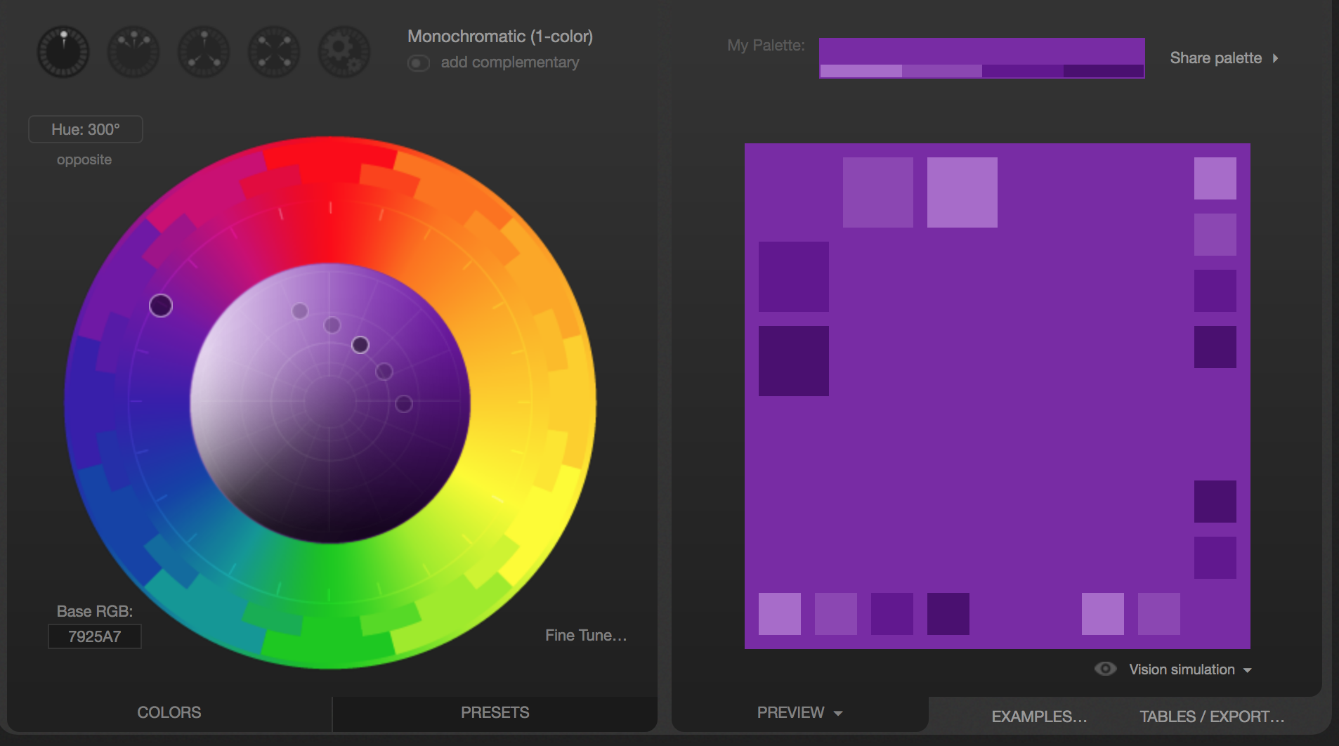
After getting some ideas from Canva’s blog (point 1 of this blog), I jump over to Adobe Color Wheel Tool. First of all, it’s so much fun. But best of all, I can start with one hexcode (one color) and then see several combinations suggested by the tool. I can see Analagous, Monochromatic and so on (see image on the right).
Interactive Tool: https://color.adobe.com/create/color-wheel

3| Get Color Combos from Paletton
Now there’s yet another free tool that I may jump over to play around with my first round of selected colors. This one is also fun and if nothing, you get a nice color therapy just looking at the color wheel ;-)
Interactive Tool: http://paletton.com
Source: http://paletton.com
4| See Your Colors in Action
By now, I have selected my first draft of three or four colors for the website. Now I jump over to design inspiration.net to see how others have used it. Again, I like to see visually what has been done with my color selections to see if the look and feel is right
The cool thing about this tool is that you can plug in several of your colors (hexcode) and see what kind of creative things people have made. You will see everything from posters to photographs - there’s a lot to get inspired by.
Interactive Tool: https://www.designspiration.net/
Source: https://www.designspiration.net/
5| Ooh! Let the Fun Begin With this Color Palette Generator
This by far is my most favorite tool. And if you are a photographer or your site will be very image heavy, this tool might be your very best friend when it comes to selecting colors. Watch the video to see this more precisely but all you do is drop your photo and this generator will spit out 5 colors selected from the photo. I think this one has the most fun-factor, at least for me!
Interactive Tool: https://www.canva.com/color-palette/

Source: Canva.com
Notice that each of these tools and resources serve a different facet of the color palette creation process. One may be for picking hues that complement each other, while another tool will convert your rgb data into a hexcode. So they are all essential in your website building toolbox. Watch the video where I am more specific about these.
6| Change RGB to HEX Code and more
This tool is one of the earliest tools I ran into back in 2014-2015. You will see in your Squarespace backend that there are tons of colors that show up in different color models such as rgba or hsl. This interactive tool is very handy because you can copy that rgb (168,138,212) from the Site Styles panel of your website. Then drop it into the site and color-hex.com will shoot a page out with not only the Hex code (ex: #A88AD4) but also give you a host of other resources - such as hues, tints, analogous colors, triadic colors and so on. So go take a look.
Interactive Tool: https://www.color-hex.com/
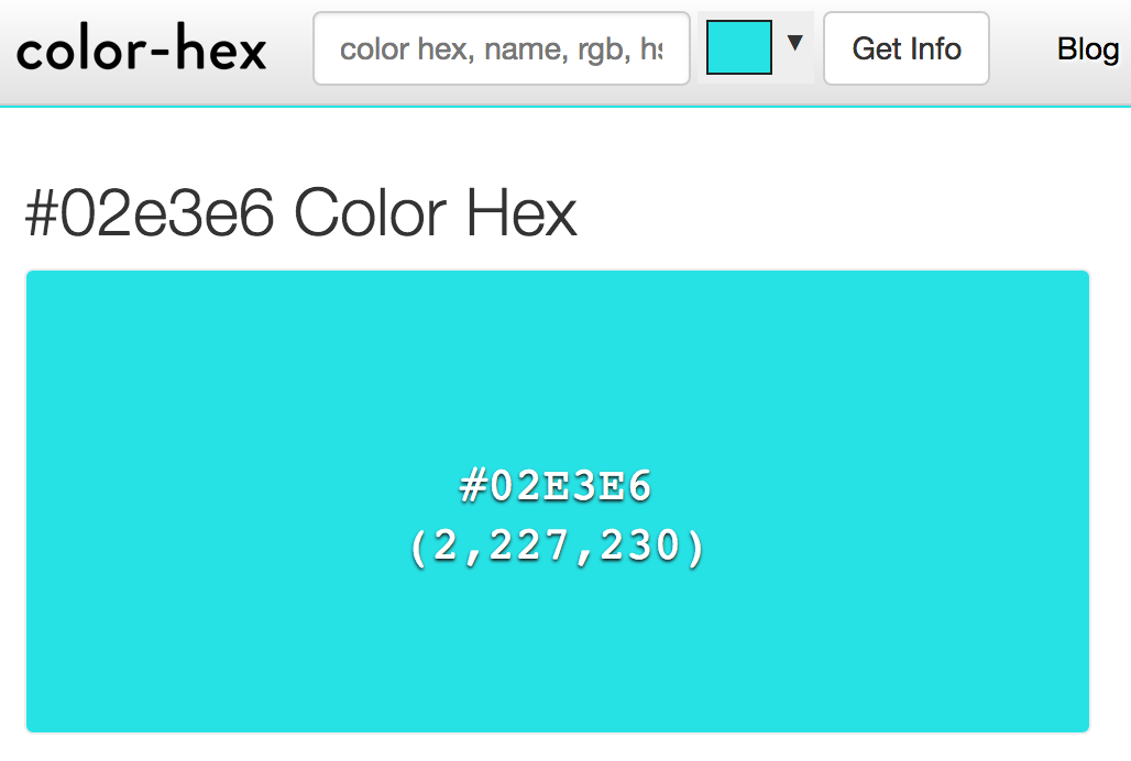
Source: Color-Hex.com
7| Use This Tool to Convert a Hex Code
This tool makes it easy to convert a hexcode into different color models such as RGB, HSL and CMYK. This may especially be relevant if you are working with printers and graphic designers.
Interactive Tool: http://www.convertacolor.com/
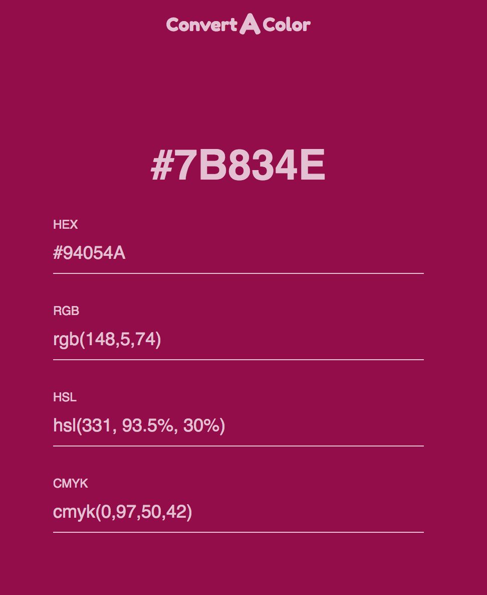
Source: Convertacolor.com
8| Pick A Color You Like Straight From A Website
This one is a real help. It’s not an interactive tool like the others. Instead it is a Google Chrome extension and once you install it, it sits on your toolbar ready to work with a just a click. When I see a website with a color scheme that I really like, I use my color picker to learn what these are. This is very good for learning from other designers, especially my esteemed colleagues who are also Squarespace Web Designer or Authorized Trainers.
Interactive Tool: http://www.colorzilla.com/

Source: Colorzilla.com
9| Another Fun Tool To Choose Colors for Your Palette
This is a fairly new tool that I have only known for a few weeks now. This tool has two features I like. 1. When you use the “Generate” feature, you can select a color, lock it and then hit spacebar to see other color combinations suggested. 2. You can go to the “Explore” section, plug in the hex code of let’s say the main color in your palette and then the app will show you color palettes that contain that color. I haven’t had used the “Explore” feature much but it’s worth a try.
Interactive Tool: https://coolors.co/
Source: Coolors.co
10| Time To Create The Moodboard
A moodboard is a collection of images, colors and fonts that designers put together for their clients as they begin their website design process. It give a quick snapshot of how the design style that the site will evoke.
If you are building a site for yourself, you may be tempted to skip this step. But there are at least two reasons why this will come in very handy. 1. When you are designing complementary design materials such as a business card, brochure, or social media graphics. 2. When you are working with a graphic designer, marketing team or redesigning your site with a web designer. In both scenarios, having a moodboard handy will help speed up and make thing easier for yourself and whoever you are collaborating with.
ProTip: If you are getting your site designed by a web design professional, make sure to get the moodboard file (PDF, .jpeg or .png) as one of the deliverables from your designer. (This could be during or at the end of the web design creation process - based on the style of your designer).
Interactive Tool: https://www.sophiaojha.com/canva (affiliate link)

Source: Moodboard I created on Canva.com for a recent client. This is a screenshot of my Canva account.
Bonus Tool: ColourCode by Toptal
This is a tool that I had fun checking out as the colors change based on the position of your cursor. It’s by a firm called Toptal and is a completely FREE, web-based color design tool. It’s an all-in-one color design tool where you can find different palette categories (analogic, triad, quad, etc.), multiple conversion colors, and even download your custom palette.
Interactive Tool: https://www.toptal.com/designers/colourcode

Are you getting excited to get your own website? I love designing websites for fabulous people like yourself, so take action to get your website design process started —> Start the Conversation by sharing some ideas about your site with me.
Each week, in my blog, in my free live trainings or in my video tutorials, I show you more things you can do on your Squarespace website without spending an extra dollar. So sign up to my weekly emails that I send out on Thursday mornings so you are always be informed when the next blog/video tutorial or free live training is coming out. Just go on over to —> Squarespace Tips and sign up!
Questions about this blog post? You can drop them in the comments below!
~Peace,
Sophia

053: How to build a landing page on Squarespace for a "survey"
Last week, I talked about the one thing you absolutely must do to understand your audience. And that’s asking them what their challenges are. In blog post 052, I outlined the six things I did to make it easier for my audience to respond to my One question aka “survey” that includs creating a landing page and setting up a form on that landing page on my Squarespace website. Today, I will show you the step-by-step on how to technically set all that up on your Squarespace website.
Last week, I talked about the one thing you absolutely must do to understand your audience. And that’s asking them what their challenges are. In blog post 052, I outlined the six things I did to make it easier for my audience to respond to my One question aka “survey” that includs creating a landing page and setting up a form on that landing page on my Squarespace website. Today, I will show you the step-by-step on how to technically set all that up on your Squarespace website.
Watch the video tutorial in which I walk you through all the steps:
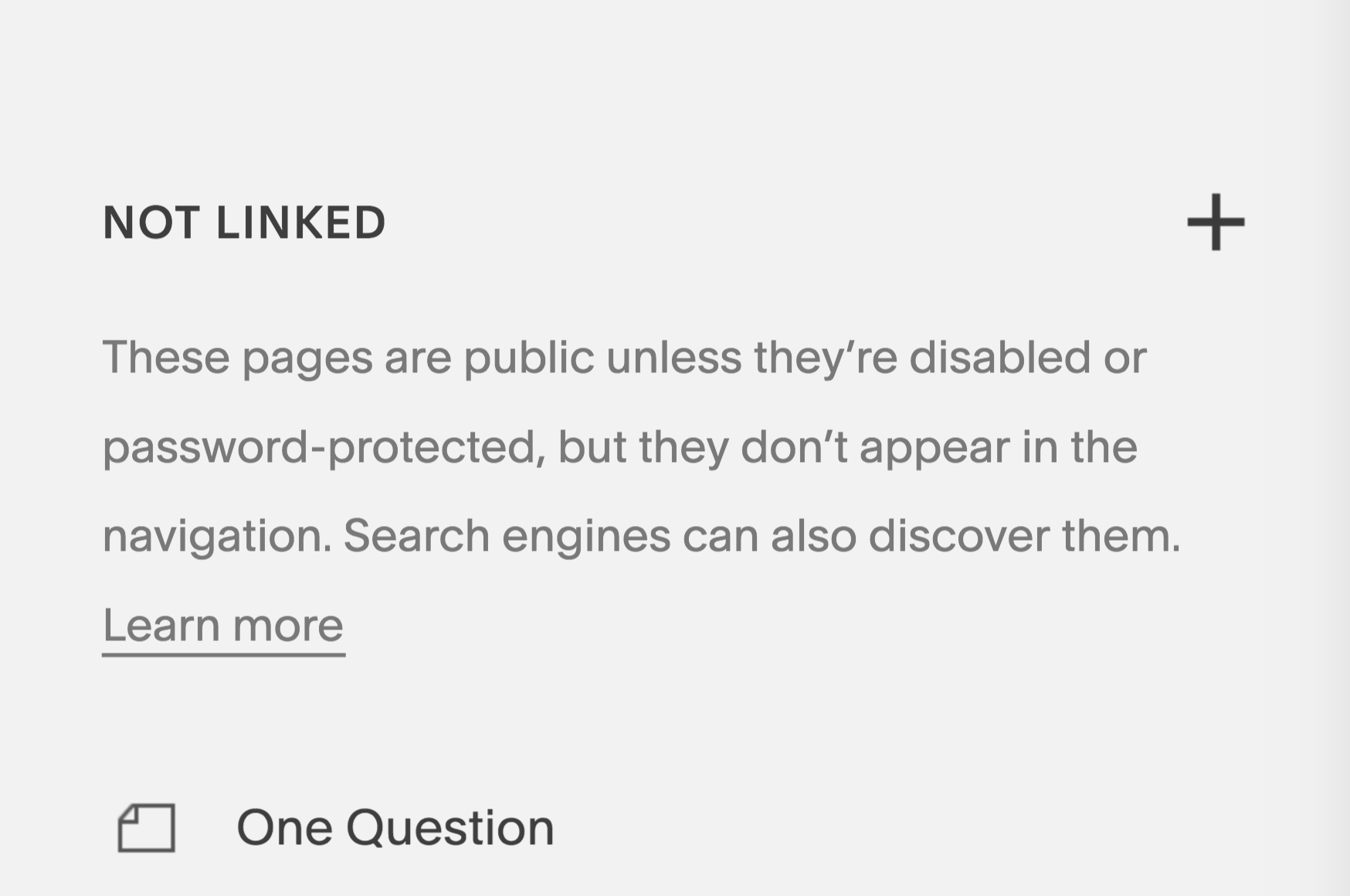
1| Create a page under the “Not-Linked” section.
Go to your Squarespace backend and to the Pages panel. Go to the Not Linked section. Click the + sign. Create a new page.
Make sure you give it a good URL. I like to use: /oneq
The reason you are putting this in your not linked section is so that the page is not crowding your top navigation or your footer navigation. The page will still be live and visible to anyone who has the link to that page. But it is not navigatable (is that a word? If not, it should be ;) from your home page. It is not linked but a live page.
2| Add a banner image and a headline to the banner section
2.1 Click the wheel of your newly created page.

2.2 Click Media and then upload the banner to the blog as shown in the image to the right.

2.3 Now add the text to the banner section.
Click the sideways teardrop for the line to appear and then pick the text content block and start typing.
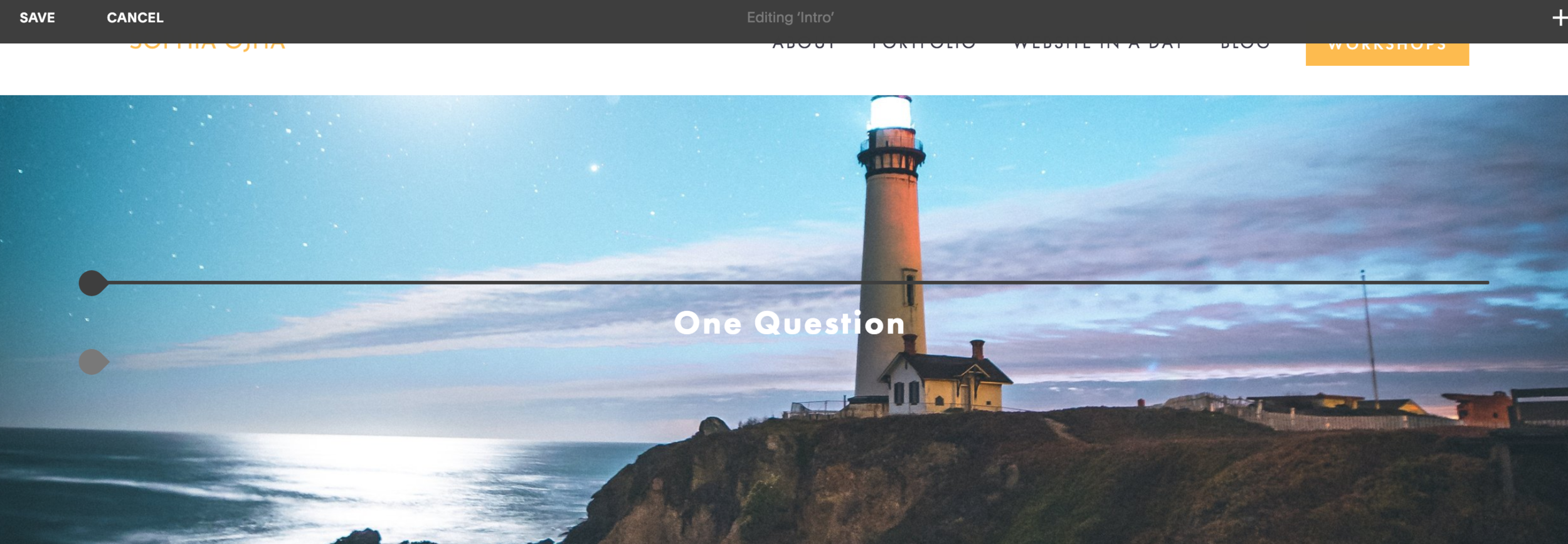
3| Create an intro text with a headline
This is how it looks when you’ve got the text entered —>

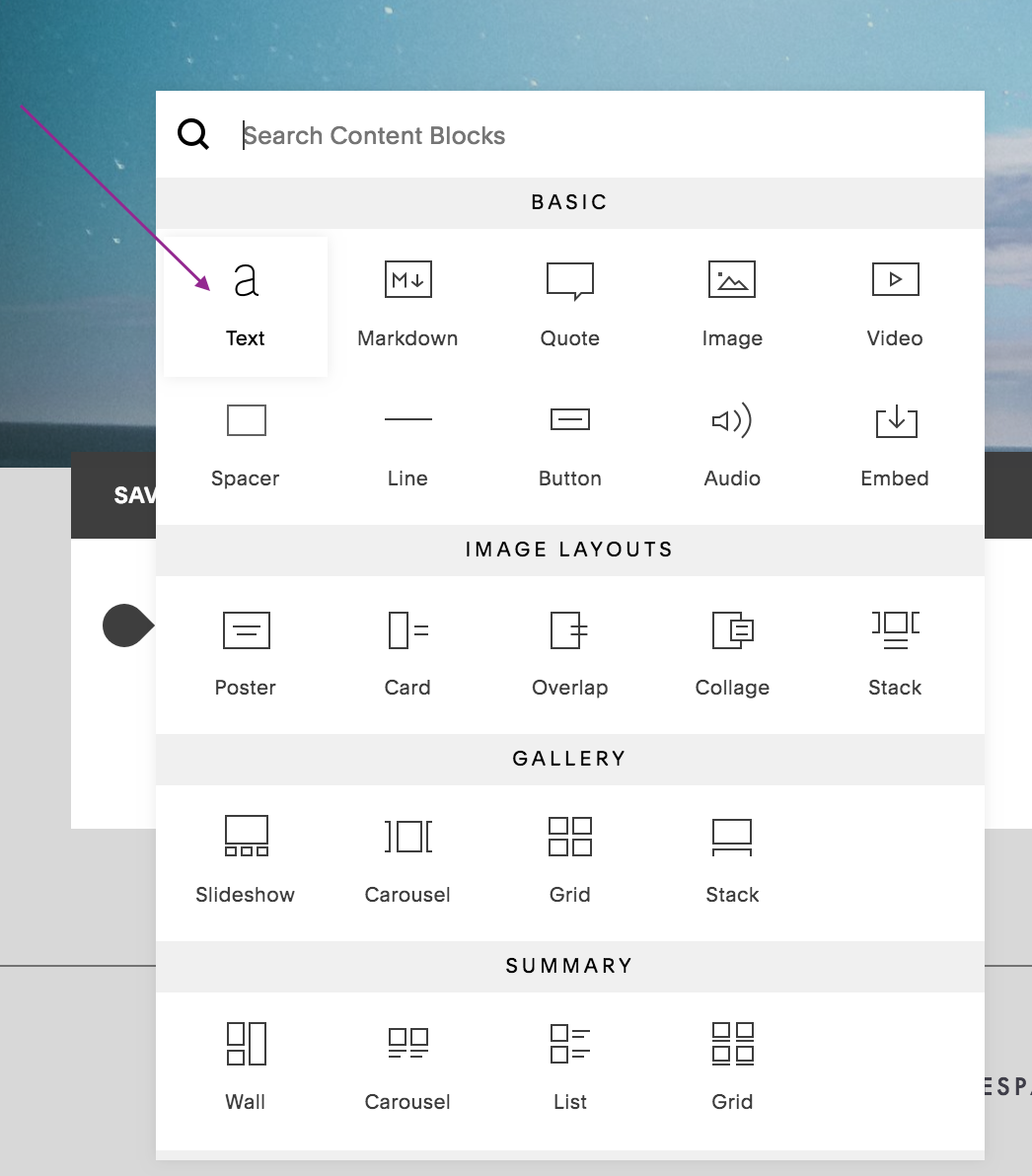
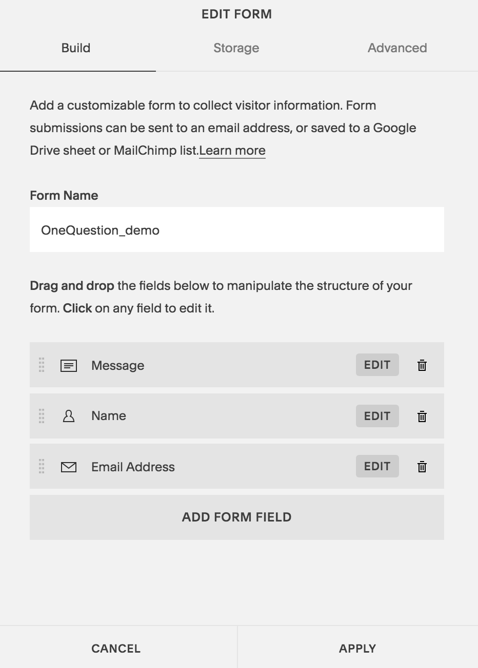
4| Create a form that has your one question
First, select the form block:

Move the Message section to the top, make sure name and email address input fields are there. You can make the Name field optional if you like. (I like to do that to give anonymity to my readers and thus, removing a barrier for them, if it is a barrier!).
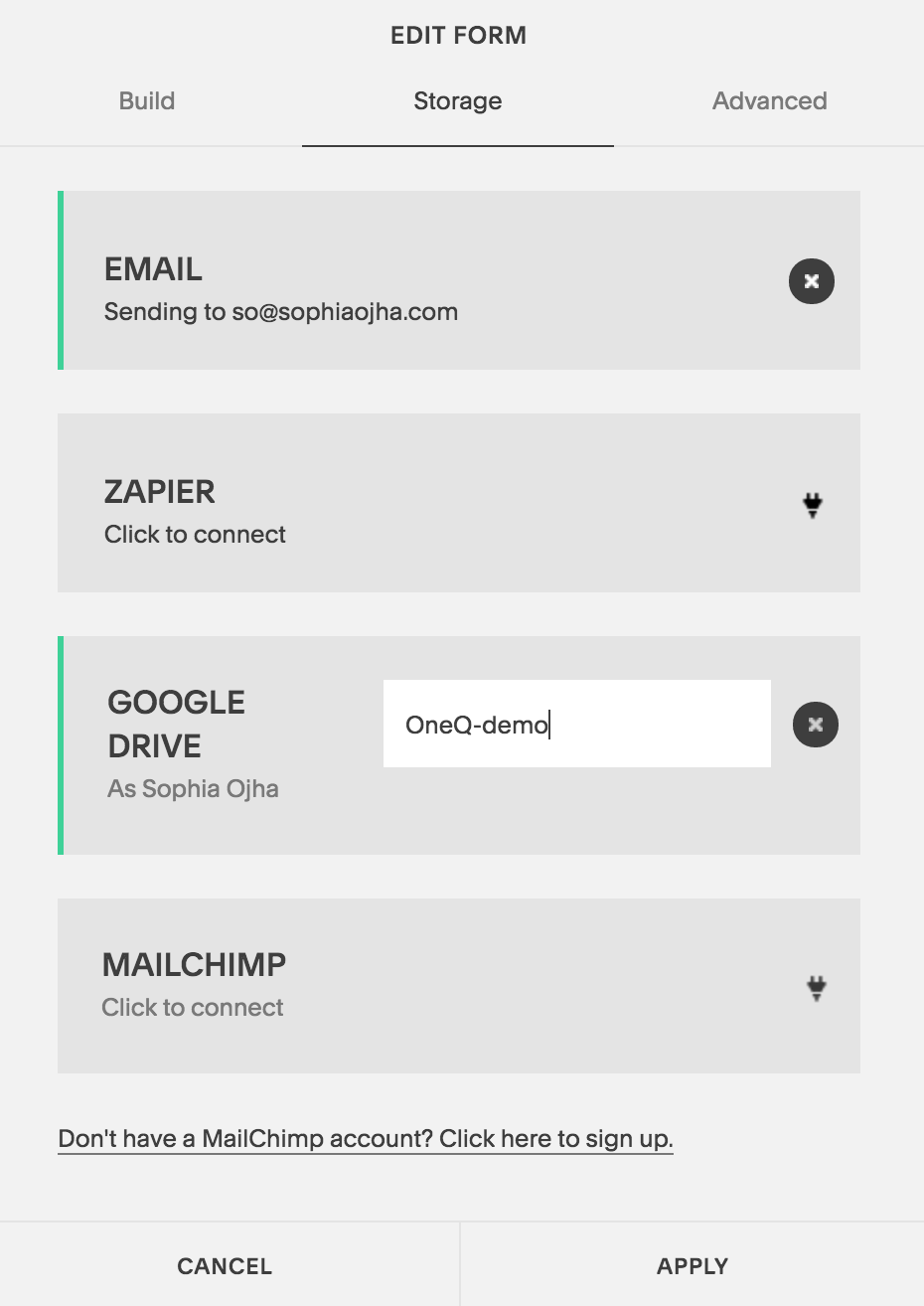
5| Connect it to your Spreadsheet in Google Drive and your email
6| Make it a button (This is a cool trick - so easy but I see it used so infrequently).
Basically, you make sure to check off the Enable Lightbox Mode. And then add a text under “Open Button Label”. This will turn your form into a clickable button.
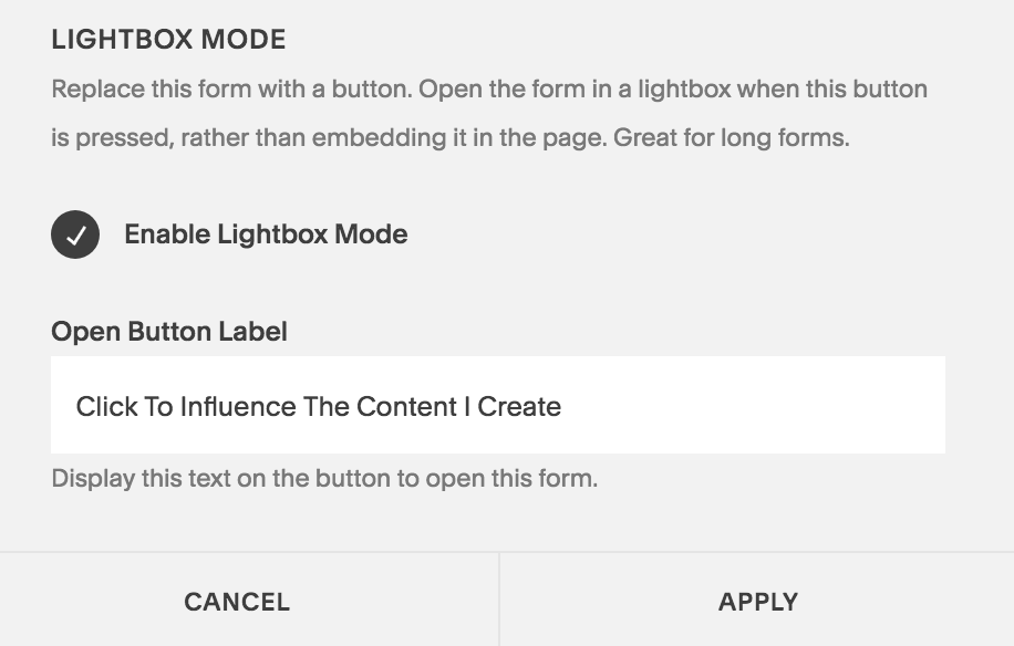
Then, add spacers on both side of this “form/button” and center it.
7| Write your email and link it to the “One Question” page.
I like to keep the email short. For an example, of the email text, jump over to Blog 052 where I show you the exact email I’ve sent out to my list.
That’s it. Now, not only do you know what to do but how to do it on your Squarespace website. So go and make it happen - you can do it in less than 15 minutes if you following these 7 steps.
You can do so much with your Squarespace website without needing to purchase a million third party apps. Sure you can get Leadpages or embed a Typform or SurveyMonkey. You can do all of that but you can also keep things simplified and make the most of the resources you already have. Well, that’s my idea of keeping things simple and bootstrapped.
And I will show you more things you can do on your Squarespace website without spending an extra dollar in the coming weeks and months. So sign up to my weekly emails that I send out on Thursday mornings so you are always be informed when the next blog/video tutorial or free live training is coming out. Just go on over to —> Squarespace Tips and sign up!
Also, I love designing websites for fabulous people like yourself, so take action to get your website design process started —> Start the Conversation by sharing some ideas about your site with me.
Questions about this blog post? You can drop them in the comments below!
~Peace,
Sophia

049: Should you hire a web designer or DIY your website?
This article is for you if your are caught in the moment where you need a new website but aren't quite sure if you really need to hire a professional web designer or to go build it yourself using one of the many drag-and-drop website builders.
Hiring a Web Designer Vs. Doing-It-Yourself (DIY)
This article is for you if your are caught in the moment where you need a new website but aren't quite sure if you really need to hire a professional web designer or to go build it yourself using one of the many drag-and-drop website builders.
Now, as a website designer myself who loves to design websites, I don't think hiring a designer is right for everyone. There is a certain need that website designers fulfill and if you actually have those needs then go hire a designer. Otherwise, invest the time and effort to learn all about website building and build it yourself. Use the questions to make the choice that's right.
Should you hire a web designer or do it yourself with a website builder?
I've prepared a set of 3 questions for you that you need to ask yourself when it comes to deciding whether you should hire a web designer or do-it-yourself using a website builder. They are all around the concepts of Money, Skills and Time.
1 | Funds
Hiring a website designer comes with many pros. But to tap into their services and expertise, it is important to have the funds to hire them. If you are starting up a business that doesn't have a starting capital or if your business doesn't generate enough revenue to cover your costs, then you should wait before hiring a designer.
Now I know some of you may say, "Hey, but I want to hire a website designer because I want to create more revenue in my business". To that, I would say,"Okay. Then start with a small website that will not cost you an arm and a leg. Hire a designer who is also starting out and wants to prove what they are made of."
When starting out as a solopreneur* for example, you may have more time than money on your hands. Use this time to learn about web design and building websites that will generate revenue."
*solopreneur = a business run by one person (often online)
So the question to ask yourself is:
Question: Do you have trouble finding enough funds to hire a website designer's services?
Answer: Yes / No
2 | Tech Skills
Website building is fun and exciting for me. In fact, learning about building a successful business online has been very interesting for me and I have spent thousands of hours pouring into books, blogs, videos and courses. If you feel you want to learn about web building then go ahead and DIY your site. You will stimulate your brain and feel happy about yourself when you create your site. There are tons of resources out there (like my blog) that will show you the many aspects of building a site that also is a high-converting site (creates revenue/ builds lists/ enrolls members, etc).
However, the same tech jargon and nitty-gritty can quickly get overwhelming and stressful. If you cannot stand anything around templates, design fundamentals, conversion-principles; or if the sound of Settings, Analytics, Security turns you off, or if you feel overwhelmed by the idea of watching tutorials and sitting through trainings about website backend technology, then the answer is clear, I hope? A web designer will be the right partner to help you birth your vision into a stunning online presence so you can focus on your core genius and leave the tech to the pros.
Tip: Even if you have your site designed by a website designer, I highly recommend that you inform yourself on the basics of running your site, updating content like text and photos or new pages and service packages. This will save you hundreds of dollars when it comes to updating your site with new content later. Some designers (such as myself) include video trainings as part of their design package so that the clients know how to work with their new sites.
So ask the question to ask yourself is:
Question: Does dealing with tech stress or overwhelm you or do you prefer not to learn about it?
Answer: Yes, I love it / No, I'm already overwhelmed thinking about it
3 | Time
As much as learning about the tech behind building a website can be fun and exciting, it is time consuming. My first website that I built was back in 2010 for my personal development site which has gone through countless updates and design tweaks over the last years. And with every site that I've built, from a site for a folk-rock music band from North Carolina, to a non-profit organization for education in New Jersey, I've learnt more and more. I'm constantly learning and not because it is part of my job as a web designer. But because I love to learn everything about web design and digital marketing. If you have the time to invest in learning, go ahead! You can learn all you want, the world is your oyster.
However, if you want to launch your site in the next couple of months, then you will need the expertise of a web designer. If you are at stage where you are working full-time and building your side-hustle during weekends and evenings, then time is of the essence. You want to leverage all that you've got. A web designer can help you take your vision and bring it into reality and your focus will be about reaching out to your ideal clients not fussing about tech details. In such a case, your next step will be more about two things: 1. which designer is a right fit and 2. which platform is a right fit for you.
So ask the question to ask yourself is:
Question: Do you have the time to invest in learning right now?
Answer: Yes, I do / No, I want to launch my website in the next two months.
Review the answers to these questions.
If your review shows that you need to delegate the web design work, then you will benefit greatly from the services of a professional web designer. He or she will take the stress and headaches away from you. They will handle the tech, the design and take the time to understand your needs. They can advise you on things that will make a big difference in your business, based on their experience and expertise. All of this allows you to
to focus on your message, your vision and your goals for your site.
Building a website is an important part of building your business. And I hope these three questions give you a good guideline in your decision-making process.
Let me know in the comments what questions you are currently facing around building your next website or redesigning your current website.
~ Peace, Sophia

Related Videos:


048: A Complete Guide for Launching your Artist's Portfolio Site.
You are an artist. Illustrator, calligrapher, pottery maestro, photographer, musician, maker of hand-made crafts and goods - these are just a few examples of what I mean when I think "artist". Artists tend to be wonderful at showcasing their work locally at art events, festivals and farmers' markets. But where they also need to be is online. See my step-by-step guide for all you need to do before you launch a Squarespace Website.
The Launch Checklist For An Artist's Website
A step-by-step guide for all you need to do before you launch a Squarespace Website.
You are an artist. Illustrator, calligrapher, pottery maestro, photographer, musician, maker of hand-made crafts and goods - these are just a few examples of what I mean when I think "artist". I live in an area of Western North Carolina which is rich in inspiration provided by nature's beauty. And where there's natural beauty, there are artists who are drawn to it.
(If you are interested, go to Google Maps and take a look at the southern tip of the Appalachian mountains. You will find the Pisgah and Cherokee National forests with breathtaking beauty surrounding the area of Boone, Blowing Rock and Banner Elk, NC.)
A website is important in 2019!
Artists tend to be wonderful at showcasing their work locally at art events, festivals and farmers' markets. But where they also need to be is online. It is 2018, after all, and soon to be 2019!
A good website is very important for several reasons from presenting your portfolio, showcasing your biography, sharing your creative process and increasingly, for selling your creations to a world wide market with ease and speed. I will go into all the reasons in a different post some time down the road. Just having a Facebook page is simply not enough!
Building a website can feel like a daunting task
But building a website or hiring a website can feel like a daunting task. Understandably so! There are a gazillion bits and pieces that need to be taken care of. That's why you have countless website design professionals such as myself who offer their services to take onboard your vision and give it form on a website. However, that can be costly ranging anywhere from $1600 to several thousand dollars. If you are ready for the adventure and want to do-it-yourself (DIY) then this post is exactly what you need to start off.
The Artist's Launch Checklist
So, if you are an artist or serving an artist community in your region, have a careful look at the following checklist. I walk you through all the most important steps you will need to take before a website can be launched. There will still be many details involved but this is a good overview so you know what is involved.
Although it can be applied generally to those other than artists, this checklist is specifically for artists, as well but there are some important elements that are unique to artists.
A complete checklist of all that you need to do before launching your artists' website
The first step, of course, is to decide whether you want to DIY your site or hire a designer. This list below is what you will need to do if you decide to go build your site.
Before You Start:
Choose a website building platform
There are many options out there and I will say the cliched phrase, "there's never been a better time than now" to build your own site! Your options are Squarespace, Wordpress, Wix, Weebly among the top platforms.
I am a Squarespace pro and I choose Squarespace for building my own site and exclusively design client sites on Squarespace, mostly because I find it has a user-friendly dashboard making it very easy for small businesses, not-for-profits and individuals to update and maintain. Plus, there are tons of resources both from the Squarespace team and a huge number of Squarespace experts on your beck and call to help. If you want to know all my reasons why I choose Squarespace everytime, read this blog post.
--
NOTE: The rest of the steps apply specifically to building a site on Squarespace. You can extrapolate it for Wordpress or others but the specifics will be different. I will only share here of what I feel confident will be helpful to you from my point of view as a Squarespace expert.
--
8 Steps to Website Launch!
There are 8 steps before your site is ready for launch. I've laid this out in detail below. But here's an overview:
Overview of 8 Steps
Step 1 | Site Goals Prep
Step 2 | Design Prep
Step 3 | Content Prep
Step 4 | Site Front-end Design
Step 5 | Site Front-end Content
Step 6 | Site Backend
Step 7 | Site Backend Conversion
Step 8 | Launch!
Here we go!
Step 1 | Site Goals Prep
These are the things you will do even before you open up your Squarespace account. This is the conceptual phase where you think of your main goals for your site. Get a pen and paper and start brainstorming!
Decide on your # 1 goal:
Deciding your No. 1 goal for your website is key because it will help you make all the other decisions much more easily. Do you want your site to be a digital showcase of your work primarily? Do you want to build a following? Do you want to sell prints of your work, the actual pieces themselves or fill out events? Do you want to inspire other artists and creatives with the mind-set challenges, show them the ropes of your art, share with them your wisdom and knowledge? This will also help you know how many pages you will need to achieve your goal.Decide on your secondary goals
A site can achieve many goals. Your # 1 goal or the primary goal will be most important. But knowing your secondary goals will help in the nitty-gritty details. For example, if your primary goal is to sell prints of your artwork, your secondary goal could be to demonstrate your creative process that went into designing that piece of artword and that would influence whether you blog or video record about it.List what pages you need to convey the goals of your site
Your no. 1 goal give you your main focus for your site. From there, you will know what content to place on your site, what key actions you want your visitor to do. Remember design is important but functionality of your site is even more important. Write out all the pages that will serve your goal. Examples of pages for an artist: Portfolio, About, Contact, Blog, Shop/Events, Resources. This is important so that you can easily choose an annual plan on Squarespace where # of pages and ecommerce functionality determine your costs.Chart which pages go in the top and footer navigation and which will remain unlinked.
Think of the architecture blue print of a house. There is a reason why some rooms are on the lower level, while others are upstairs. A kitchen is most likely on the lower floor because you will access it three times a day (at least) for your daily meals. A bedroom is tucked away on the upper level so that it is a quiet refuge from the hustle-bustle of activity in the rest of the house. Think of your website in that way. What is the most important point you want to achieve? Those corresponding pages go in top navigation. Those that are supplementing or supporting pages but still important, can go in the footer.
Step 2 | Design Prep
This is what you will do for preparing for your layout, the visual aesthetics of your site - an important part of your process.
Choose a template for your site:
Every Squarespace site comes with a template. The template gives you a starting point for your design and layout of your site visually. Squarespace templates are grouped in families. So there many be several templates grouped under one family who all behave and function in a similar way. Squarespace has demo sites for each template so you can give that a look. I am also creating a guide on how to select a template in my blog posts.
Tip: If you just want to shortcut that process, start with any template in the Brine Family. This template family is the most versatile and has the most options of all template families.Pick 2-3 fonts
I tend to go for a minimalist approach when it comes to picking fonts. So pick no more than 3 fonts. This is also becoming an industry standard for modern websites. Here are some resources on how to pick a font.Pick 3 colors for your fonts:
Again like point 2, less is more. Choose one color for your body text font, one for headlines and one for links and buttons. You can have another color for design elements. On my site, I have two colors for my fonts. A dark grey for headlines and main body text, and mango yellow for links and buttons. I use burgundy red in my logo and other graphic elements such as my YouTube thumbnail and Facebook thumbnails.
Tip: Don't worry too much about the colors because as you learn more about what you want, you can easily switch the colors. For starters, focus 3 colors only: for main body text; headlines; and link+button colors only.Have your logo ready:
Get a logo for your website designed by a graphic artist. Or create one on Canva or PicMonkey if you enjoy that. You can also create a text logo inside Squarespace - a paid feature for everyone but free for you as a Squarespace customer.
Tip: You can always get a logo down the road also. So don't let this be an obstacle. You can insert a text title in place of your logo in the meantime.Collect good quality photos for your site in a stand-by folder:
Photos make a big difference. As an artist, you will most likely use a lot of your own photos to talk about your process and showcase your creations and items for sale. But you may choose to get nice background images to break up text. You can get stock photos (free or paid) or organize a photo shoot for brand photos. See an example of how I use stock photos to break up text content in a website I designed for a writer's club.
Tip: There are tons of places you can get free, hi-quality photos. I've put together some resources to help you find them.
See blog post 045: 51 resources for free stock photos to use on your Squarespace site.Prepare your images before uploading to site:
This is a very important step for artists because generally your site will be image-heavy. The more images of hi-resolution you have, the slower your pages will load. And Google notices that and marks negatively towards search engine results. So format your images before loading it into your pages. Read my guideline for image formatting.
Step 3 | Content Prep
This is where you write out content for all your main pages.
Build out your page content:
You will start writing copy for all the main pages. I would suggest that you craft your content in a word processor and save it first. Then you copy and past that text into Squarespace.
Tip: There is no auto-save feature in Squarespace, so if you forget to save, you may lose your content. As you get more comfortable, you can write straight into Squarespace.(Bonus): Write a couple of blog articles
I say this is a bonus because it can be very overwhelming to start a blog and I rather that it not become an obstacle for launching your site. You can always build out your blog bit by bit.
Tip: Don't postpone it too long because the content on your blog will greatly help your site be found in Google Searches.
Step 4 | Site Frontend Design
n this phase, you begin to build out your navigation, create the page layout and implant your text and images. If you've got a shop or a blog, you can start off with one or two of them and build it out gradually to avoid overwhelm.
Stick with the current template or install new template:
When you start your Squarespace account, you will be asked to pick a template. If you did your prep work and selected the right template, great. You don't have to do anything. But if you just picked a template without doing the due diligence on it, then now is the time to go a bit deeper into your research and see which template is the best fit for your website needs. Then go into your dashboard back end and switch the template.Move all demo pages into unlinked or delete them:
All templates come with a set of "demo" pages. You guessed it right, they are all meant to serve as a demo or a demonstration of what is possible in that template. Many will uste the demo pages as their starting point whereas others like to start off on a blank canvas. In either case, I suggest you move all demo pages into the "Not Linked" Section. This way, they are not filling up your main navigation. If you choose to use them, just click on them and create a page just like it. Otherwise you can simply click the trash icon and delete those pages. I show you how to do all of this in my online workshop.
Note: You may do Step 4.3 and 4.4 together.Select the fonts for all texts:
Next, go into the Style Editor and set the right fonts for all your text content. This includes headers (H1, H3 and H3), main body text, navigation fonts and footer fonts.Select the colors for body text, header and links/buttons:
You can set your text and link/button colors to match your branding colors. See Step 2.3 on that.
Step 5 | Site Frontend Content
In this phase, you begin to build out your navigation, create the page layout and implant your text and images. If you've got a shop or a blog, you can start off with one or two of them and build it out gradually to avoid overwhelm.
Tip: Review SEO Checklist points before beginning this part.
Tip: Either use the demo pages that come with your template or start from scratch.
Create and build out your page content
Add text and image content. Create Home page, About page, Portfolio and Contact pages. Create all pages for the footer as well. Add images on all pages make sure to use keywords behind images. Your portfolio page is important so take your time in building that out. Know that you can always add more. Start with the least viable product and then add more later.
Tip: For SEO (search engine optimization), use only one H1 header on each page.Build out top navigation pages:
Now that all the pages are created, drag the important pages into the Main Navigation inside your Squarespace dashboard.Build out footer navigation pages:
Do the same for the footer. Put the supporting pages into the footer by dragging them in your side panel.Build out any unlinked pages:
There will be some pages you want to link from within your page but not show up in the top or footer navigation. These can be easily moved into the unlinked section.Design the footer
You may like to change the background colors or font colors here.Bonus: Create your blog, create your shop
I say this is a bonus because some of you may not have items for your shop all ready. And some of you may not be prepared to start writing about your work. By the way, the simplest way to have blog posts is to put up work-in-progress images of your art and write short descriptions for each stage.
Tip: Remember a website is a living breathing organism and it will grow and evolve in time. Don't put off launching your site until you have every detail perfected (an artist's pet peeve but also affecting a lot of us!). Remember you want your site to be found and the sooner it is launched, the sooner it can start creating SEO juice for your future, making it more easily found by your audience down the road. Makes sense? I hope so :)
Step 6 | Site Backend
Step 6 and 7 are your final steps before launch. Now it is time to get the nitty-gritty details of the backend of your site squared away so you can launch your site.
Purchase Squarespace Plan:
Review the pricing plans on Squarespace and get your credit card ready. Note that if you are a participant in my online workshop, you get a 20% off discount code because of me being a Squarespace Authorized Trainer. So maybe you want to look into getting some training before you DIY your site.
Tip: Annual plans are cheaper than going month-to-month.Buy/Transfer domain name
This is your website URL which can be the same as your name if you are an artist, or it could be your studio's name or business name.
Tip: You can buy your domain name with one click inside Squarespace which saves a lot of time as you won't have to do the configuration and tech stuff that comes when you buy the domain name from another place such as GoDaddy or JooHost, etc. My suggestion is to keep it simple, get out of the tech mess and get the domain from Squarespace.Add Logo/Site title:
If you've got a logo ready, now it is time to upload it. You can alternatively use a text title for your site which will be visible on the top of your site.Fill out site description:
Write out a short 2 sentence para describing what your site is about.Add favicon:
This is what is seen on left of your tab as you open your pages. My favicon is a burgundy red colored kitty, which you can see right now on the tab!
Tip: You create one inside a free tool such as Canva or PicMonkey or inside Squarespace in the logo making tool.Turn on HTTPs and AMP:
This will make your site secured (HTTPS instead of HTTP). And it will make your website better viewed on mobile devices. Being AMP friendly is another point won in the eyes of Google!
Step 7 | Site Backend Conversion
Do all SEO items on SEO checklist
This is important. My workshop participants get an SEO guide and checklist so they know what things they need to do for crossing off the most important SEO tasks.Set-up list building form ex. newsletter signup
Make sure you select an email newsletter so your visitors can get updates and messages from you periodically. There are many out there both for a monthly fee as well as free.
Tip: Mailchimp and MailerLite are two free options (at least until certain number of subscribers). Mailchimp is integrated inside Squarespace which makes it a great one to start off for your first website. ConvertKit is one of the paid options.Set-up integration with third party apps:
If you need other elements such as a booking app, you can now go about integrating these.
Tip: When you use Squarespace, for certain plans, you get free access to one of the plans on Acuity, which is an app for scheduling meetings.Connect all your social media accounts
You can connect your website to all your social media accounts.Disable Squarespace badge
There's a small badge on the bottom of your site that says that your site is built on Squarespace. You can disable that badge from your dashboard.
Step 8 | Launch!
You did it! What an achievement!! Now it is time to tell all your friends, family and peers about your new website. Get your visiting cards printed and begin sharing your link in your email footer!
Well, I hope this detailed step-by-step guide gives you what you need to decide if you want to DIY your site. And if you do choose to go that route, then you have a nice overview of everything you need to get done before launching your new website.
Good luck and have fun on this amazing adventure!
~ Peace, Sophia
Related Videos:


047: My Mini-Website Review for Agnieszka
Recently, I did a mini-website review for Agnieszka, owner of a retreat site, with suggestions on how to clean up some elements on the navigation and home page. Watch the video here.
Mini-Website Review for Agnieszka
It is always nice to get another set of eyes on your website. New ideas, new inspiration often follows for the one who has put in a lot of time, effort and sweat equity into building their new site. That's when a website review comes in handy.
If you already have a website running for and feel that it is not converting like you would like it to or truly representing your vision, then again, a website review can really help you make the changes that will make a difference in your business.
What you see below is only a mini-website review (a full website review would be much more comprehensive with initial interview on your vision and goals, list of suggestions along with a gameplan on how to make those changes). It is about 11 minutes long and in it I make some broad suggestions to Agnieszka, the owner of the site. It gave her enough fuel to get started on making some changes before she dives into a complete redesign.
Take a look at what I suggested to Agnieszka in the video below:
Watch the Video:

Related Videos:


046: Why I purchased something from a website that has a sub-par design? (and what you can learn from it)
Some weeks ago, I wanted to buy a birthday gift for my friend and I wanted it to be a massage session so she could relax after some exhausting photography projects. After a Google search for massage studios, it came down to two websites. Watch the video as I show you why a site that has sub-par design actually got my money.
Some weeks ago, I wanted to buy a birthday gift for my friend and I wanted it to be a massage session so she could relax after some exhausting photography projects.
The challenge: I am in North Carolina. She is in Toronto.
This location difference meant that I had no idea where a good massage studio was in Toronto. I had to rely on google searches and scanning various websites that popped up in the results. It was nice to see a good selection of massage studio websites close to her home.
I found some lovely sites with nice photography showing the studio and its services. I also found some not so aesthetically pleasing sites.
You may be surprised by this. It turned out that I ended up buying a massage package from a studio that was not my first choice. It was a website that didn't hit all the marks in terms of stunning, credibility-building design.
Why would I buy from a website that I myself would rate as "sub-par" design?
Simple. Functionality.
Design is important but without functionality, your site is not making the deals it ought to make.
Watch the video to see the full story where I show you the actual websites in question:
There are some useful nuggets that you take from this story and make your website more conversion-friendly a.k.a. sell more products, services, events, online programs, and workshops.
This is why it is super important to know what your #1 goal is for your website. This #1 goal will help determine what functionality you need for your site and how to go about designing your site as a result. The functionality of a site cannot be overlooked. It is important to create clear pathways for your audience to easily do the things that you want them to do.
This is what will set your site apart. And this is the difference between a stunning, beautiful website and a stunning, beautiful website that also converts.
All of this is given to you in the pre-workshop prep material when you attend my workshop that teaches you how to build a website.
If you'd like to know how to think "conversion" when building your website, come to my next workshop, "Create a Website that Converts". I will show you how to build your own Squarespace website with conversion in mind. Check out the details here: Create a Website that Converts
045: 51 resources for free stock photo sites to use on your Squarespace website 2018
Your search for high-quality photos is over. Check out this resource with 51 free stock photo sites to help you with nice pics for your website and blog.
When you think of starting a new website, many details start emerging. One of them is: "where do I get photos for my website?" On Squarespace, you can easily purchase photos from Getty Images. It's actually integrated into the backend when you use the image block. But at $10 a piece + state and local tax, that can quickly add up.
Alternatively, you can have photos professionally shot. Find a local portrait/brand photographer, see their portfolio, chat with them and hire them for a day shoot. Excellent! But those photos are great for creating some nice brand photos that you can use on your About page, Home page or Work With Me pages. What about photos for your blog content?
Well, my dear web designer/entrepreneur, thankfully, there are so many wonderful stock photo sites that you will have enough for hundreds upon hundreds of blog posts. In fact, you can swim in an ocean of stock photos and the ocean keeps expanding - that's how creative we humans are. But I digress! In other words, the lack of photos is no longer an obstacle on your website-building journey! Isn't that a relief?
Below you will find a list of photo sites that have a variety of stock photos for you in a number of categories from Business, Nature, Landscape, Technology, Food, Animals, Women, Men and so on.
Before you go scroll through them, keep in mind to check the license and copyright requirements, even though many of these sites offer photos under Creative Commons Zero; meaning no copyright restrictions. It's best to double check for each site because copyright infringement can cost you in time, money and headache.
Without further ado, here's a collection of stock photo sites in no particular order.
(Also see my little tip to prevent overwhelm below).
51 Resources for free stock photo sites to use on your Squarespace Website
I've made little notes with anything that stands out to further help you choose.
publicdomainarchive.com (vintage public domain images)
realisticshots.com
(7 new photos everyday)images.superfamous.com
(need to provide credit)photostockeditor.com
(new images weekly)travelcoffeebook.com (wonderful photos of Asia)
SpaceX
(public domain space photos)thepicpac
(pay what you want)Removed as link expired.
moveeast.met (photographer from Portugal)
13. cupcake
14. barnimages.com (photos, fonts, mockups)
15. mmtstock.com (photos + video)
16. snapwiresnaps.tumblr.com
17. bucketlisty.blog (travel photos)
18. removed (artsy)
19. skitterphoto.com (photographers from the Netherlands started it)
20. freenaturestock.com (nature images)
21. imcreator.com/free (slow to load)
22. canva.com (yes, free photo downloads!)
23. kaboompics.com (one woman show)
24. Unsplash
25. Gratisography
26. Pixabay
27. Stockvault
28. Pexels
29. Picjumbo.com
30. Pikwizard
31. Rawpixel
32. Reshot (handpicked, non-stocky)
33. foodiesfeed.com (food)
34. freestocks.org
35. picography.co
36. lifeofpix.com
37. littelvisuals.co
38.deathtostockphoto.com (scholarships for artists and nonprofits)
39. new old stock (vintage pics from public archives)
40. jaymantri.com
41. shotstash.com
42. styledstock.co (feminine stock photography)
43. fancycrave.com
44. splitshire.com
45. isorepublic.com
46. libreshot.com (fine art photography)
47. startupstock.com
48. freerangestock.com
49. stokpic.com
50. negativespace.co
51. picography.co
And as a bonus, here’s a blog article written by Amos Struck of Cologne, Germany in which he has compiled a comprehensive list of free stock photo resources and given a verdict and a score on usability of each resource so it's easy to choose one. So check it out:
https://www.stockphotosecrets.com/best-free-stock-photo-sites
Tip to prevent overwhelm: Now, you have a huge photo resource to choose from. To prevent overwhelm, skim the list and click on sites that resonate. Check them out first. If you don't find anything you like, then come back to this list to look again.
What do you think of this list? Do you have a favorite free stock photo site that is not listed here? Share in the comments!
Want to learn how to build your own Squarespace site? Check out upcoming workshop dates here.

043: Don't create a website that is stunning. Create a website that converts.
See the four steps of the marketing process and assess which step you need to optimize on your website.
Don't create a website that is stunning. Create a website that converts.
Yes, this is coming from someone who loves building beautiful websites for her clients. But it also comes from someone who has built a website that actually serves as a business asset that is the main source of revenue for her. So consider this advice very closely, my friend - build a website that converts not just a website that is stunning.
Watch the Video:
I Love Stunning Websites. I Love High-Converting Websites More!
Don't get me wrong. I am all for a beautiful, stunning website.
You can spend the big bucks on designing a site that is awe-inspiring, with the coolest effects, high-quality photos and customized code but if it doesn’t connect with your potential customer, then it will just be that - a beautiful site. It will fail in working for you.
That's why I'd rather go for a website that gives me value than a website that sits there looking pretty.
Your business depends on your website to help grow your business regardless of what kind of a business you are running. If you are a brick and mortar business with most of your clients coming in through the door, a web presence is so critical. Your customers will most like seek you out online before deciding to drive down, park somewhere expensive and then walk in all kinds of weather to get to your store.
And if you are a solopreneur or an online business owner who wants to sell a product (physical or digital like an e-course) or a service, then a website that converts is essentially bread and butter for your business. It determines whether you will be able to pay your business costs as well as feed and house you and your family.
So you can see it is so critical to implement strategies that will make your website worth the time and money you put into it. You need a website that converts.
A Stunning Website ≠ A High Converting Site
Unfortunately, I see too many websites that are heavy on design but light on content. And unless, your content is design - say you are graphic designer or visual artist, then my friend, I am sorry to say, your pretty website is really not working for you. If you want your website to actually build your credibility, win you clients and sell your products (digital and physical) then you've got to make some changes. (I do have a word for the visual artist a little ways down this article. So if you are a visual artist, do consider those thoughts).
I myself have fallen for the trap of the pretty website. I cannot even recount how many hours I have spend on changing my the template on my website and going through countless number of images in order to choose the right photo for the right mood. Or spending hours on Canva or some design tool creating the perfect Pinterest thumbnail. If had spent even half of that time on creating content, creating blogs and videos that solve people's real problems, then I would be in a completely different place in my business today - without a doubt.
A stunning website is not equal to a high converting site.
And that is what I am now focussing on in my business and I want you to do so as well: Transform your website into a value-giving, content rich home for solving people's real problems. As you begin doing this, you will be well on your way to transforming it into a real business asset - one that produces revenue for your business.
I know there are many SEO guru's who will advise on creating SEO rich landing pages. Sure you can do that. But don't squint your efforts in creating real helpful content for your specific audience.
Content is the name of the game today.
But you are asking why is it so important to create content. You've got your portfolio that speaks for itself. You've got your courses that stand for itself. You've got your bio, that explains it all. Then why do I need more content?
Content really is the name of the game today.
People are going to the web more so for solving problems than ever before. With more and more people around the world getting access to the internet, more of them will come knocking at your door to find solutions to their real problems. And if you can solve them, you will not only make a difference but stand out as someone who adds value. People care about people who add value to them.
And it is with value-giving content that you can truly stand out. People today watch your videos, read blogs, listen to your podcasts and say, "I like this woman and what she has to offer." I wonder if she will be available for doing this project for me.
It is content that converts not a glitzy glam website. If you want to sell a product or a service as a solopreneur or a small business, you've got to have a value-rich website.
Here's #realtalk for the artists who want a portfolio-website: I must say that even if you are an artist whether a visual or performing artist and your work is more design and visuals than words, you will find that creating content around your creative process will bring you much further in your career than just displaying your awesome creations in a bad-ass portfolio. A hand-lettering artist, for example, who walks people through her process of her craft, will establish herself as an expert in her topic faster than you can say "what?".
So this post is for entrepreneurs in two different stages. One: Brand new. You’ve decided to go get a website and you want to make sure it’s done right from the start. Two: Experienced online entrepreneur or business owner frustrated with her results. You’ve had your site for a while, say a year or two, and are not seeing the kind of results you had hoped for.
What’s common in both these situations is that you want your website to work for you. You realize that creating a stunning, beautiful website is only part of the game plan. Squarespace makes it easy to build such an eye-catching site. But what you are becoming even more aware of is the importance of strategies that will actually influence your revenue. You want to build a high-converting website that converts.
What do I mean by a website that converts in the first place?
Now, I want to be clear in the use of terminology and want to make sure I express what I mean when I say, “a website that converts”. A website that converts is essentially a website that successfully convinces a reader to start their relationship with you.
It is a fact that 97% of new visitors of your site will not make a purchase. They view your site and then fizzle away into the vast deep space of the internet.
"As Chet Holmes points out in The Ultimate Sales Machine, only 3% of people are ready to buy right now. You want to keep in contact with the 97% who are in the “not quite yet” stage".1
What you want is to have things in place on each page of your site that will help them say, “Yes, I like this. I want to see what they have here for me”. "And oh, wait, I want to give her my email address, so that I don’s miss out on all the goodness she has to offer".
You want them to want to sign up to whatever free content you have on offer and give you their email address.
Notice that I said, "give you their email address". I didn’t say, “buy your product or services”. Of course, there are occasions when you get a purchase right away from someone who just landed on your site, depending on what type of industry you are in and what type of product or service you are selling. But even for those types of sales to happen, your website has to check off some key boxes, so that a brand new person visiting your website today can have the confidence in what you offer and say, “Hey, I like what you have on offer. Take my money.”
So, my definition of a website that converts is: a website that convinces people that you are a reliable, trustworthy source of valuable information and makes it super easy for visitors to become your subscribers. You can measure this by what percent of your site visitors are turning into subscribers of your email list. You can see this by how many people join your list.
4 Step Marketing Process in Online Business
A natural process of marketing for online business looks like this:
Step 1 -> Step 2 -> Step 3 -> Step 4 = Sales$$
Step 1 Land on your website->
Step 2 Convert those visitors into subscribers ->
Step 3 Nurture them with value-giving content ->
Step 4 Invite them to new products and services
= Generate revenue & sales
Step 1: First, people have to know about your website. To have that happen, there are tons of things you can do which has to do with content marketing, seo, social media marketing, networking with influencers, guest blogging, interviewing, etc. This falls under creating traffic to your website.
Step 2: Second, when all those efforts (from step 1) have been successful and people finally land on your website, that’s when your site has to already be in gear, ready and waiting to welcome them. Just like the sales person inside a tea shop is ready with everything - all items are on display, the pricing is clear, and she is present as well so that she can answer any questions you may have. This falls under what I call, "making your site conversion ready".
Step 3: Third, is when they are on your email list and over time, you build a like, trust and know factor by sending them consistent, high-value content. This is the nurturing and trust-building phase.
Step 4: Fourth, once the relationship is nice and strong. Then, you can then invite the people on your list to a new product, service or a program or an event.
=
All of these steps combined lead to revenue and sales.
It seems to me that there’s a lot of focus on step one. A lot of folks are focussing on social media, Facebook Ads, Google Adwords, etc. All of this is important and certainly has its place. It is important to do all those things to get people onto your website.
But it’s even more important to do steps 2 and 3. Because no matter how successful step one efforts are, they all fall flat if step 2 is not done well. Step 2 is where the reader actually sticks around a bit after landing on your site and then finds things that they want to opt-into and instantly get access to. This is so so key.
Remember Step 2 is all about having a conversion ready website. And Step 3 is about nurturing those folks who are on your email list.
How do you fair on step 2, in creating a conversion-friendly website?
Step 2 calls for putting into place a strategy, a plan of action for what your site is going to do to inspire people to subscribe to your list. But not in a sneaky, manipulative way. Instead, it’s got to do it in a way that the visitor says to herself, “wow, i really need this. ooh, I need to opt-in for this, and this and this. There’s so much here, I will bookmark this page. I will come back in my lunch break. I need to binge watch and binge read…" You get the point. It has to be in the most generous way. You’ve got to make the person feel that there’s a ton of content, useful content here that they absolutely need to get their hands on. They may even ask themselves, how come they haven’t heard about this page and start thanking their stars that they have finally found you.
This I find key because of all the effort you are putting into guest blogging or into social media and driving all that traffic to your website, you’ve got to have it ready for them. So that they will stop, spend some time there and give you their email. Instead of simply bouncing off to the next thing on their to-do list.
Only when Step 2 is done, will step 3 and 4 even come into play. You see what I mean. How can you nurture a list when people are not opting in. How can you launch a product and service when you don’t have a list of people who like trust and know you? I hope you are beginning to see why Step 2 is über-essential.
So the moral of the story is put efforts in making your Website Conversion ready.
How to make your website conversion ready?
Now, there are plenty of ways to make your Squarespace site do really well in Step 2. There are three key things you need to do in order to make your website conversion-friendly.
1. Clarity of purpose
2. Value-rich Content
3. Effective Calls to Action (CTAs)
1. Clarity: Present yourself clearly
You’ve got to be very clear on what you do and how you do it. Big big clarity.
So for example, don’t just state that you are web designer. State that you build websites on Squarespace with a 2- week process of completion.
This has to emerge very clearly in the way you present your business. It can refer to a main result, a core service or to specific tools, strategy or the approach you use that makes you stand out. Key would be to also add who you do this for. Don’t be afraid of getting really niche and getting really narrow.
I once saw a presentation of blogger who runs a million dollar business selling all things around succulents! Not plants but a very focused type of plant: succulents. And then she said that she would make more money if she addressed the needs of a yet narrow group within that succulent category. Wow! Succulent is already narrow and she said going even narrower would be her ticket to greater success. This is key. And don’t worry about have it all right from the start. Begin somewhere and refine as you go. Some other ways to present yourself clearly would be to use videos and photos while make it all personable and showing your process.
2. Content: Value-rich content that solves problems
Next, you’ve got to have tons of content on your site. Experiment with different types of content. You will begin to feel what your strength is. And then eventually you can focus on that one thing that is at the crux of your skill and what works.
For example, Amy Porterfield, a very successful marketer, does only audio podcasts. Just that one thing. She makes high-quality value rich content in the form of audio podcasts. She also has PDF checklists and summaries that people can download connected to that episode. Plus she has free PDFs on her home page that people can download for free. This is a great way to give out content. Another example is Melyssa Griffin. She has an immense resource library where you can get a whole portfolio of PDF resources. I think she does this really well.
But you may find that you love to create blog articles or video tutorials.
May you are a photographer or a visual artist of some kind, an actor or a performer. May be you make things by hand. Then articles that showcase your work, your process, in text and photos would be a huge way to build content.
I personally have found live workshops a great way to teach content. I do intense, info filled paid trainings like this one and then shorter, more focused live trainings for free as well. I am also building my youtube channel full of video tutorials. For me, blogs, live workshops, youtube videos are the three types of media I use that provide content. Then I support all of those by offering a variety of PDFs for people and I have a few in queue for publishing in the coming months.
3. Call to Actions: Every page must have a CTA
And finally, CTA. Now this is kind of interlocked and overlaps with the above point but it also has a unique feature that earns it its own section. So what is a CTA? It essentially is a Call to Action that basically invites your visitor to take one small action to move the relationship forward. Think of the example of two people going on a date. A girl and a guy go out for drinks. Then the next day, the girl takes the next step and calls the boy and says, ”hey do you want to go for a movie” and then the next day the boy invites her to go for dinner. At each step, there’s the next step. So the girl and the guy are not going for drinks, dinner and a movie all in the same moment. Which may happen down the road but it begins in small tiny steps.
CTA’s are very useful for moving the visitor from a content consumer to the next state where they are actually becoming a friend and more interested in your business and your offerings. They are taking the next step. Now, what’s important to note is that at any time they can take the relationship from visitor to consumer to customer. That option must be available for them. When you are at an advance stage where you have a nice size list that is active and engaged, then you can do launches of signature products and so on. But at the beginning stage, you’ve got to have things available at each stage of the customer journey. Meaning you've got to have clarity, value-rich content, and calls to action to take the next step.
So that's it, my friend. I hope you will review your website in light of the ideas I've presented here. The key message here is to encourage you to move way from obsessing about the design and style elements of your website and begin obsessing over creating useful content and products and services that solve people's problems. In the end, that will solve your problems as well because your website will begin generating revenue for you.
~ Peace,
Sophia
Related Videos:


042: These 6 tweaks I made to my Squarespace website helped conversions
See the 6 tweaks that helped me make my website conversion-friendly. Watch the video for case studies and examples to help you get ideas and inspirations.
These 6 tweaks I made to my Squarespace website helped conversions
Over the last few years, I've studied and collected tons of information on how to make a website conversion-friendly. In other words, conversion-friendly is all about preparing your website so that visitors turn into subscribers.
It's not just about putting up a lead-magnet or sign up to my newsletter form, which of course are important. But you need to pave the way with these other strategies so the reader will want to subscribe.
Now, knowing all the info is one thing. But implementing is another. So today, I want to share with you the 6 changes I actually implemented on my Squarespace Website that helped me to improve my website conversions.
I invite you to assess your own site and see if you need to make any of these changes to your site to improve your website conversions.
Watch the video to see examples and
case studies from other sites for all 6 tweaks
So here are those six tweaks I made on my website:
1. I changed all my links to be of the same color:
This is something I learnt a couple years ago from Derek Halpern of Social Triggers. It made sense to me. When we have different link colors, the experience for the reader is discord and disharmony. Our eyes are trained to see patterns.
So bank on that behavioral fact and make all your links to have the same color. This unified look will give cohesion and clarity to your site and trains the eye to easily know what is "clickable".
Pro-tip: Choose a color for your links that stands out from the rest of the font colors on your site.
Pro-tip: Apply this rule to all buttons and anything clickable.
Pro-tip: Carry over this rule into your emails where buttons and links are of the same color as those on your site for links.
These are examples from my blog as of June 14th, 2018:


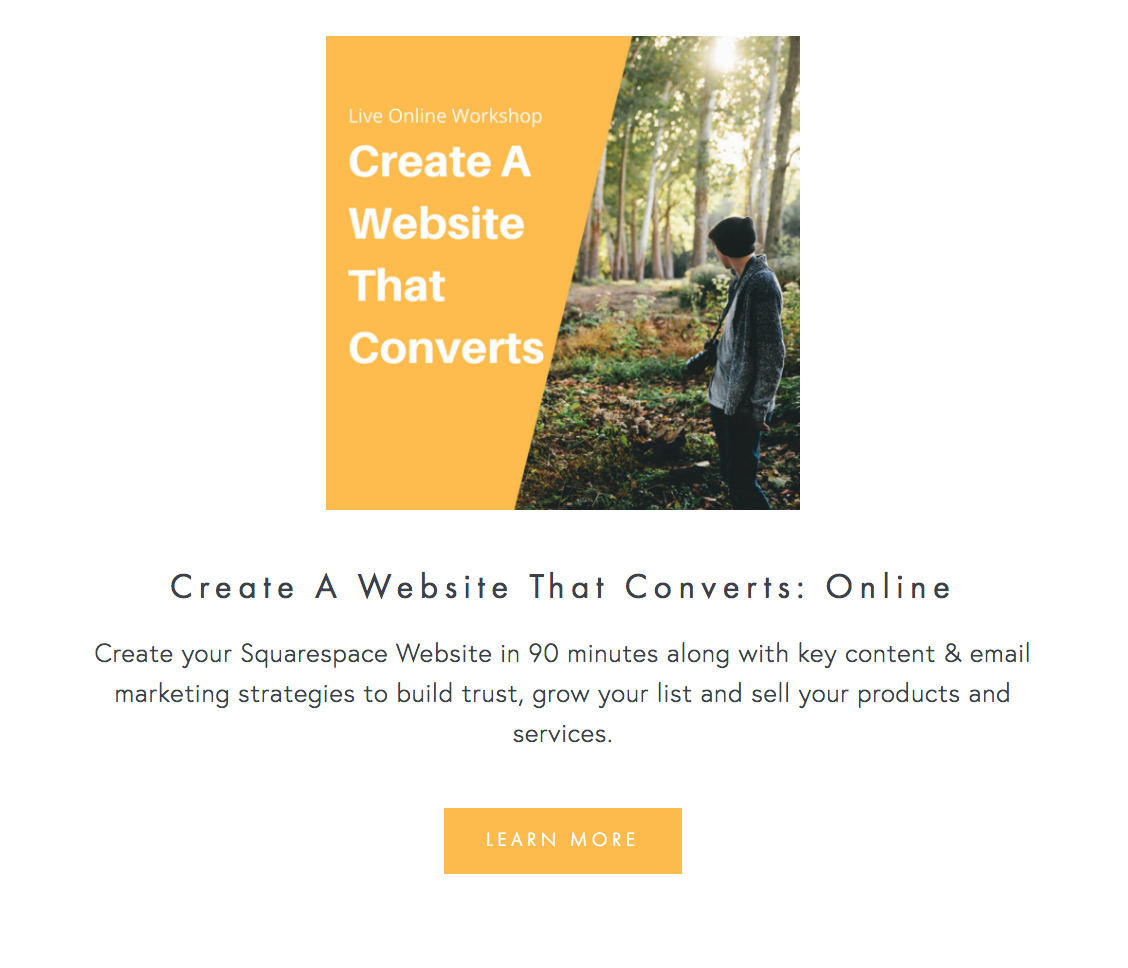

Here you see an excerpt of my blog summary on my home page. I've got the clickable headline in mango-yellow. And the Read More link is also in mango-yellow.
Here you see my Blog sidebar. Notice that all the category links are in a unified color.
Also my invite to my weekly newsletter is wrapped in a mango-yellow circle.
Here is a screenshot of my Live Workshops page. Notice the button is in mango-yellow.
On my work with page, I have yet another button. You can see that "Start this package" button is in a button that has a mango-yellow border.
Same thing I repeated with the purchase buttons on my "Create a Website that Converts" Live Workshop page. You see the repetitive mango-yellow and they are all clickable.

Here's a screenshot of my top navigation. You can see that upon hovering over each option, the link color turns mango-yellow. And of course, the text logo on the upper-left and the button on the upper-right are both clickable and have mango-yellow to create a harmonious user-experience.
2. I reduced my top navigation to four tabs
I streamlined my top navigation with only four page choices: Portfolio, Blog, Work With Me and Live Workshops. All of them have interlaced purposes. I want my Portfolio to show that I can build Squarespace Websites so that folks will want to Work with Me. My Blog also helps to build credibility and demonstrate my expertise which leads folks to either work with me or join my Live Workshops. I am working on integrating my Portfolio within my Work with Me page so it will go down to three and make room for a value-giving lead magnet instead.
Below you can see my top navigation has only four options:

Right now, my footer navigation is a bit overcrowded. But I am on my way to fixing it and want to streamline it as well.
You will also see that there are no drop-downs. I find them a bit cumbersome and sometimes even counter-productive when they end up overlapping on top of other menu items.
Having fewer options to click makes it easier to for the viewer to make choices and move forward with interacting with your site. You can always put more details nested within the umbrella pages.
If you do need to have very distinct pages all at once in a at - glance view, have them in the footer in a neat and logical list. I encourage you to find more cleaner and streamlined ways to organize your pages. In the video I show some good example of orderly footers. I am taking my own advice and working on streamlining my footer navigation is on my task list!
3. I have a logical CTA on each page (as much as possible)
I made an effort to have calls to action (CTA) embedded on each page as much as possible. Each page of your site needs to graciously move the conversation forward. For example, once people have read your About page, what should they do next? After they have read your blog article, what's the next step. Ask this question when crafting each page of your site and you will create a natural flow to keep your visitor moving forward. Call-to-actions can be anything that makes the person click and helps them move forward in exploring your content and connecting with you. Some examples of CTA: Read more, Hire me, Check out the blog, Sign up to the newsletter.
My next goal is to bring a CTA above the fold. Above the fold essentially means, to the top part of your page on the screen, before you need to scroll down. I still have this to do on most of my pages. It is a work in progress - the work is always getting more and more refined over time!
4. I have a blog that is filled with useful content
This is really key to making your website conversion-friendly. Why? Because a blog helps you stand out, shows that you can help people solve a particular problem and builds trust. Whether its written content, audio podcast, video tutorial or a combination of it all, a blog is one of the most important things on your website. It makes people come back to your site repeatedly.
Your blog content sets you apart as an expert, an authority, as someone who knows what they are talking about. It is your digital content that serves as the window to your business. Create content. Create consistent content. That's key. Sean McCabe at the 2017 Craft and Commerce Conference said that as soon as we started writing daily, the income in his business sky rocketed. Take a look at this photo below of one of his slides where he points out how his revenue increased when he began writing daily. Here are some meaningful things I learnt from Sean McCabe in my blog post No. 025.

Consistent can mean different things to different people. Pick a frequency and keep at it. Weekly, twice a month or monthly - whatever it is Pick it and stick to it.
For over a year, I blogged weekly but burnt out and had a gap for a while. This didn't help my business.
Now I am back, with a stronger and better approach to creating content and so far I have been doing well with a new weekly publication - every Thursdays!
Want to receive my Thursday emails? You can sign up here.
So, yes, creating content is muy importante. Please consider putting up a blog if you don't have already and start publishing content. It would be a wise move on your part.
5. I personalized my about page:
I still come across sites where I see nothing about the creator or the human behind the website. People buy from people. We like to know who we are dealing with. People are always eager to find out who is this person behind this organization or behind this site. Add an about page.
And then don't be afraid to show your personal side. At least add one photo - and choose a photo that reflects the mood you want to project to your audience.
Ex. I chose a photo of me with a kitty - why? for two reasons. I love cats and that’s a huge part of my life - I have seven cats and my dream is to fund animal shelters in places that don’t have any. And two, my brand is about friendly expertise that I share with the main purpose of helping my readers.
That’s why the mango-yellow is a big part of my site branding. I did not choose a photo of me in a suit sitting behind a desk working on my computer. That’s not the image I want to give.
Also, you’ll see lots of trees and nature and landscape on my site - that’s part of a very intentional choice. I love nature but do spend 8 to 10 hours behind the screen. And so do my readers and my clients. I want to give them a chance to experience nature at least visually through my site. Nature also represents wisdom and quiet strength. And that is what I want to bring to my clients under all of the tech and the strategy, my goals is that with all that help people will be able to have a peaceful, thriving life where they act from compassion and wisdom. Not very common for a business that is so tech oriented but that’s a big part of me.
6. I added a location
This may not seem important but it is important. Every website should state where it is located. This helps people have an anchor in their minds. I often like to know where my clients are based or where they are if they are traveling.
My mind makes an invisible connection with that place and I know that’s where my client is. Otherwise people are just floating in the vast internet space and that is very unnerving for us earth-bound creatures. Don’t you think so?
Adding a location also adds character and personality to the site. If you are a business based in London or one that's based in Perth or one that is based in the deep forests of the Appalachain Range in North Carolina (that's me), you will each have a different vibe. It's important to bring that flavor.
I choose to not have cityscapes and gorgeous street art graffiti in my photo choices on my site because I live inside a national forest. I have wall-to-wall green, lush trees to look at - so I feel my site should emanate that vibe.
There you go. Now it's your turn!
These are just a few of the tweaks that I made on my website that has made it more conversion-friendly. My clients have found me because of the blogs that I have written and videos on YouTube that helped them solve a problem. And people are registering for my workshops. This is evidence to me that things are on the right track.
If you've got all these tweaks down and your site is working well for you, congrats.
But if not, and you want to transform your website into one that converts,
And learn those tips and strategies in an afternoon, then you are invited to my live workshop.
I'm hosting a live workshop, "Create a Website that Converts".
Get all the dates, details and registration info here.
Thanks for being here,
Sophia
Related Blog Posts:


038: How to link an image to a ConvertKit modal pop-up form in Squarespace?
Here's a video showing you just how to do that. Linking an image to a ConvertKit pop-up modal form. I've yet to experiment with how it is to have multiple images on the same page linked to different pop-ups. Until I play around with that, here's the video that shows you how to link one image to a form.
Also, if you want multiple forms to pop-up from buttons, here's the blog post with video tutorial on that:
024: How to Create Multiple ConvertKit Forms on My Squarespace Page?
Okay, now the video tutorial: (Copy code on the bottom of the video)
Here's the bit of code you'll need:
<a href="#ck_modal" rel="ck_modal"><img src="grab the image url from the browser by right clicking on the image"/></a>
Do share with me a link of where and how you incorporated this. I'd love to know.
Peace,
Sophia

029: How to remove the announcement bar just from one page on Squarespace?
This one is short and sweet. On your Squarespace site, you are able to add an announcement bar on the very top. This is really nice because you can draw attention of the visitor to something that is current or most important. But how do you remove it from displaying on just a single page of your site? I show you how in this mini-video tutorial.
Hello my friend,
This one is short and sweet. On your Squarespace site, you are able to add an announcement bar on the very top. This is really nice because you can draw attention of the visitor to something that is current or most important.
It looks like this:
But what if you'd like to remove it?
In my case, the announcement bar draws attention to my live trainings. But once I get to that page (by clicking on the link in the announcement bar), I don't need that bar there.
So how do you remove it from just that page?
All you have to do is:
1. go to that particular page in your dashboard and click on settings
2. Click Advanced Settings
3. add this piece of code in the Advanced Settings:
.sqs-announcement-bar { display: none; }
4. Hit Save, Refresh the page and see the results! Done!

Watch the video below for a quick demonstration:
Love it when things are quick and simple, right? Me too! :)
Let me know if this worked for you in the comments!
Peace,
Sophia
![026: How to remove date on Squarespace blog posts [Hayden or Pacific Templates]](https://images.squarespace-cdn.com/content/v1/63921a08c456116377cc3381/1713295156348-GY5165RLRYPIJH7YZM90/image-asset.jpeg)
026: How to remove date on Squarespace blog posts [Hayden or Pacific Templates]
Here's a quick tip on how to remove the date feature on your blog in Squarespace (templates Hayden and Pacific).
Hello there, my friend!
Here's a quick tip on how to remove the date feature on your blog in Squarespace (templates Hayden and Pacific).
Go into Design -> Custom CSS
and add in this piece of code:
.entry-date { display: none; }
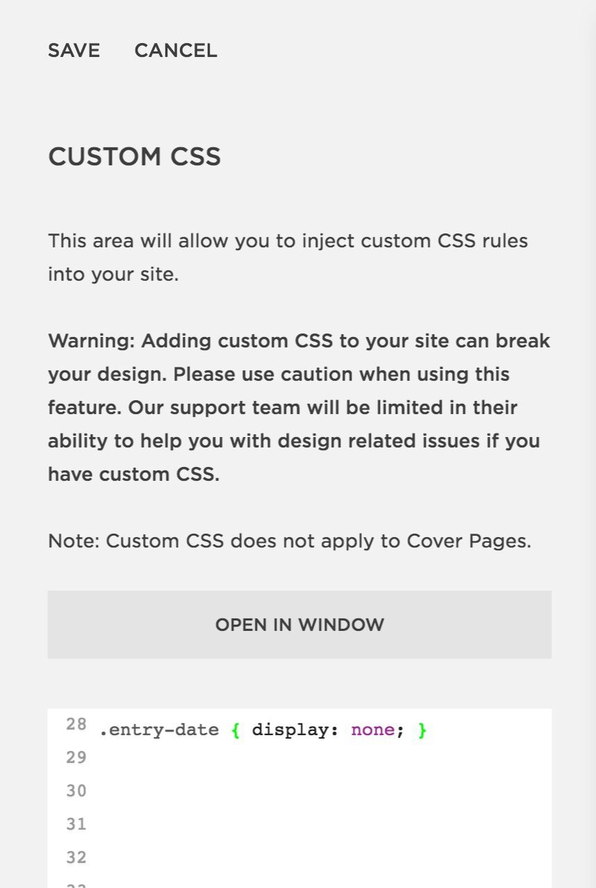
Watch the short video tutorial to see how I do it:
Hope this has been helpful. Thank you for watching!
Sophia

024: How to Create Multiple ConvertKit Forms on My Squarespace Page?
I took the cue from a facebook question to create a video tutorial showing you how to have three different ConvertKit form pop up from a button on the same page AND do this without Zapier.
Yes, you heard that right! Without using Zapier! And there's a detailed step-by-step video in the blog as well.
Hello there, my friend!
This is one of my first hurdles that I faced in Spring 2016 while setting up ConvertKit forms on my personal development website. I wanted to add three different ConvertKit forms to my homepage, each with a unique free download (also called content upgrade or lead magnet). Eventually I figured it out and have been wanting to make a video tutorial to show you as well.
Then, today in the ConvertKit Family Facebook, this question came up again:
".... I am creating a Resource page with different content upgrades... I'd LOVE for the ConvertKit form to pop-up on a button click...Has anyone does this?"
So I took that as my cue to create a video tutorial showing you how to have three different ConvertKit form pop up from a button on the same page AND do this without Zapier.
Yes, you heard that right! Without using Zapier!
Here's a video showing you step-by-step. But below you can also see an outline of all the steps:
Step 1:
Create your resource page with the three Content Upgrades (or more if you like)
It can look something like this:

Step 2:
Add the following piece of code under Design-> CSS on your Squarespace account:
/* CTA Button */
#cta-button-container {
text-align: center !important;
line-height: 3em;
margin-top: 30px;
margin-bottom: 30px;
}
#cta-button {
text-align: center !important;
background-color: #111111;
padding: 10px 15px;
padding-right: 15px !important;
color: #fff;
font-size: 14px;
text-transform: uppercase;
letter-spacing: 2px;
font-weight: 600;
display: inline-block;
}
#cta-button:hover {
background-color: #111111;
border: 2px #111111 solid;
color: #fff;
}
Step 3:
Customize the button colors above to match your brand color. You will see the color codes that I've made bold above. This is what you will need to change. To find out your button color code, go into Design and look for the button color there.
Step 4:
Create 3 different ConvertKit Forms. Make sure you have customized them (with the right freebie, tag/automation, sequence and so on). Make sure all three ConvertKit Forms you are using are MODAL forms.
All three of them must be MODAL forms. This is because you want them to popup from a button. (Modal means they will pop-up while inline means they stay on the page).
Like this in the picture below:
Step 5:
Add this bit of code under each content upgrade on your Squarespace page:
<div class="sqs-block-button-container--center"
id="cta-button-container">
<a rel="ck_modal" href="#ck_modal"
class="sqs-block-button-element--medium sqs-block-button-element" id="cta-button">
Download Here!
</a>
</div>
<p style="clear:both;">
</p>
So in other words, you will place the above code under each of the images on your resource page so it should visually look like this:

Step 6: Add the three ConvertKit Form Codes individually
Now we will make grab code from the three different ConvertKit forms and place them very delicately. Please watch the video if my text here is not making sense. Sometimes showing these things is easier than explaining in words for me.
Step 6.1: Resource # 1 - the First ConvertKit Form
Just copy the Java script and place it above the existing code. That's it. This is the easiest. You get that from EMBED section of your Form:
Step 6.2: Resource # 2 - the Second ConvertKit Form
For the second and the third ConvertKit Forms, you will grab the HTML code. You will also get that from EMBED section of your Form. But instead of Javascript, click on HTML.
Just copy all the HTML code and place it on your squarespace page where you already have some code in the code block. See the image below for a visual reference.

Step 6.3: Resource # 3 - the Third ConvertKit Form
Do exactly the same thing as in Step 6.2 for the third ConvertKit Form.
Just copy all the HTML code and place it on your squarespace page where you already have some code in the code block.
Step 7: Customize the Second and Third ConvertKit Form
Now this is where you will need to pull up your detail-oriented, laser-focus. Because now we will go into the Raw HTML that we just posted in the second and the third resource form, and customize it.
You are now doing this inside the code block on squarespace. This is where I will be making the corrections to the code.

Okay so now, you will change three parts in the code:
rel
href
id
Follow the steps below to see what I mean. (Watch video above if that is easier to follow).
Step 7.1 Let's start with Form No. 2
In simple words, what we want to do is to give a suffix to the modal forms so that Squarespace can tell the difference from one form to the other. This suffix will be added at the end in the three places. And it can be any term as long as it is the same in the three places.
First find this bit of code at the very top. You are looking for the form id. Then add any suffix you like. In my case I am adding "treehouse".
This is the code before
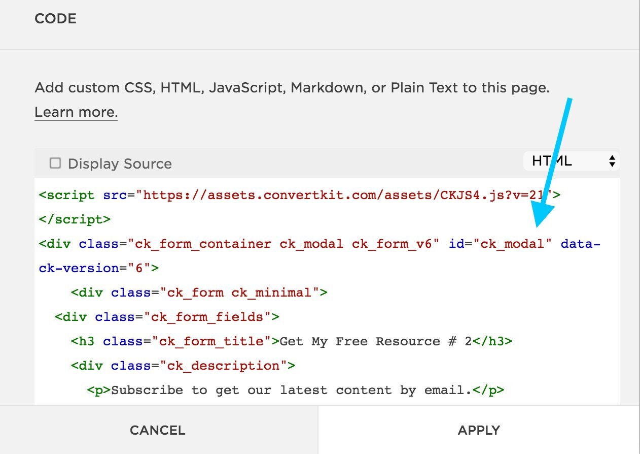
This is the code with the suffix added
Now scroll to the very very bottom. Find <a rel="ck_modal" href="#ck_modal"
And also add the same suffix there.
This is the code before

This is the code with the suffix added
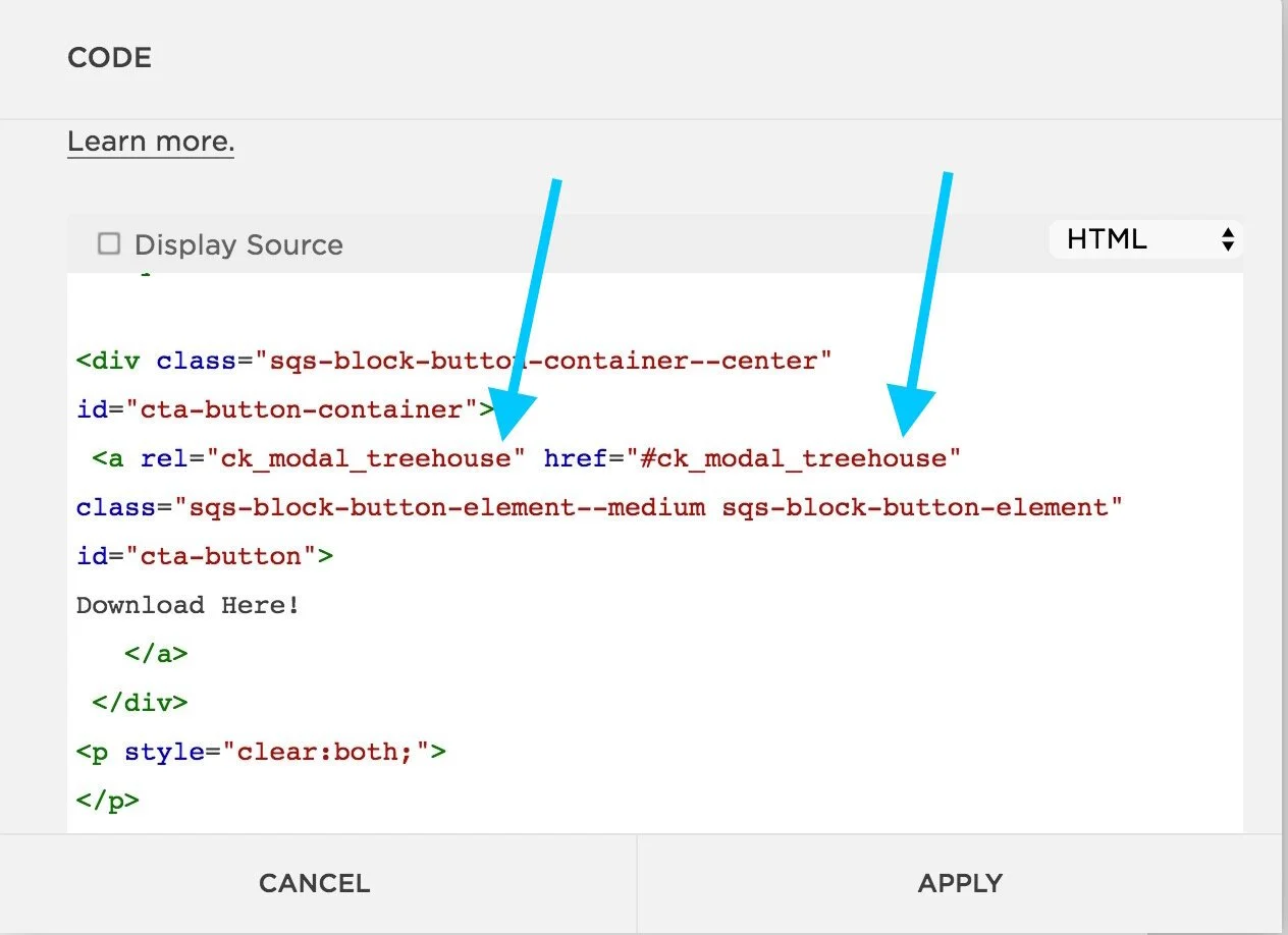
Step 7.2 Make sure to do the same actions in Step 7.1 for the third convertKit form. Just make sure you use a suffix that is different than what you used in the second form. I used "bigcat" for my third form - just because!
Step 8: Test!
Now make sure to test everything. There are a lot of pieces to this, so don't worry if it is not working the first time. There may be a tiny detail that you need to tweak and you will get it.
If after testing it and trying it out, you still can't seem to make it work, just drop me a line in the comments. I will be happy to help troubleshoot - my gift to you.
I want to thank my colleague Melissa Thorpe who taught me a huge part of the multiple optin form process and I also thanks Tors Grantham for teaching me how to make the button pop-up on Squarespace. You see, we are all constantly being helped! THank you for watching/reading this blog and be sure to share it.
PS: This blog post can be freely shared on social media. If you'd like to share it to with your readers inside a paid platform as a resource - please drop me an email to see what to write in giving credit!

017: How to Set Up a ConvertKit Pop-up Form or Exit Intent Form on Your Squarespace Site
This one is easy peasy and you'll be done in about 5 minutes - well, at least this video is less than 5 minutes. In it I show you, step by step, how to set up an exit intent form or a pop-up form on your Squarespace site.
This one is easy peasy and you'll be done in about 5 minutes - well, at least this video is less than 5 minutes. In it I show you, step by step, how to set up an exit intent form or a pop-up form on your Squarespace site.
Watch the Video below
Check the Display Settings
One thing that I didn't mention in the video is that because of new regulations from Google on pop-up forms for mobile, just make sure that you select "desktop only". Take a look at the screenshot below:

Well, my friend, I hope that you now can easily set up a pop-up form or exit intent form on your squarespace site using ConvertKit!
If you tried my steps, drop in your website link in the comments as I'd love to see what you have created.
Peace,
Sophia