
Simplify Your Life &
Align with Your True North
Choose Your Path
-

Simplify
-

Introspect
-

Quotes
-

Inner-Voice
-

One-Person Business
-

Financial Freedom

061: How to Add Video Clip in the Banner?
Demonstrating a message with moving images rather than just text is a powerful way to set the tone for your site. Adding a video clip to your website’s banner is one way to do that. It creates a certain mood for that specific page and it is easy to set up as you will see in this 3 min video.
How to Add A Video Clip in the Banner of Your Squarespace Website
Demonstrating a message with moving images rather than just text is a powerful way to set the tone for your site. Adding a video clip to your website’s banner is one way to do that. It creates a certain mood for that specific page and it is easy to set up as you will see in this 3 min video:
1| Create the Page You want the Video Banner on
Or if the page is already created, jump to step 2.
2| Click on the Wheel for the Page Settings
This is the icon next to the page name you see in the Pages Panel

3| Jump over to Media
Copy the url of the video you want to play and paste it there. Click save and check how it looks. If it appears narrow like a thin bar, then go into Edit and add a spacer to lengthen the banner. Check the video to where you can visually see how I do this.

Show us what you’ve created!
That’s it, my dear friend! It really is as easy as 1-2-3! I love seeing what you create so hop on down to the comments and show me what you’ve created!
Your Brand New Website!
Are you getting excited to get your own website? I love designing websites for fabulous people like yourself, so take action to get your website design process started —> Start the Conversation by sharing some ideas about your site with me and get a free 15 minute video consultation to discuss your website dreams.
Questions about this blog post? You can drop them in the comments below!
~Peace,
Sophia
Learn How to Build Your Website on Squarespace:

 Read More
060: Why is the Cart Icon Not Showing up in My Top Navigation?
After I design a website, my clients can still work with me by hiring me on an hourly basis. This blog+video is a direct result of a request my client had after I completed her site. I had created an e-commerce site for her that had a shop with multiple products. My client wanted to have the cart icon show up for her. But she found that to be not a simple click and activate situation. There was one more step to take care of.
If you are using any of the Brine Family of templates and have a product page but your cart icon is not showing up in Design and then Site Styles, then follow the simple step in this video to resolve it.
Why is the Cart Icon Not Showing up in My Top Navigation?
After I design a website, my clients can still work with me by hiring me on an hourly basis. This blog+video is a direct result of a request my client had after I completed her site. I had created an e-commerce site for her that had a shop with multiple products. My client wanted to have the cart icon show up for her. But she found that to be not a simple click and activate situation. There was one more step to take care of.
If you are using any of the Brine Family of templates and have a product page but your cart icon is not showing up in Design and then Site Styles, then follow the simple step in this video to resolve it.
1| Go to Commerce > Checkout
Uncheck “Express Checkout”.
2| Refresh page
You should now see the cart icon show up a) either in the navigation bar or b) as an option under Design> Site Styles> Header: Layout
3| Customize the icon or text
Change the color, size or type of icon as you like.

1| Go to your panel Commerce > Express Checkout. Then uncheck this option.
2| b) Click the drop down arrow and change from “Hide” to a position, for example “Top Right”.
Show us what you’ve created!
Again an easy 1-2-3 video. Let me know if you have other questions about this tutorial and I’d be happy to help!
Your Brand New Website!
Are you getting excited to get your own website? I love designing websites for fabulous people like yourself, so take action to get your website design process started —> Start the Conversation by sharing some ideas about your site with me and get a free 15 minute video consultation to discuss your website dreams.
Questions about this blog post? You can drop them in the comments below!
~Peace,
Sophia

I realized the power of meditation when I experienced intense pain
Last week, I had to undergo an unexpected surgery. An intense pain developed over the weekend which sent me straight to the Urgent Care who sent me to see a surgeon. The reason I am telling you this is because it happened just before my March 27th presentation which is all about navigating pain through meditation.
Now, I felt that I was fit to talk about this subject because I used to have extremely debilitating menstrual cramps for years before I began using meditative techniques to reduce the pain and stress. But life had a different plan.
Before the surgery was conducted, I went through excruciating pain over the weekend with nothing but my meditation practice and a loving husband to get me through it. Having never gone through anything like that before in my life, this was a brand new territory for me and a very potent learning ground. I hope to tell you more about the fruits of that experience in a future blog (or if you are in the Boone, NC area then on March 27th), but all I want to leave you with is this:
Meditation is not a luxury. It is a vital tool for navigating the real mess this life we live. Everything may be going well for you now so you may not feel the urgency of developing a meditation practice - I get it. We, humans, tend to do things only when we are fully convinced of its value. And if everything is going well for you right now, then that's really good. Take the opportunity of good conditions and practice meditation as much as you can.
It was when I could continuously place my attention on my breath, that I could feel relief from the intense physical pain. It was in those moments that I realized how far I still need to go in my practice. But I also became aware of how far I had come. Had I not been practicing meditation so far, the pain would have been completely overwhelming for me.
Meditation is a balm that you can apply now so you can handle any injuries in the future with ease and find relief from suffering.
Love,
Sophia

059: How to Activate Cart Icon in Your Top Navigation in Squarespace
One of the benefits of a Squarespace site is the ease of the shop functionality. You can have your digital or physical products on sale or you can sell your 1 to 1 services, online workshops (like I do) or coaching sessions.
Now if you want to have a cart icon enabled in your navigation, this blog + video is for you. In this example, I am working with the Rally template but it applies to any template within Brine.
How to Activate Cart Icon in Your Top Navigation in Squarespace
One of the benefits of a Squarespace site is the ease of the shop functionality. You can have your digital or physical products on sale or you can sell your 1 to 1 services, courses (like I do) or coaching sessions.
Now if you want to have a cart icon enabled in your navigation, this blog + video is for you. In this example, I am working with the Rally template but it applies to any template within Brine.
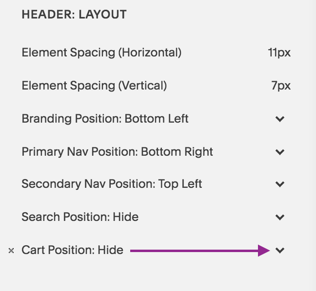
1| Go to Design > Site Styles
Hover over the top navigation and see if the Cart option shows up in the sidebar setting options. You will see under Header: Layout, Cart Position: Hide. Click on the drop down arrow and select the position you want it to show up. In my case, I chose Top Right.
If this option doesn’t show up, that means you need to create a product page with either digital, physical or services items.
Note: If you have a product page but still don’t see the cart option, then you need to disable “Express Checkout” in your Commerce> Check Out options. See how to do this in an upcoming video.

2| Go to Header: Cart
Under Header: Cart, you will see the options for customization show up. Choose from Text, Cart, Cart (alternative), Bag (alternative).
3| Choose Colors & Font to match your design

When you select “Cart”, you can customize these items: font size and style, color of the quantity and color of the quantity text.
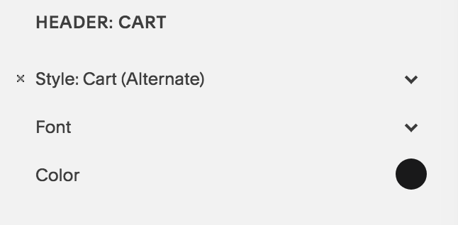
When you select “Cart Alternate”, you can customize these items: color of the cart icon, and the font size + type of the quantity text.

When you select “Bag”, you can change the color of the bag, and the font size + type of the quantity text.

When you select “Bag alternate”, you can change the color of the bag, and the font size + type of the quantity text.

When you select “Text”, you can change the font size and type and the color of font as well.
Show us what you’ve created!
That’s it, my dear friend! It really is as easy as 1-2-3! I love seeing what you create so hop on down to the comments and show me what you’ve created!
Your Brand New Website!
Are you getting excited to get your own website? I love designing websites for fabulous people like yourself, so take action to get your website design process started —> Start the Conversation by sharing some ideas about your site with me and get a free 15 minute video consultation to discuss your website dreams.
Questions about this blog post? You can drop them in the comments below!
~Peace,
Sophia

058: How to Create Double Top Navigation Layout in Squarespace
A double top navigation layout is a great way to separate out your links on the top of your site. This way you can create a visual distinction among your links and space out the links reducing navigation clutter. Watch the video below or follow the steps in the blog to create that look for your site on Squarespace.
How to Create Double Top Navigation Layout in Squarespace
Some links in your top navigation are important but you may not want them to take prime real estate. You may want them to take a secondary position but still stay easily found by your visitors.
How to create such a layout? Enter: the navigation bar above the top navigation.
A double top navigation layout is a great way to separate out your links on the top of your site. This way you can create a visual distinction among your links and space out the links reducing navigation clutter. Watch the video below or follow the steps in the blog to create that look for your site on Squarespace.
1| Go to Design > Site Styles
Hover over the Secondary Navigation to pull up relevant settings. Under Header: Layout, look for “Secondary Nav Position”. Click to choose “Top Left”. This will create its own bar on the top.
2| Primary Nav Position: Bottom Right
Also under Header: Layout, look for “Primary Nav Position”. Select “Bottom Right”.
3| Reduce Padding
Under Header Bottom: reduce the padding to get the right spacing between the new top bar and the Site Title
4| Change color of the White Bar
Click on the white bar. The settings for Header:Top will now show up on in the sidebar panel. Under Background, select the color you want the bar to have.
5| Hit Save 6| Refresh the Page & you are done!

Show us what you’ve created!
That’s it, my dear friends! I hope you will try this layout effect for your site. If you do, I’d love to see it. Drop a link to your page in the comments and share what you’ve created!
Your Brand New Website!
Are you getting excited to get your own website? I love designing websites for fabulous people like yourself, so take action to get your website design process started —> Start the Conversation by sharing some ideas about your site with me and get a free 15 minute video consultation to discuss your website dreams.
Questions about this blog post? You can drop them in the comments below!
~Peace,
Sophia

057: How to Change the Background Color of an Index Section
Are you ready for a little CSS fun? There’s a lot you can do with Squarespace websites and one of them is tweaking the design to create your own customized look - a look away from the templates that Squarespace offers. Today, I am showing you how you can change up the background color of a page or section in your Index collection of pages.
Are you ready for a little CSS fun? There’s a lot you can do with Squarespace websites and one of them is tweaking the design to create your own customized look - a look away from the templates that Squarespace offers. Today, I am showing you how you can change up the background color of a page or section in your Index collection of pages.
Have a look at this super quick video (less than 5 minutes) to see how it is done.
1| Identify the URL Slug of the section
As you will see in the video, the Navigation Title and the URL Slug of your page/section may not be the same. So you first need to collect the URL slug of the page you are targeting.
Notice that I will use the word “page” and “section” interchangeable as both apply in this situation. An Index is a collection of pages. Each page is called a section.
To find the URL slug, click on the wheel icon that is next to the Page you are targeting. Then look for the URL Slug and either copy it or memorize it.
Try and memorize it to train your memory skills - well that’s what I tell myself at least. You can always go back and check if you missed something and you will know that latest when the CSS code doesn’t apply to your section. That’s because the Code never lies! Okay, I am in a funny mood as I prepare this blog (I hope you don’t mind).

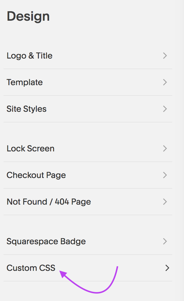
2| Go over to Design Panel
Armed with your URL slug, you will jump into your Design Panel. Instead of heading to Site Styles, go all the way to the bottom and click on Custom CSS. That’s where the magic instructions will be placed!
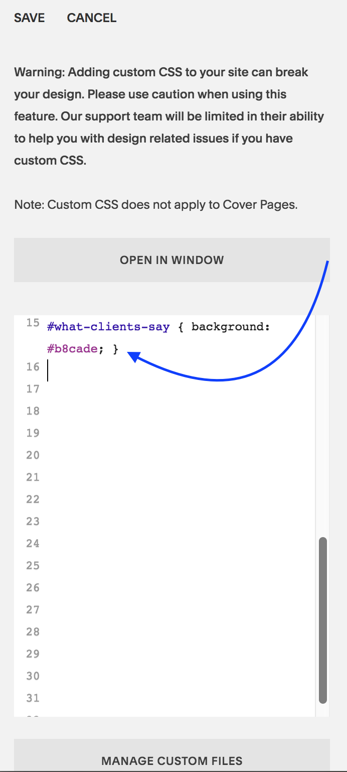
3| Enter the CSS code
Now you are ready to enter the CSS code which should look like this:
#what-clients-say { background: #b8cade;}
Here’s a quick breakdown. Everything after the colon ”:” is what you will be doing. I keep mixing colons : and semi colons ; as you will see in the video. I certainly hope my 8th grade English Teacher doesn’t find out! Hihi!
Enter: #
Next write the URL Slug: what-clients-say
Then open bracket: {
Then write: background
Add a colo: :
Write the hexcode of the color: #b8cade
Add in semi colon: ;
Close bracket: }
Click: Save
Refresh page to see the magic happen!
That’s it, my dear friends! I hope this quick fix pikes your interest in Custom CSS as it really is so so cool!
Squarespace always alerts its users that using Custom CSS code could “break” their website. That’s to be on the safe side. So, I too, am alerting you: Using Custom CSS can break your website. Use it only if you know how to employ the code correctly.
Al’right, that’s enough for disclaimers and such.
Show us what you’ve created!
Changed the background of a section of your Index? I want to see! I want to see! Drop a link to your page in the comments and share what you’ve created!
Your Brand New Website!
Are you getting excited to get your own website? I love designing websites for fabulous people like yourself, so take action to get your website design process started —> Start the Conversation by sharing some ideas about your site with me and get a free 15 minute video consultation to discuss your website dreams.
Questions about this blog post? You can drop them in the comments below!
~Peace,
Sophia

056: Squarespace Pricing Comparison: Which plan is right for your business?
Hopefully, you are convinced that Squarespace is the right platform for you and now you want to figure out which plan is right for you. Or may be you are still undecided and understanding the Squarespace pricing plans is the last bit you need to make an informed decision. In either case, this blog article is exactly what you need as I walk you through the different plans and show you how they differ from each other so you can make your decision quickly and easily.
Hopefully, you are convinced that Squarespace is the right platform for you and now you want to figure out which plan is right for you. Or may be you are still undecided and understanding the Squarespace pricing plans is the last bit you need to make an informed decision. In either case, this blog article is exactly what you need as I walk you through the different plans and show you how they differ from each other.
Note: This info is subject to change - so get the latest info on Squarespace pricing from their website.
Squarespace Pricing Plans
Here’s a run down of the 4 pricing plans and tips on how to decide if it’s right for you.
1| 4 Pricing Tiers
As of Feb 6th, 2018, Squarespace has 4 pricing tiers ordered within two categories: Websites and Online Stores.
Under Websites, there are two tiers:
Personal
Business
Under Online Stores, there are two tiers:
Basic
Advanced
It can be confusing how these 4 tiers are classified. So read the points carefully below and you will be able to choose the right one for your business in no time.
2| Each plan builds upon the former.
As you go up in the pricing tier, you get all the features that a lower priced tier includes. It is not always this logical in all business offers where sometimes a higher tier may omit something from a lower one and have something of greater value instead. That’s why it’s worth a mention here.
There’s a pricing hierarchy and so a plan always includes everything from the plan right below it. Personal plan is the lowest priced tier and it goes up all the way to Advanced. This visual makes it easy to see that:

3| Here’s what’s included in each plan
On the Squarespace Pricing page, you will see these 4 plans laid out in detail. I’ve made an at-a-glance visual that shows you all the features
For a larger view of this graphic, click on the image to see the details better.
4| Which plan to choose?
As you go about choosing your plan, the decision on which of the two categories to choose will depend on whether you plan to sell (receive money) on your site. If so, how much do you expect to sell in the first stages of your business. This will directly influence the category and the tier you choose.
Tier 1: Personal Plan (Website)
This is ideal for a solopreneur, artist or a small business or essentially anyone who wants to build a smaller site. This one is also good for those who simply want a online business card, meaning the most important info about their business is presented online without much changing content (although you can make updates anytime). It limits contributor access to 2 people only. (Contributors are anyone who would be accessing the back end of your site).
You can display a photo gallery, set up a blog page and have as many as 1000 pages that are mobile optimized. So for most use cases of a small business, this plan works well. But as soon as you want to sell an item (physical or digital), grow your portfolio of things to sell or collect payment for services rendered, you will need to move up to the next level.
Note: Some bloggers still have posts that say you can sell products on the Personal plan. This is now only possible on what is called a Legacy Personal Plan - the plan you had before Squarespace updated its pricing offers. What you see in this post is up-to-date info as of Feb 6th, 2019 but keep in mind this info can change as Squarespace may change their pricing at anytime. Whenever I make updates on the pricing, I will make a note using an *asterisk.
Pros of the Personal Plan
+ unlimited pages (1000 max)
+ free custom domain 1st year w/annual purchase
+ SSL Security
+ website analytics
+ 2 contributors
+ mobile optimized website
Cons of the Personal Plan:
- cannot sell products/services
- cannot add more than 2 admin contributors
- limited website analytics
Personal Plan Price:
If you purchase it month to month: $16/month
If you purchase an annual plan: $12/month
Total Annual cost: $144 to $192 per year
*Squarespace Authorized Trainers can pass on a 20% discount code to their clients. (I am one of them and my clients and workshop participants benefit from that discount). Plus, remember that you get a free custom domain for the 1st year when you purchase the annual plan - saving you around $20.
Tip: The Personal Website plan of Squarespace is great for small businesses, artists, individuals who want an online presence to showcase their skills, portfolio, writings and service descriptions. Those who want to receive payment for the goods and services online will need to skip this tier and look at the remaining three tiers.

Tier 2: Business Plan (Website)
The Business plan has a bit more of the bells and whistles that will take your business website a long way. You get everything in the Personal Plan and can start selling products, have an integrated business email (GSuite $50/yr), have an announcement bar on top of your site to draw attention to new happenings on your site, and can do third party integrations.
However, you do have a 3% transaction fee for each product/service sold. This is fine if you are only selling a few products a month. But as soon as you are selling boatloads, you will need to consider the next two tiers (e-commerce tiers of Basic and Advanced). On the Basic and Advanced, you will pay a higher monthly amount but will skip the per product transaction fees which is great.
Pros of the Business Plan
+ unlimited pages (1000 max)
+ free custom domain 1st year
+ SSL Security
+ advanced website analytics
+ unlimited contributors
+ mobile optimized website
+ professional email from Google
+ $100 Google Ads Credit
+ promotional pop-ups
+ fully integrated pop-ups
+ unlimited products & accept donations
+ mobile information bar
+ announcement bar
+ premium blocks and integrations
+ CSS and Javascript customization
Cons of the Business Plan
- 3% transaction fee per sale (Not really a ‘con” because this allows you to pay a lower monthly plan fee. Makes sense if the sales start off slow in the first few months. You can upgrade to the next tier anytime).
- doesn’t have the pros of the Basic and Advanced Plans (see below)
Business Plan Price:
If you purchase it month to month: $26/month
If you purchase an annual plan: $18/month
Total Annual cost: $216 to $312 per year*
*Squarespace Authorized Trainers can pass on a 20% discount code to their clients. (I am one of them and my clients benefit from that discount). Plus, remember that you get a free custom domain for the 1st year when you purchase the annual plan - saving you around $20.
3| Tier 3: Basic (Online Store)
This is the tier where no transaction fees comes in. For a few more bucks per month than the Business plan, the Basic plan lets you sell unlimited products/services without a transaction fees added on top of the fees from the payment processor such as Stripe or Paypal. You also get powerful commerce metrics to track your sales and inventory. And other e-commerce related features such as label printing, track inventory, add tax and coupons and sell products on Instagram.
This is a good online store tier for the perfect Goldilocks situation. Not as small as the Business Plan and not as big as the Advanced Plan. Just right! ;)
Pros of the Basic Plan
+ everything from the Business Plan
+ no transaction fees
+ unlimited products
+ mobile optimized website and checkout
+ powerful commerce metrics
+ inventory, orders, tax, coupons
+ label printing via ShipStation
+ integrated accounting via Xero
+ Checkout on your domain
+ customer accounts
+ products on Instagram
Cons of the Basic Plan
- doesn’t have the pros of the Advanced Plan (therefore it is a bit lower in the price).
Basic Plan Price:
If you purchase it month to month: $30/month
If you purchase an annual plan: $26/month
Total Annual cost: $312 to $360 per year*
*Squarespace Authorized Trainers can pass on a 20% discount code to their clients. (I am one of them and my clients benefit from that discount). Plus, remember that you get a free custom domain for the 1st year when you purchase the annual plan - saving you around $20.
4| Tier 4: Advanced (Online Store)
This is a full-fledged online store feature all the bells and whistles that Squarespace has to offer. You have more backend commerce features that make sense when you have a large shop selling a lot of items. You can also add gift cards and offer flexible discounts. And of course, no transaction fees - this really adds up with a large ecommerce shop.
Pros of the Advanced Plan
+ everything from the Basic plan
+ no transaction fees (like in the Basic plan)
+ abandoned cart auto-recovery
+ advanced shipping
+ flexible discounts
+ gift cards
+ orders API
Cons of the Advanced Plan
- a higher pricing tier than Basic (but no transaction fees and more advanced ecommerce management backend.
Advanced Plan Price:
If you purchase it month to month: $46/month
If you purchase an annual plan: $40/month
Total Annual cost: $480 to $552 per year*
*Squarespace Authorized Trainers can pass on a 20% discount code to their clients. (I am one of them and my clients benefit from that discount). Plus, remember that you get a free custom domain for the 1st year when you purchase the annual plan - saving you around $20.
5| Is hosting extra or included?
Website hosting is included with all Squarespace plans. This is great because you save time. You don’t have to shop around for the best hosting offers. And you don’t have to invest time in setting that aspect of your site nor will you have to invest money in a website designer to get that taken care for you.
This saves you anywhere between $5 to $30 or more per month depending on the needs of your business, the bandwith used and offers from the hosting companies. That’s between $60-$360 you save by going with Squarespace because they include hosting in their pricing already. Plus, no extra technical set up is needed.
6| Is a domain name included or extra?
I am super excited about the fact that you can purchase a domain name (your website url eg: sophiaojha.com) directly from inside the Squarespace dashboard. No more domain registration, IP address or nameserver updating! It really is just one click.
That will cost $20 per year for the domain and you can set it on auto-renew that way no need to worry about your domain name expiring and someone grabbing it. (This actually happened to a business owner friend of mine and so this is a real problem. He forgot to renew his domain name by just a day and already someone had purchased it and wanted to sell it back to him for a hefty amount).
+ Plus, you save around $20 for your domain in the first year because when you purchase an annual plan. So your domain name for the first year is free!
+ Also, you don’t have to worry about your domain name expiring because you can have Squarespace auto renew your domain each year automatically. You will just need to set the auto-renewal in the backend correctly (it is just a checkbox).
Tip: If you want multiple domains to point to the same site, for example: you want both sophiaojha.com and Highcountrywebsites.com to go to the same website, then you can do that too with great ease. All you have to do is to select which domain will be primary one.
So there you have it - all the details around the pricing plan on Squarespace. Remember you can always switch from one plan to another at anytime. You will find that a plan above Personal is most suitable for a business that sells products or gets paid for their services online. If you want a digital portfolio or an online resume (with no selling involved) and if you will not be collecting any emails, than a Personal Plan will be perfect for you.
Are you getting excited to get your own website? I love designing websites for fabulous people like yourself, so take action to get your website design process started —> Start the Conversation by sharing some ideas about your site with me.
Questions about Squarespace’s Pricing Tiers? You can always jump over to Squarespace and their excellent customer service team to clarify any of your questions. Plus, you can drop them in the comments below!
~Peace,
Sophia
Mindfulness for solving biz problems
Hello there,
This morning I conducted a live FB chat with my friend Julienne DesJardins for her FB Group Solorpreneur Strategy. We talked about how to use mindfulness to solve business problems and as a result grow your business and impact.
I'm sending out a worksheet with a mindful process and examples of how you can use it in real-life scenarios. If you'd like that, please fill out the form below. You will also be automatically added to my newsletter list from which you can unsubscribe at anytime. So here it is:
Please fill out the form with your contact and some of your current issues that cause emotional distress and mental anxiety or in general make you uncomfortable.
Thank you. If you have specific questions, please add them to the form above as well. I will be emailing you the worksheet in a few hours.
Peace,
Sophia
055: My top navigation links became un-clickable and this is how I solved it
I hope that you never run into the problem that recently rendered my top navigation links of my website un-clickable. It was a glitch that completely took me by surprise and even the Squarespace support could not solve it.
But after looking throughly at how I had things set up, I figured it out and fixed it. And today, I want to share it with you. I want to share it with you so that you can learn from this mishap and even if you never experience this particular problem, you will know how to think about solving your website problems on Squarespace.
How to Troubleshoot Glitches on Your Squarespace Website
I hope that you never run into the problem that recently rendered my top navigation links of my website un-clickable. It was a glitch that completely took me by surprise and even the Squarespace support could not solve it.
But after looking throughly at how I had things set up, I figured it out and fixed it. And today, I want to share it with you. I want to share it with you so that you can learn from this mishap and even if you never experience this particular problem, you will know how to think about solving your website problems on Squarespace.
Watch the video below to see the top navigation acting up and how I fixed it.

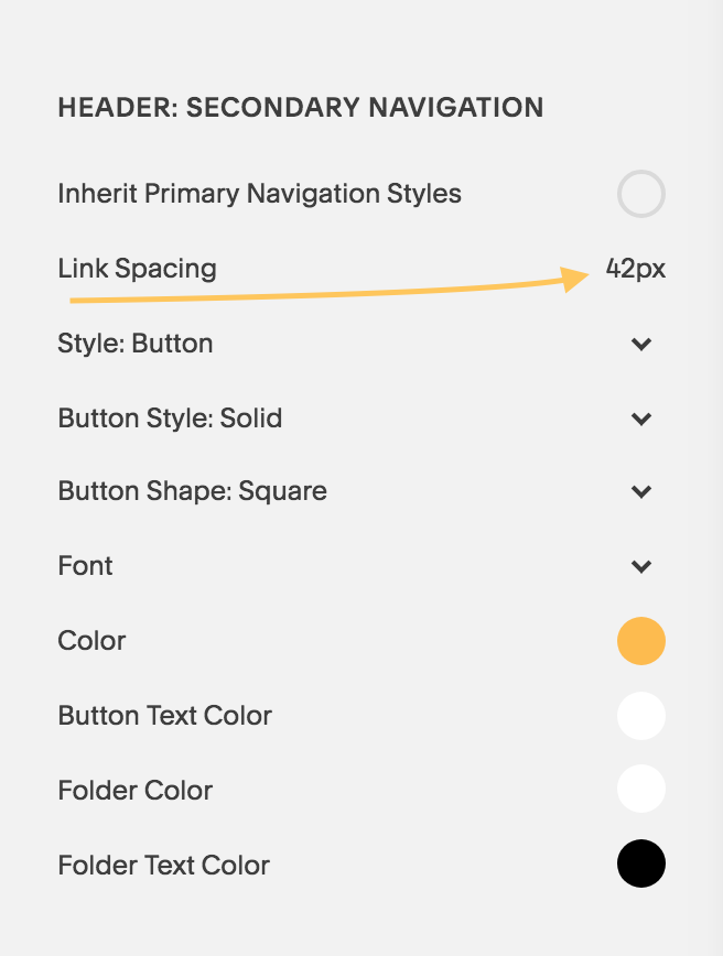
The Mysterious Problem: Top navigation links were un-clickable

So a couple weeks ago, I was updating my site with a new blog post and realized that the top navigation pages were functioning in a weird manner. When I hovered over each of them (see video as I recorded how it was acting) it was not clickable. I needed to hover slightly above or slightly below the links and then it would work. The interesting thing was that the secondary navigation page (Workshop in yellow button) was working fine.
I won’t go into the whole process of how I figured it out (the process included confusion, frustration, impatience, slight panic and removing every bit of code I had on my site to find out where the glitch was rooted).
But I must give appreciation to one of my Squarespace Authorized Trainer colleagues who pointed out that the secondary navigation was overlapping the primary navigation pages. He suggested some code to fix it, if all else failed.
I didn’t want to have to use code to fix a problem that shouldn’t have been there in the first place. I want to use code in scenarios where I want to create an effect to add to the visual aesthetic of the site or correct how something looks on mobile. However, the top navigation links should work by themselves!!
Well, I noted my colleague’s point carefully and kept his suggestion in mind as a last resort.
What You See Is What You Get?
To cut to the chase, I found out that my settings in the Site Style panel were affecting how my navigation links were working. It was the Link Spacing under HEADER: SECONDARY NAVIGATION that was at a crazy high number. As soon as I reduced the number down to 42, everything went back to normal!
So, it turns out that when adjusting the Site Style settings, I had played around with the Link Spacing. But I didn’t see any change visually right away and so I simply moved on. I did that because Squarespace is a WYSIWYG website builder. What this means is: What You See Is What You Get and any changes I make from Site Styles panel is usually visible right away. But for some reason, it was not working like that in this case.
This goes to show that What You See Is NOT ALWAYS What You Get!
The Solution: Looking carefully at Site Styles Panel
Sometimes, glitches like this can happen. And the remedy is to take a deep breath, go back to your settings and see which element is not showing a change and know that sometimes even when you don’t see a change in your Site Content Area while adjusting things in the Site Styles panel, things are actually happening. (Watch the quick video to see all of this demonstrated).
Well, my friends, I hope that you will take this message with you when designing your website on Squarespace. In the rare case you run into an issue like this, look at the Site Styles panel more carefully.
Let me know in the comments your thoughts on this and if you’ve run into an issue that doesn’t make sense. I’d be happy to have a conversation and guide you in the right direction.
Squarespace is a real fun platform to host your site on. And I love designing websites for fabulous people like yourself, so take action to get your website design process started —> Start the Conversation by sharing some ideas about your site with me.
Remember to drop your comments in the comments section below!
~Peace,
Sophia

054: Ten tools (free) for choosing your website color scheme
Did you know that 90% of an assessment for trying out a product is based on color alone? This data is according to Buffer and it’s one more reason why the color palette of your website holds über-importance.
That’s also one of the toughest decisions for me when building a website. Selecting the right combination of colors that will go on a website is essential for attracting the target audience of my client’s business.
The color palette should not only reflect the style, voice and values of my client’s business but it should also have a visual aesthetic that is attractive to the audience that my client wants to serve and speak with.
It’s not easy but I want to help to make this part of the website design process easier for you - with my favorite 10 tools.
Whether you are building your website from scratch or even tweaking it to fit a renewed focus or expansion of your business, these 10 tools will be of help. They have helped me at different stages of my web site design creation process. I’ve bookmarked them and they all open up in a new window when I am ready to work on a new website.
Ten tools (free) I use for creating a color palette
or a mood board for my client’s websites
1| Start with some inspiration
This blog on Canva comes in handy when you are just starting to brainstorm. When my clients send me info about their business and a selection of photographs, I already have made notes on the mood, the voice and the style the website should reflect. This blog gets my creative juices flowing as I am very visual and I find that looking at 50 curated websites based on style (ex. fun and professional or modern and clean or enon tones and sharp contrast), is quite helpful.
Blog: https://www.canva.com/learn/website-color-schemes/

Source: Canva.com
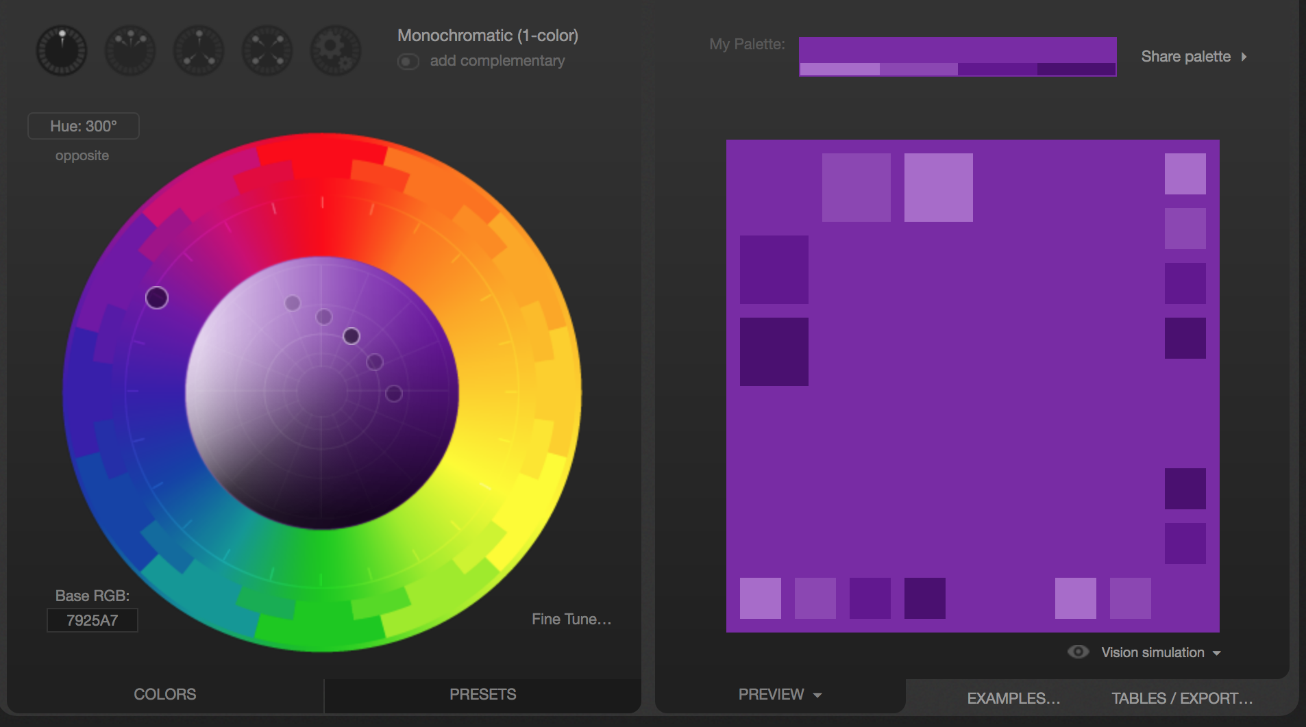
2| Play With the Color Wheel
After getting some ideas from Canva’s blog (point 1 of this blog), I jump over to Adobe Color Wheel Tool. First of all, it’s so much fun. But best of all, I can start with one hexcode (one color) and then see several combinations suggested by the tool. I can see Analagous, Monochromatic and so on (see image on the right).
Interactive Tool: https://color.adobe.com/create/color-wheel

3| Get Color Combos from Paletton
Now there’s yet another free tool that I may jump over to play around with my first round of selected colors. This one is also fun and if nothing, you get a nice color therapy just looking at the color wheel ;-)
Interactive Tool: http://paletton.com
Source: http://paletton.com
4| See Your Colors in Action
By now, I have selected my first draft of three or four colors for the website. Now I jump over to design inspiration.net to see how others have used it. Again, I like to see visually what has been done with my color selections to see if the look and feel is right
The cool thing about this tool is that you can plug in several of your colors (hexcode) and see what kind of creative things people have made. You will see everything from posters to photographs - there’s a lot to get inspired by.
Interactive Tool: https://www.designspiration.net/
Source: https://www.designspiration.net/
5| Ooh! Let the Fun Begin With this Color Palette Generator
This by far is my most favorite tool. And if you are a photographer or your site will be very image heavy, this tool might be your very best friend when it comes to selecting colors. Watch the video to see this more precisely but all you do is drop your photo and this generator will spit out 5 colors selected from the photo. I think this one has the most fun-factor, at least for me!
Interactive Tool: https://www.canva.com/color-palette/

Source: Canva.com
Notice that each of these tools and resources serve a different facet of the color palette creation process. One may be for picking hues that complement each other, while another tool will convert your rgb data into a hexcode. So they are all essential in your website building toolbox. Watch the video where I am more specific about these.
6| Change RGB to HEX Code and more
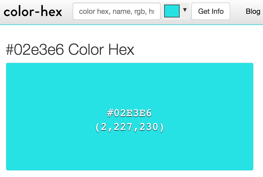
This tool is one of the earliest tools I ran into back in 2014-2015. You will see in your Squarespace backend that there are tons of colors that show up in different color models such as rgba or hsl. This interactive tool is very handy because you can copy that rgb (168,138,212) from the Site Styles panel of your website. Then drop it into the site and color-hex.com will shoot a page out with not only the Hex code (ex: #A88AD4) but also give you a host of other resources - such as hues, tints, analogous colors, triadic colors and so on. So go take a look.
Interactive Tool: https://www.color-hex.com/
Source: Color-Hex.com
7| Use This Tool to Convert a Hex Code
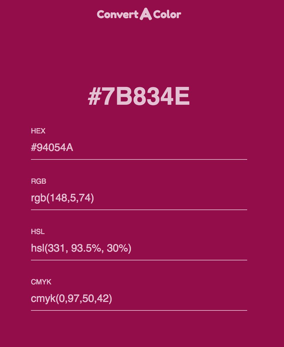
This tool makes it easy to convert a hexcode into different color models such as RGB, HSL and CMYK. This may especially be relevant if you are working with printers and graphic designers.
Interactive Tool: http://www.convertacolor.com/
Source: Convertacolor.com
8| Pick A Color You Like Straight From A Website
This one is a real help. It’s not an interactive tool like the others. Instead it is a Google Chrome extension and once you install it, it sits on your toolbar ready to work with a just a click. When I see a website with a color scheme that I really like, I use my color picker to learn what these are. This is very good for learning from other designers, especially my esteemed colleagues who are also Squarespace Web Designer or Authorized Trainers.
Interactive Tool: http://www.colorzilla.com/

Source: Colorzilla.com
9| Another Fun Tool To Choose Colors for Your Palette
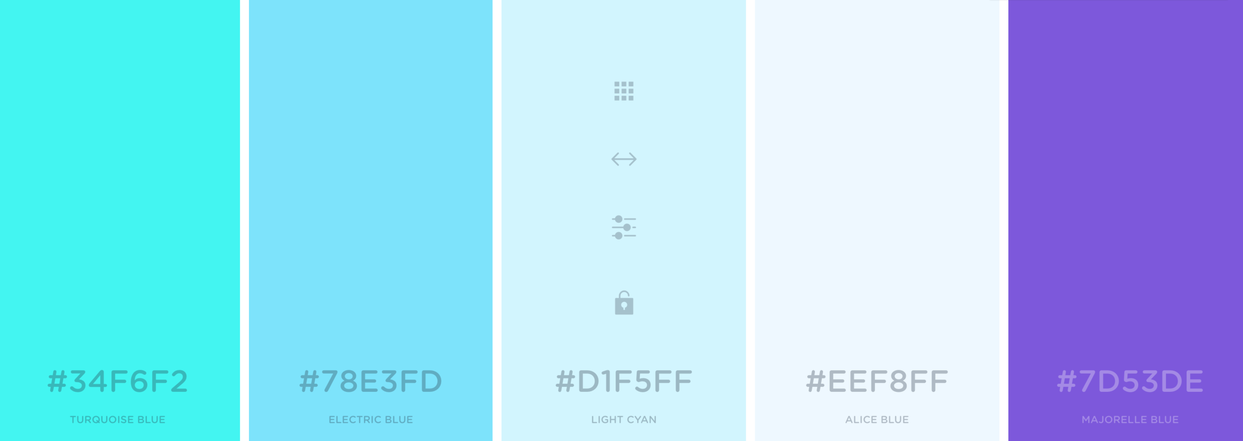
This is a fairly new tool that I have only known for a few weeks now. This tool has two features I like. 1. When you use the “Generate” feature, you can select a color, lock it and then hit spacebar to see other color combinations suggested. 2. You can go to the “Explore” section, plug in the hex code of let’s say the main color in your palette and then the app will show you color palettes that contain that color. I haven’t had used the “Explore” feature much but it’s worth a try.
Interactive Tool: https://coolors.co/
Source: Coolors.co
10| Time To Create The Moodboard
A moodboard is a collection of images, colors and fonts that designers put together for their clients as they begin their website design process. It give a quick snapshot of how the design style that the site will evoke.
If you are building a site for yourself, you may be tempted to skip this step. But there are at least two reasons why this will come in very handy. 1. When you are designing complementary design materials such as a business card, brochure, or social media graphics. 2. When you are working with a graphic designer, marketing team or redesigning your site with a web designer. In both scenarios, having a moodboard handy will help speed up and make thing easier for yourself and whoever you are collaborating with.
ProTip: If you are getting your site designed by a web design professional, make sure to get the moodboard file (PDF, .jpeg or .png) as one of the deliverables from your designer. (This could be during or at the end of the web design creation process - based on the style of your designer).
Interactive Tool: https://www.sophiaojha.com/canva (affiliate link)

Source: Moodboard I created on Canva.com for a recent client. This is a screenshot of my Canva account.
Bonus Tool: ColourCode by Toptal
This is a tool that I had fun checking out as the colors change based on the position of your cursor. It’s by a firm called Toptal and is a completely FREE, web-based color design tool. It’s an all-in-one color design tool where you can find different palette categories (analogic, triad, quad, etc.), multiple conversion colors, and even download your custom palette.
Interactive Tool: https://www.toptal.com/designers/colourcode

Are you getting excited to get your own website? I love designing websites for fabulous people like yourself, so take action to get your website design process started —> Start the Conversation by sharing some ideas about your site with me.
Each week, in my blog, in my free live trainings or in my video tutorials, I show you more things you can do on your Squarespace website without spending an extra dollar. So sign up to my weekly emails that I send out on Thursday mornings so you are always be informed when the next blog/video tutorial or free live training is coming out. Just go on over to —> Squarespace Tips and sign up!
Questions about this blog post? You can drop them in the comments below!
~Peace,
Sophia
This is what you can expect from me in 2019!
This new year is potent with new possibilities. Know that as each week goes by, I will be creating new opportunities for you to learn, grow and take your business to the next level.
I recommit to my goal of helping you transform your Squarespace Website into a revenue-generating business asset. Here's a glance at what's in store for you this year from me at sophiaojha.com.
Live Paid Online Workshops
I will continue to conduct live workshops to help you make the most of your Squarespace website. At the moment, I am offering two workshops: Squarespace Fundamentals (for the new website owner who wants to learn how to build their Squarespace website) and Create a Website that Converts (for the more advanced website owner who wants to sell more products/services and build their emails lists via their website).
Learn more about current workshops here.
Weekly Blog + Video Tutorials
Each week, I will publish a blog post on some aspect of using your Squarespace platform. It will include a written article but my aim is to include a video tutorial because I find that some things are easier demonstrated via video than described in words.
Influence the content I create by sending me your requests here.
Weekly Live Free Online Trainings (May 2019 Update: Monthly*)
Starting in April 2019, I will be adding live online video trainings on a focused topic related to building your business website on Squarespace. In these live trainings, I will give you a walkthrough of that specific skill from the backend of my website dashboard and you can ask questions live during the training in the chat comments. I am really excited about these live sessions!
Request a training on a specific topic by sending them here.
*Monthly: I got ill, needed surgery and recovering from it all took 6 weeks. So I missed the April start date but still made my first live training happen in May. But I lost so much time that doing it weekly was not feasible. I decided that monthly makes more sense given all the blog + video content I want to create consistently and the web design projects + web maintenance projects that I want to do for my clients.
New, Redefined Design Process & Packages
In the new year, I am putting in place new and redefined website packages along with a brand new streamlined client onboarding process so that clients who hire me to build their sites will experience a smooth, streamlined process. They will always be up-to-date about all the details about their project with clear timelines, action steps and results. I can't wait to work with business owners and individuals and create their stunning new online presence a.k.a. their websites!
To begin the process of working with me click here to get the conversation started.
Well, I hope this gives you a little glimpse into what you can look forward to from me in the coming year. My new year's wish for you is to thrive in your endeavors and find fulfillment and a sense of contentment in your life.
I am excited for what you will create and how you will thrive in the coming year.
Thank you for letting me part of your journey!
With love and gratitude,
Sophia

053: How to build a landing page on Squarespace for a "survey"
Last week, I talked about the one thing you absolutely must do to understand your audience. And that’s asking them what their challenges are. In blog post 052, I outlined the six things I did to make it easier for my audience to respond to my One question aka “survey” that includs creating a landing page and setting up a form on that landing page on my Squarespace website. Today, I will show you the step-by-step on how to technically set all that up on your Squarespace website.
Last week, I talked about the one thing you absolutely must do to understand your audience. And that’s asking them what their challenges are. In blog post 052, I outlined the six things I did to make it easier for my audience to respond to my One question aka “survey” that includs creating a landing page and setting up a form on that landing page on my Squarespace website. Today, I will show you the step-by-step on how to technically set all that up on your Squarespace website.
Watch the video tutorial in which I walk you through all the steps:
1| Create a page under the “Not-Linked” section.
Go to your Squarespace backend and to the Pages panel. Go to the Not Linked section. Click the + sign. Create a new page.
Make sure you give it a good URL. I like to use: /oneq
The reason you are putting this in your not linked section is so that the page is not crowding your top navigation or your footer navigation. The page will still be live and visible to anyone who has the link to that page. But it is not navigatable (is that a word? If not, it should be ;) from your home page. It is not linked but a live page.
2| Add a banner image and a headline to the banner section
2.1 Click the wheel of your newly created page.

2.2 Click Media and then upload the banner to the blog as shown in the image to the right.

2.3 Now add the text to the banner section.
Click the sideways teardrop for the line to appear and then pick the text content block and start typing.
3| Create an intro text with a headline
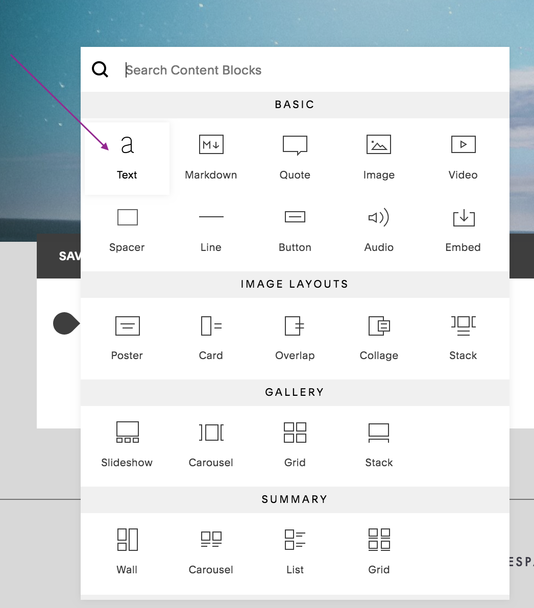
This is how it looks when you’ve got the text entered —>

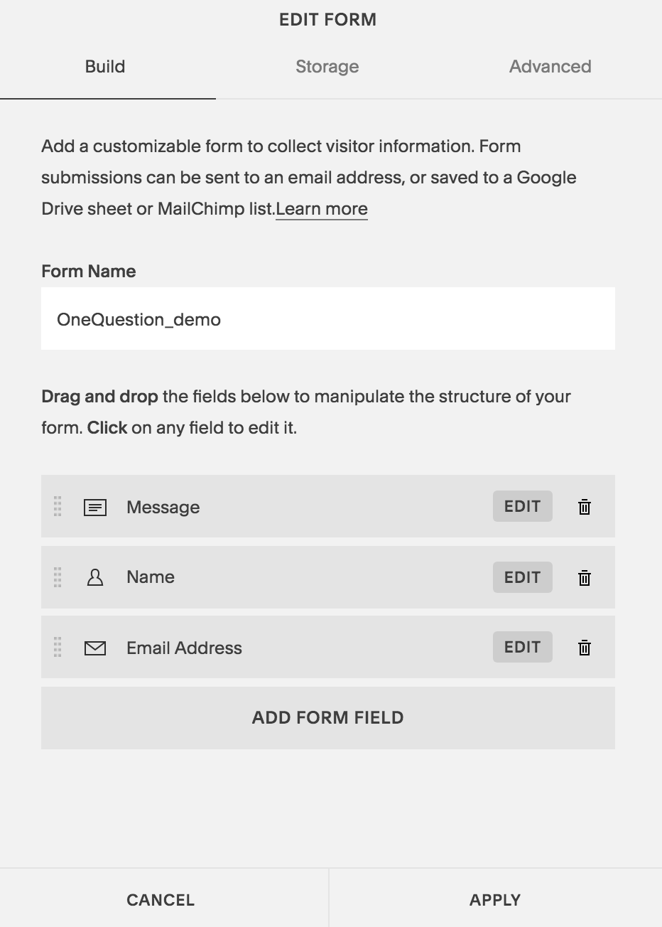
4| Create a form that has your one question
First, select the form block:

Move the Message section to the top, make sure name and email address input fields are there. You can make the Name field optional if you like. (I like to do that to give anonymity to my readers and thus, removing a barrier for them, if it is a barrier!).
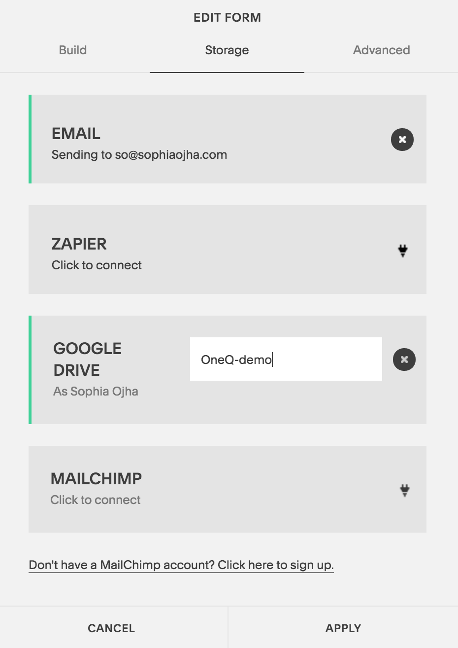
5| Connect it to your Spreadsheet in Google Drive and your email
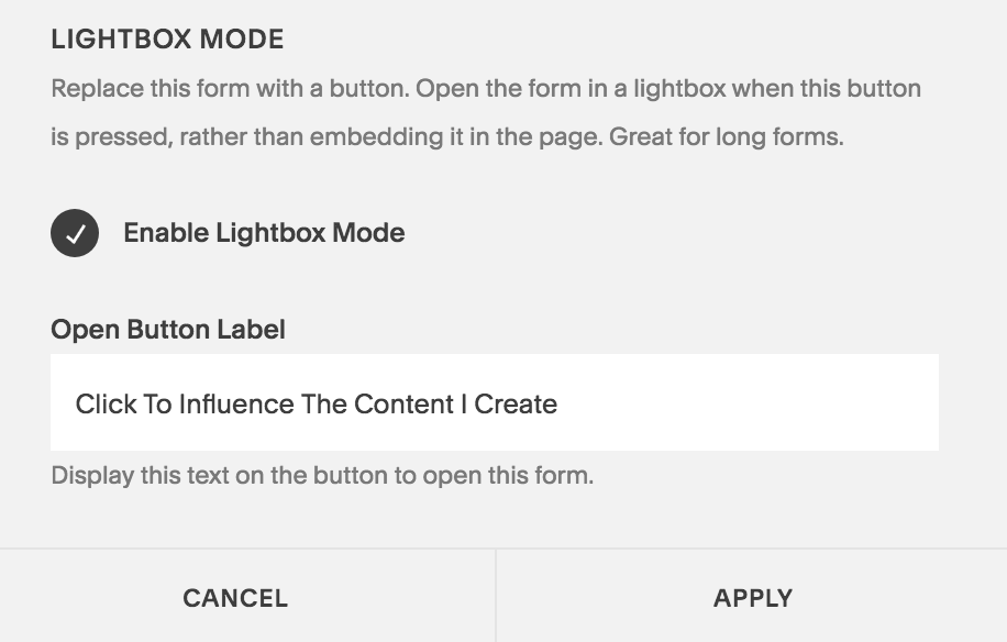
6| Make it a button (This is a cool trick - so easy but I see it used so infrequently).
Basically, you make sure to check off the Enable Lightbox Mode. And then add a text under “Open Button Label”. This will turn your form into a clickable button.
Then, add spacers on both side of this “form/button” and center it.
7| Write your email and link it to the “One Question” page.
I like to keep the email short. For an example, of the email text, jump over to Blog 052 where I show you the exact email I’ve sent out to my list.
That’s it. Now, not only do you know what to do but how to do it on your Squarespace website. So go and make it happen - you can do it in less than 15 minutes if you following these 7 steps.
You can do so much with your Squarespace website without needing to purchase a million third party apps. Sure you can get Leadpages or embed a Typform or SurveyMonkey. You can do all of that but you can also keep things simplified and make the most of the resources you already have. Well, that’s my idea of keeping things simple and bootstrapped.
And I will show you more things you can do on your Squarespace website without spending an extra dollar in the coming weeks and months. So sign up to my weekly emails that I send out on Thursday mornings so you are always be informed when the next blog/video tutorial or free live training is coming out. Just go on over to —> Squarespace Tips and sign up!
Also, I love designing websites for fabulous people like yourself, so take action to get your website design process started —> Start the Conversation by sharing some ideas about your site with me.
Questions about this blog post? You can drop them in the comments below!
~Peace,
Sophia

052: Do this One thing to get to know the real needs of your audience
Do this one thing to get to know the real needs of your audience: Ask them!
For the longest time, I thought that understanding my audience meant researching the type of questions my target audience is asking on online forums, in Facebook groups and on blog comments of other businesses. But I didn’t look at the golden opportunity that lay right at my finger tips - my own email list.
Today, I will show you the exact email I sent to my email list to get to know their real challenges and I invite you to emulate it in your business.
Watch the video below:
I didn’t ask my email list because I felt that it was too small and I needed at least such and such number (most marketer’s throw the number 1000) of subscribers in order to get any real results. But that really is not taking your list seriously. Whether you have 5 people, 500 people or 5000 people on your list, these are real people and a certain outspoken group will respond to you.
You, too, may be in this boat where you think your list is too small to send them a survey or ask them about their challenges. But that’s really not giving importance to the folks who are actually there on your list. If you think 40 is a small number, imagine 40 people in your living room all present there because they want to hear what you have to say. That means something!
Follow these 6 Steps below to make it easy for your audience to respond to you:
So just before Thanksgiving, I sent out an email to the people on my list asking them what their real challenges were in their business. Here are four things that I want to point out about that process.
1| I only asked one question.
In the email I sent, I asked my readers to simply answer one question about their current business challenges. People can always write more and I had some folks write multiple paras. But having one question lowers the barrier to respond and you rather get a short, quick response than no response.
The question I asked was: “What video tutorial, workshop or articles would be helpful to you right now?” That’s it. One Question.

2| Surveys are Intimidating. ‘One question’ is inviting.
I didn’t call it a Survey. I called it "One Question”. I didn’t ask them to fill out a survey but just one simple question. This feels un-burdensome, light and fun. In the subject line of my email it just says, “One question” not, “Please fill out this survey”.
May be it’s just me but I run from surveys. However, I have filled out tons of them helping my fellow entrepreneurs whenever they ask me for feedback - it’s all in how things are phrased. I always want to be of help so when they ask for my help, I am happy to fill out “surveys”. Knowing my dislike for surveys, I decided to just skip that word all together. The reader knows what we are talking about without calling it a ‘survey’.
3 | I made a lovely landing page.
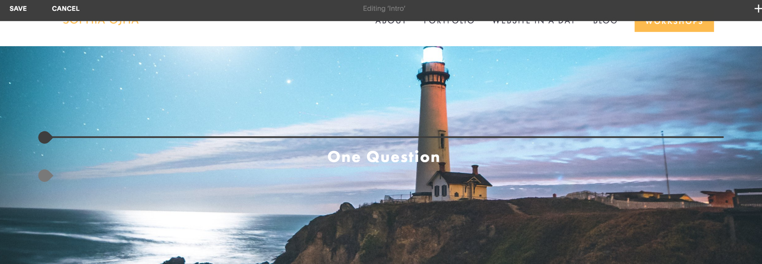
Finally, I created a nice landing page with just that One Question and added the link to that page in my email. This creates a nice custom user-experience and keeps folks on your website while they answer your question.
This is what it looks like when it is all done.
4 | I used a form.
Often I get emails inviting me to simply “hit reply” and answer back. Now that may work for some readers who will just write you an email reply. But for many that is a bit intimidating. Having a form instead is more inviting I find, personally. Also on the form, I make it optional for folks to write their name and email which gives a sense of anonymity which writing an email doesn’t.
On Squarespace, you can simply use the in-built form and link it to a Google Spreadsheet. Or you can go even more fancy and use Typeform which gives an awesome user experience to your audience. I used a form and it looks like this:
If you’d like to share with me your business challenge, and see the landing page, go on over to the live page and add your thoughts to my One Question: sophiaojha.com/oneq
5| The One question is open-ended.
As you can see in the screenshot below, I asked the question but kept it open-ended. Folks can write as much or as little as they wanted. This is good because it’s open and unrestrictive. Structured questions certainly help guide the reader but having several open questions let’s the reader answer to the question that best resonates with them.

6|I created a virtuous cycle with my request.
I asked my readers to help me create content that would be useful for them. So I framed it in a way that they knew clearly that they were helping me. But I also stated that this would ultimately help them. They are helping me help them, thus, creating a nice virtuous cycle that benefits all.
As you see on the landing page, I titled the section with this headline:
”Your Unique Opportunity To Direct The Content I Create”. That sounds exciting because now with their responses, my audience is telling me what they need help with and what would truly benefit them which is a true win-win.
Here’s the exact email copy I wrote to my readership. Use it to inspire your own version:

Asking your audience what they really want is a surefire way to get to know your audience. Yes, not everyone will respond. But those who respond will give you nuggets of insight that will prove invaluable.
Here you see the landing page, the form and the email - so go ahead, give it your own spin and ask away.
Do share with me in the comments how you are getting to know your audience and what you think of this blog post!
~ Peace, Sophia
Mar Startari-Stegall - Poet & Performing Artist
When it comes to technology, I am a frightened deer at the edge of the meadow. Sophia’s patience, understanding, compassion and, most important of all, her knowledge and speed with web design, have turned me into a lion. She will thoroughly prepare you beforehand and give comprehensive support the week afterward. With our co-creation of my website, I feel like I am finally a member of the 21st century cyber-society. I highly recommend her services for anyone of any age or computer skill level.
Kind words from a client that give fuel to one’s work every day:
When it comes to technology, I am a frightened deer at the edge of the meadow. Sophia’s patience, understanding, compassion and, most important of all, her knowledge and speed with web design, have turned me into a lion. She will thoroughly prepare you beforehand and give comprehensive support the week afterward. With our co-creation of my website, I feel like I am finally a member of the 21st century cyber-society. I highly recommend her services for anyone of any age or computer skill level.
- Mar Startari-Stegall boonebarndog.com
Almaz Wilson - Visual Installation Artist
Taking the online workshop with Sophia was excellent. Step-by-step, she showed me how to create the best possible platform for my work & helped me make a plan for the site I envisioned. If you are looking to work with someone who can articulate clearly and direct you through the web building process, work with Sophia!
Kind words from a client that give fuel to one’s work every day:
Taking the online workshop with Sophia was excellent. Step-by-step, she showed me how to create the best possible platform for my work & helped me make a plan for the site I envisioned. If you are looking to work with someone who can articulate clearly and direct you through the web building process, work with Sophia!
Almaz Wilson of almazwilson.com Gainesville, Florida, USA

051: Asana Vs. Trello: Which productivity app I use in my business.
Recently, I took my annual three week break to rest and rejuvenate and c oming back from the break was a challenge on top of dealing with a massive jet lag from a 25 hour flight around the world. So I jumped into my Google Calendar and my handy-dandy paper notebook/calendar to start jotting down my upcoming projects and tasks. But I yearned for a unified system, a mothership of sorts for all my tasks, goals and projects. What I found from my afternoon of playing around with two apps on my shortlist is that I totally love Asana. But not so fast. You will see the reason why Asana is my preferred productivity app.
Best productivity app for your business: Asana Vs. Trello
Recently, I took my annual three week break to rest and rejuvenate - the importance of which I learnt the hard way back in 2017. On my return, one thing was top of mind for me and that was getting my business activities organized and get even more efficient.
For that reason, I jumped into my Google Calendar and my handy-dandy paper notebook/calendar to start jotting down my upcoming projects and tasks to get organized once again. This led me to want a better way of dealing with my projects. Having some things digital and some thing on paper was just not going to cut it anymore. I wanted to have a unified system, a mothership of sorts for all my tasks, goals and projects.
What I found from my afternoon of playing around with two apps on my shortlist is that I totally love Asana. But not so fast. You will see the reason why Asana is my preferred productivity app.
In this video, I walk through the two systems (Asana and Trello) and show you how I set up my productivity app of choice:
So which productivity app should you go for?
I've worked with Basecamp, Asana, Trello and Freedcamp at different times in my business. While all of these apps have their pros and cons, I am going with Asana for all my business projects and tasks.
1 | Board Vs List View
In Trello, you can only have your tasks listed in a Board view. It uses Kanban system in which you can drag and drop your tasks from different columns. This allows you to have a visual of the progress you are making in your work. Like this:
Kanban Progress System in Trello:

In Asana, you can choose whether you want list view or board view. You must decide that before you set up your project because you cannot switch back and forth between list and board views. There is a workaround for this which I lay out in the video. But essentially, you have a choice and that’s what primarily won me over to Asana from Trello.
Board View in Asana:

List view in Asana:

2 | At-A-Glance View of Tasks
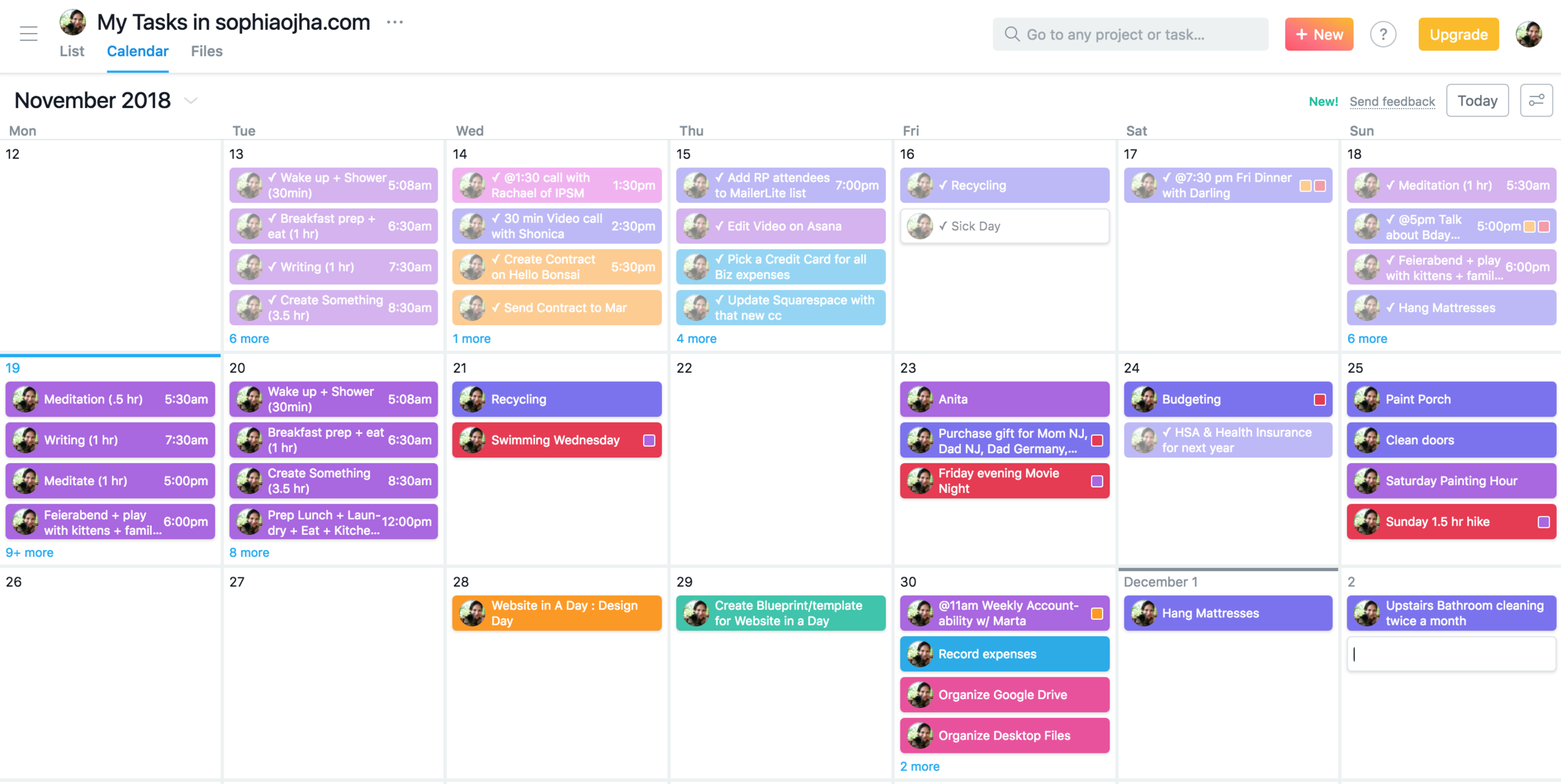
When you are using a productivity app day in and day out, it needs to have versatility to fit your individual needs. I find Asana to fit my need to have an at-a-glance view of all my tasks on a particular day from all my projects. You can sort them based on “today”,” upcoming” or “later”. So there’s a tab on the sidebar called “My Tasks”. When you click on it, you will see all your tasks across all your projects. So it looks like this.
At-A-Glance View of All Tasks Across Multiple Projects
In Trello on the other hand, one has to go into each and every project to see what tasks are upcoming. You can see all your projects on the home dashboard but I don’t find that useful since I still need to click into each project. This may work for teams who are really project-based. But for solopreneurs such as myself who essentially are running all parts of their business or delegating only a small part, then Asana’s “My Task” view is more helpful.
All Project Boards At-A-Glance In Dashboard
3 | Synching up with Google Calendar
What I appreciate in both Trello and Asana is that you can synch up your projects/tasks with Google Calendar. In the video above I show you how to do that in Asana. And it is practically the same process for doing it in Trello as well.
This way, whenever you are planning out something and open up Google Calendar, you can get a calendar view of everything in one place. I do think I will stop using this feature as Asana has a very nice Calendar view as well of ALL my tasks. But while I transition from Google Calendar, the sych up feature comes in handy. Also this is very useful when you are on the go and can look at your Google calendar on your phone. (Asana has a nifty app for your phone as well).
This is how Google Calendar looks when syched up with “My tasks” from Asana:

Asana’s Calendar view is quite attractive as well
The pros of using the Calendar feature in Asana is that all your projects are color coded and you can also see the colors of any tags you may have added to your tasks.
To get the same effect in Google Calendar, you will need to synch up each and every project/Team individually into Google. Doable with some patience! :)
Which Productivity App Will You Use?
So there you have my top three reasons why I like to use Asana (although Trello was quite up to par on point no. 3!). I am now using this daily and it’s the first thing I open up when I get to work each day. I love the feeling of a clear mind because I know all my tasks and projects are down on paper…well, actually…digital paper. (I still use a notebook or project paper for brainstorming processes). And I don’t have to store them in multiple places. I must admit, having my entire system set up on Asana has radically increased my productivity which is after all why we have a productivity app to begin with, right?
Running a website design business involves tons of small details and juggling many parts of both personal and business life. I am excited about my new system and I hope you found some inspiration to set up yours as well.
Let me know in the comments which feature of Asana or Trello you like. Or if you use something else, share why you went for it as well!
~ Peace, Sophia
Kathleen Kramberg - Non-Profit Organization
I am completely new to building websites and Sophia’s workshop was exactly what I was looking for to help get me started. I really liked the interactive parts and the resources she provides after the training have already been invaluable. She’s also available to answer any questions that may come up later. I highly recommend her workshop.
Kind words from a client that give fuel to one’s work every day:
I am completely new to building websites and Sophia’s workshop was exactly what I was looking for to help get me started. I really liked the interactive parts and the resources she provides after the training have already been invaluable. She’s also available to answer any questions that may come up later. I highly recommend her workshop.
Kathleen Kramberg San Diego, California, USA
Chelsea Carbary - Coach
This workshop was excellent! Sophia provided great foundational training and answered all my questions in an easily digestible way. She also includes 20% off your Squarespace purchase, email and video support following the workshop, and super helpful resources that make building your own website much easier.
Kind words from a client that give fuel to one’s work every day:
This workshop was excellent! Sophia provided great foundational training and answered all my questions in an easily digestible way. She also includes 20% off your Squarespace purchase, email and video support following the workshop, and super helpful resources that make building your own website much easier.
Chelsea Carbary of chelseacarbary.com Issaquah, Washington, USA

Create Your Happy New Year!
Here’s something more important than resolutions, action plans and goals - create your happy new year using my suggestions to make your dreams come true.
The New Year brings the energy of a fresh start. Like turning to a crisp blank page in your notebook or walking on untouched sand or making the first brush stroke on a blank canvas, we have a brand new year to do, create and be that which we want. Resolutions and plans are a great way to anchor those new goals. And I certainly have done my share of those in the past. But it has not always worked for me because the focus of those goals was too much on an end result and nothing else.
Instead, this is what works for me:
Starting with the question, "How do I want to feel in 2019?", I journal whatever answers come up. Then, from there I identify what action steps will help create those feelings for me. And then schedule it as a task in my calendar which puts focus on what actions I will take rather than the end result I am aiming for. When you take those actions on a consistent basis, you start to get inspired, you build your confidence and enjoy the process. And often, you enjoy the process so much that the end result becomes irrelevant. This lightness about it all then makes it all the more possible that your goal, the end result you are wanting to create, actually comes to fruition in your life.
Putting it into action:
For example, one of the things that came up when I asked, "How do I want to feel in 2019?" in my recent introspective break was this: "I feel that my home is utterly neat, clean, bright, minimal and streamlined". Then I ask myself what action steps will I need to take because a neat, clean, bright, minimal and streamlined home will not just appear to me sometime magically in the year! I wish ;-) Well, the answer was: On Saturday mornings, take an hour or so to clean out the pantry and for caring for the home. Now this action step goes straight into my calendar as a weekly action step. And each time, I complete that task, I will get the feeling I was going after in the first place. This then goes on to have a cumulative effect week by week which will result in a continuous feeling that I want for my home.
This was an example from my personal life but I apply it also to my business, my health, my creative aspirations and any other aspects of my life that are important to me.
Here are the steps again:
1. Ask, "How do I want to feel in 2019?" Write down your response.
2. Ask, "What action steps will I need to take to help create those feelings for me?” Write down answers and pick one or two tasks.
3. Schedule it in your calendar as a daily, weekly or a monthly task (or even an annual task - ex. big family reunion).
4. Repeat it for all aspects of your life that are important to you.
The most important step: Step 5
What I love about us humans is that we are constantly wanting to change things, make them better. But what I also have noticed about myself and others is that in this quest to make things better, we become so caught up that we forget one thing. And that is to be kind to ourselves. Making resolutions and plans and action steps is all great but if you will beat up yourself at every missed step, then you are not being kind. I'd rather play the piano really badly while being kind to myself than be a piano virtuoso who is impatient and unkind to herself, you know what I mean? So please remember that if you skip the gym or miss your daily commitment to journal (or whatever action plans you've chosen for yourself), just brush it off, consider it a learning lesson and start fresh again. Each day is the first day of your life - we don't have to wait for the next new year's day to start again! ;-)
Be kind to yourself and create a happy new 2019!!
Love,
Sophia
Want to meditate with me in Boone? We have new dates for a monthly event.
I am super excited to announce that the Life Long Learners' group in Boone, NC has arranged with the Lois E. Harrill Senior Center to host a monthly Meditation + Presentation event! Here are the dates we have confirmed and I'd love to meet you there. The events are free of charge and during each event, you will participate in a guided meditation, hear a short presentation on the topic of the day and have time for sharing your personal experiences.
Time: 2 pm - 3 pm, 4th Wednesdays
Venue: Lois Harrill Senior Center, 132 Poplar Grove Connector # A, Boone, NC 28607
Cost: free to the public
Dates:
Jan 23rd, Wednesday: Starting Fresh - Why you need a daily meditation practice and 5 steps on how to set it up in your life.
Feb 27th, Wednesday: Practice of purification of past negative karma.
Mar 27th, Wednesday: Understanding the Buddhist concept of impermanence, Karma, and breath meditation to deal with physical pain.
Apr 24th, Wednesday: Living wisely today to experience a peaceful death - whenever it happens.
May 22nd, Wednesday: Putting Meditation into Perspective - Understanding Buddha's Noble Eightfold Path to Enlightenment.
PS: If you want to check if the Center is open or not during inclement weather, please call the Center at (828) 265-8090.
See you there!
Katia Herman - Health Coach & Personal Trainer
Before I met with Sophia, I was overwhelmed with the ins and outs of Squarespace ad didn't feel like I would be able to put together my website. After only two hours with an interactive, live format, I felt like I was well on my way to being able to figure it all out. Sophia was able to answer all of my questions, had a depth of knowledge and tools to teach me, and I recommend to anyone that this is an investment 100% worth it. Sophia was an absolute pleasure and I plan to work with her again on my projects!
Kind words from a new client that give fuel to one’s work every day:
"Before I met with Sophia, I was overwhelmed with the ins and outs of Squarespace and didn't feel like I would be able to put together my website. After only two hours with an interactive, live format, I felt like I was well on my way to being able to figure it all out. Sophia was able to answer all of my questions, had a depth of knowledge and tools to teach me, and I recommend to anyone that this is an investment 100% worth it. Sophia was an absolute pleasure and I plan to work with her again on my projects!"
- Katia Herman of yourjoyspace.com